Post-production

Film structure and elements

Audio-visual elements are defined, recurring elements within the film sequence. They have a uniform design for MTU. This design ensures that the film fits seamlessly into the MTU environment.

An MTU film always begins with a standard opener, of which there is a version with the film title and a version without it.

During the film, various versions of bumpers and lower thirds can be utilized as design tools.

Each film ends with a standard closer, of which there are two versions: a longer one with a 3D spark animation; and a short version containing only the MTU logo, with no 3D animation. If the film is intended for playing continuously in loop mode the closer without a logo is used, so that after the film is reset to the start the MTU logo appears once only.

Apart from the opener and closer, it is not necessary to use all elements in every film.

Whenever an element is used, however, it must always be incorporated unchanged in terms of image and sound. However, text and titles contained therein may be appropriately adapted to suit the particular content. The volume of the sounds they contain can, of course, be changed during the sound-mixing process.

Fonts

In our AV media, we exclusively use the “Corporate S” font.
In the typographical design, note should be taken of the following:

  • In film elements such as titles, subheaders, bumpers, subtitles, basic text and highlighted text, fonts are shown in negative white. On white backgrounds, however, they may be shown in MTU dark blue or MTU blue gray. (MTU dark blue must be used in highlighted text boxes.)
  • The ratio of font size to line height is determined by the pixel specifications in the UHD format.
  • All titles should be left-justified.
  • This applies in particular to the main title that is integrated into the opener, to section headers and to multiline blocks of text, e.g. in lower thirds.
  • As a general rule, an adequate edge distance should be maintained in all cases. The title safe area serves as a guide here. (see “Safety areas” illustration, p. 10)

Use of the MTU logo

The logo is already incorporated in the “opener” and “closer” media elements. Its size, position and movement here have been predefined.

A corner logo will be introduced for image and product films and interviews. This will make MTU films identifiable on various platforms as official sources.

The logo must always be placed on a quiet background free of distracting shapes or movement.

Opener

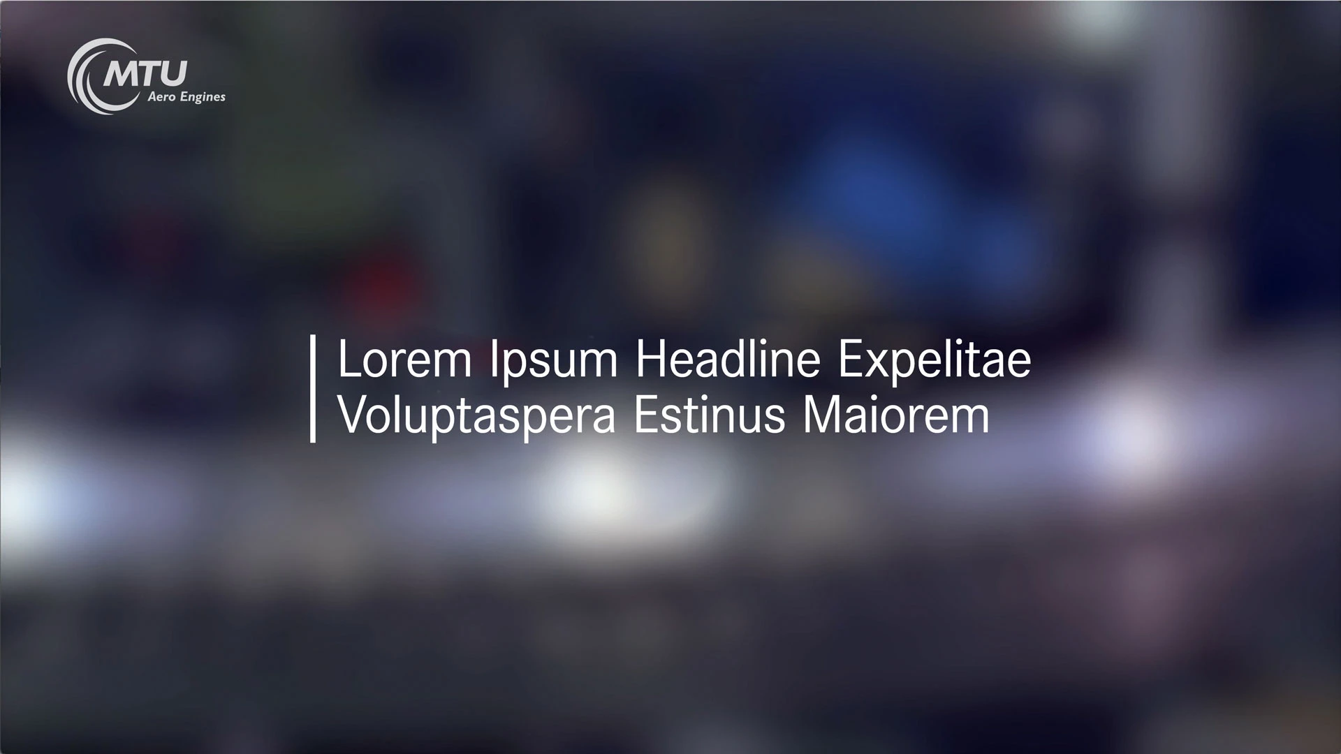
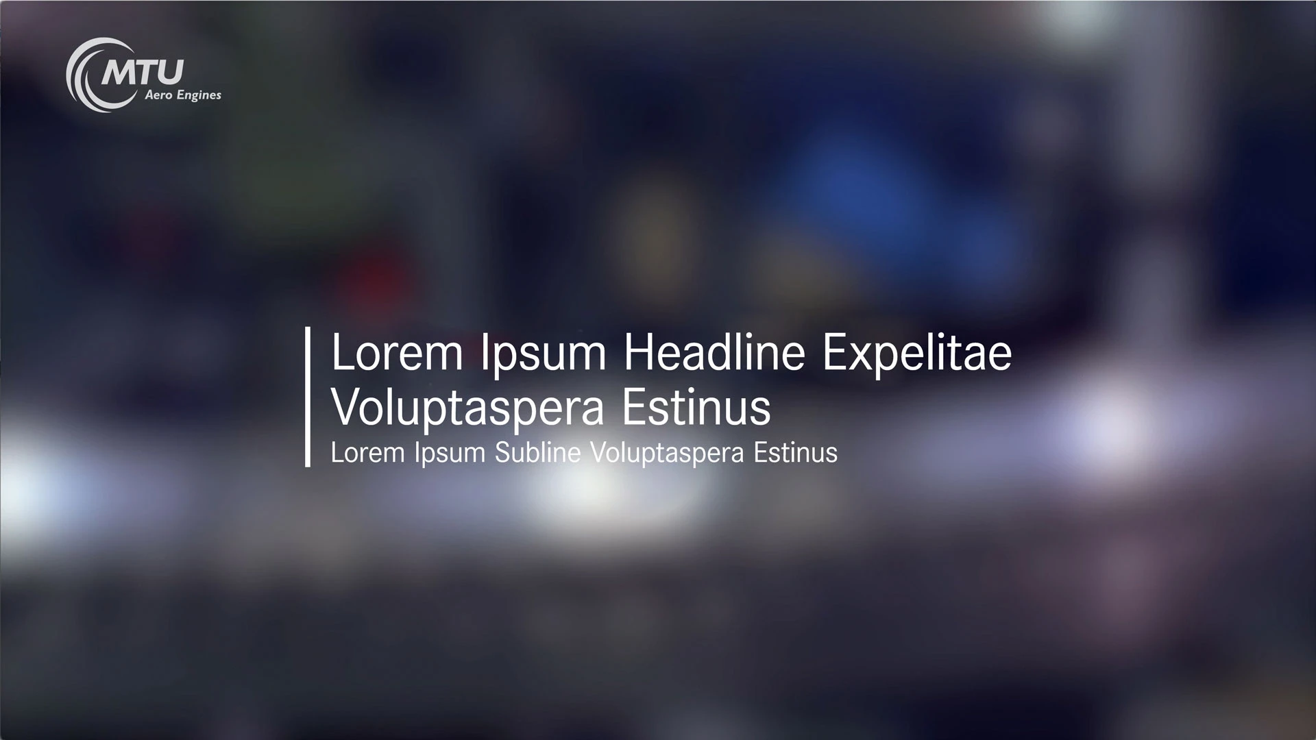
The opener precedes the film and its function is to present the title of the work. Its appearance, matched to the overall concept, introduces the audience to the MTU brand environment.

Suitable openers are available for the various brands in the MTU family.

These are subdivided into:

  • MTU Aero Engines
  • MTU Maintenance
  • MTU Power

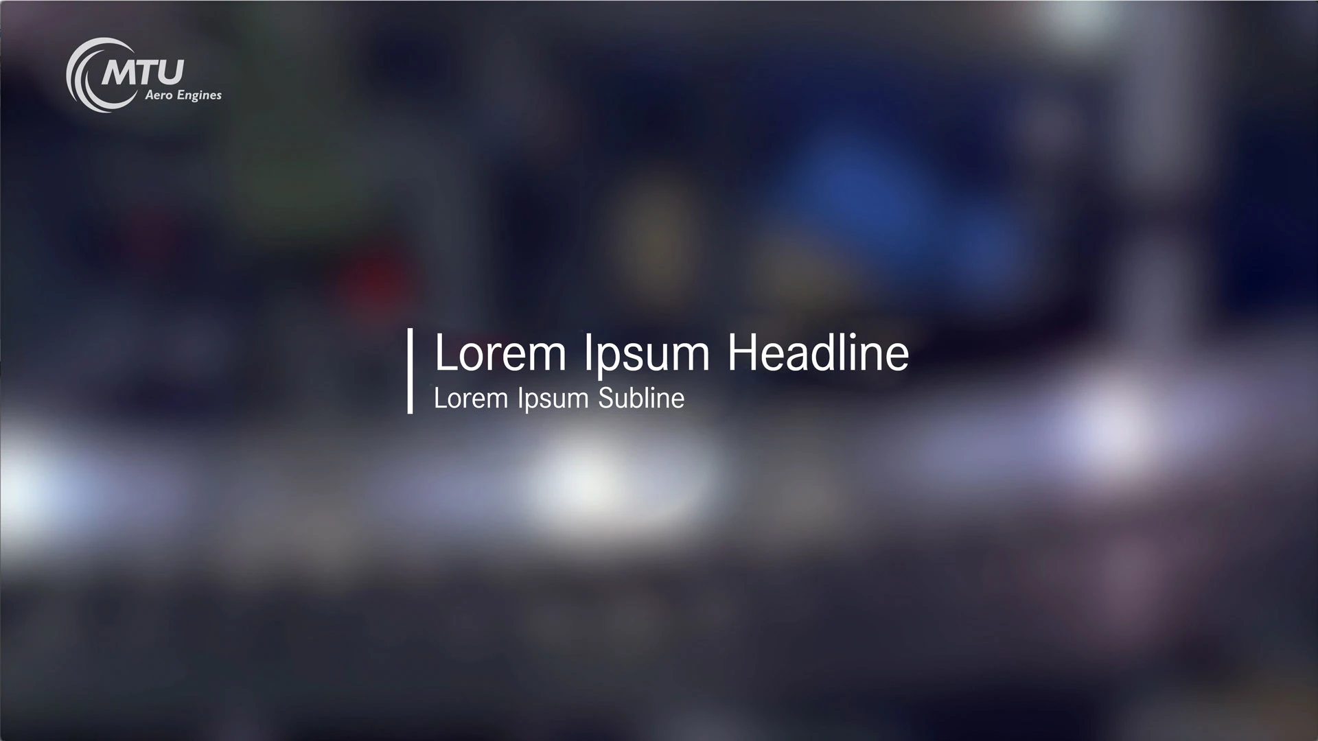
The MTU logo appears as an animation on a transparent, softened background. After 50 frames (starting at 0), the logo fades out and reappears at the top left as a corner logo. The animated title follows and fades out with the softened background blurring, marking the transition to the film content.

The background image material can be chosen freely. Care must be taken to select a calm image that contrasts sufficiently with the white MTU logo and title typography. If this is not possible, there is another typeface version using MTU Dark Blue (0-57-99 rgb).

There should be no image cuts in the softened background while the MTU logo appears on screen, and no more than two image cuts should be used while the title is visible.

MTU logo – animated opener logo

Height: 560 px (UHD)
Position: centered horizontally/vertically
Color: white (rgb)
Type: animated

MTU logo – corner logo

Height: 220 px (UHD)
Position: top left/safety action zone
Color: white (rgb)
Opacity: 80%
Type: static

For more details see data sheet.

MTU title copy

Headline: Corporate S Regular, 160 px (UHD), line height 160 px
Subheadline: Corporate S Regular, 90 px (UHD), line height 90 px
Line height between headline and subheadline: 110 px
Vertical stroke: width 15 px, height equals the total height of the headline and subheadline plus 15 px both above and below
Alignment: left-justified
Position: centered horizontally/vertically
Width: maximum width is limited to 60% of screen width

If the text space is insufficient, the title may be spread across three lines, in which case the side bar must be extended downward the equivalent height.

Background blurring
After Effects “Gaussian Blur” 250% (UHD)

For more details see data sheet „Film Title“.

Download of master and sample files.

Closer

The closer concludes every MTU film and is a brand-building component, leading to the logo and thus to the MTU brand.

If the film is run continuously in loop mode, the fading-in of the logo at the end is omitted, and there is a seamless cut back to the opener and its logo. There are two different closers available for such cases.

The closer is introduced by a dimming of the last scene, which fades to black in 50 frames (2 seconds). The subsequent 3D spark animation serves as a versatile optical vehicle that symbolizes the distinctiveness of MTU products and services. It stands for the “sparks of genius” in every department, the energy and thrust behind the innovations that make MTU special, whether in research and development, service and maintenance, or recycling. The MTU logo then fades in with 5 frames.

The sound embedded in the closer is part of the corporate design and must always be used.

As an alternative, the closer is available in a version with only the MTU logo fade-in and no 3D animation. In this version, the last scene fades to white in 25 frames (1 second) before the MTU logo builds up in the closer.

For more details see data sheet „Logo“.

Download of master and sample files.

Important: Please observe the notes about the closer on YouTube.

Bumper

There are two types of bumpers:

1. Simple transition between two film scenes

The bumper essentially consists of a “wiper effect.” The new scene is introduced in the softened background, and the transition to the scene is made after the wiper fades out.

2. “Chapter bumper”

A subject change is introduced by fading in title text.

MTU title copy

Headline: Corporate S Regular, 160 px (UHD), line height 160 px
Subheadline: Corporate S Regular, 90 px (UHD), line height 90 px
Line height between headline and subheadline: 110 px
Vertical stroke: width15 px, height equals the total height of the headline and subheadline plus 15 px both above and below
Alignment: left-justified
Position: centered horizontally/vertically
Width: maximum width is limited to 60% of screen width

If the text space is insufficient, the title may be spread across three lines, in which case the side bar must be extended downward the equivalent height.

Background blurring
After Effects “Gaussian Blur” 250% (UHD)

Download of master and sample files.

Subtitles

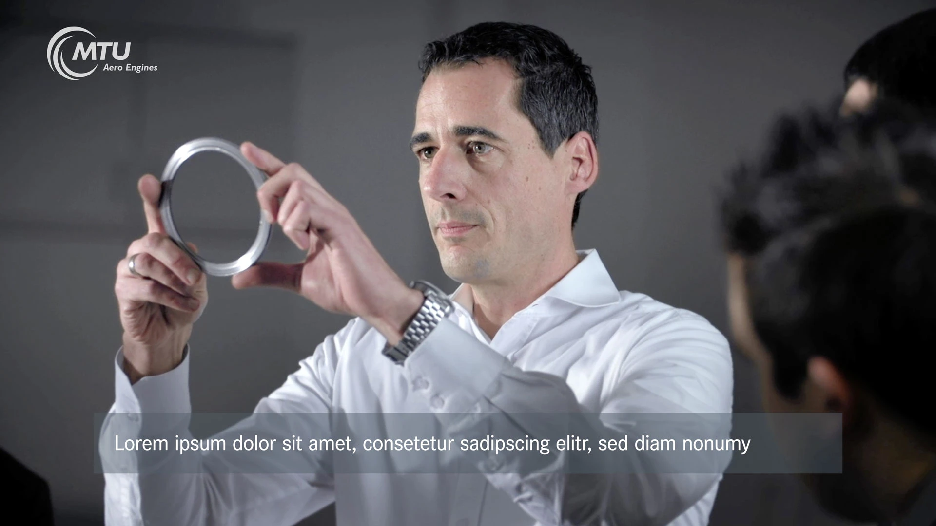
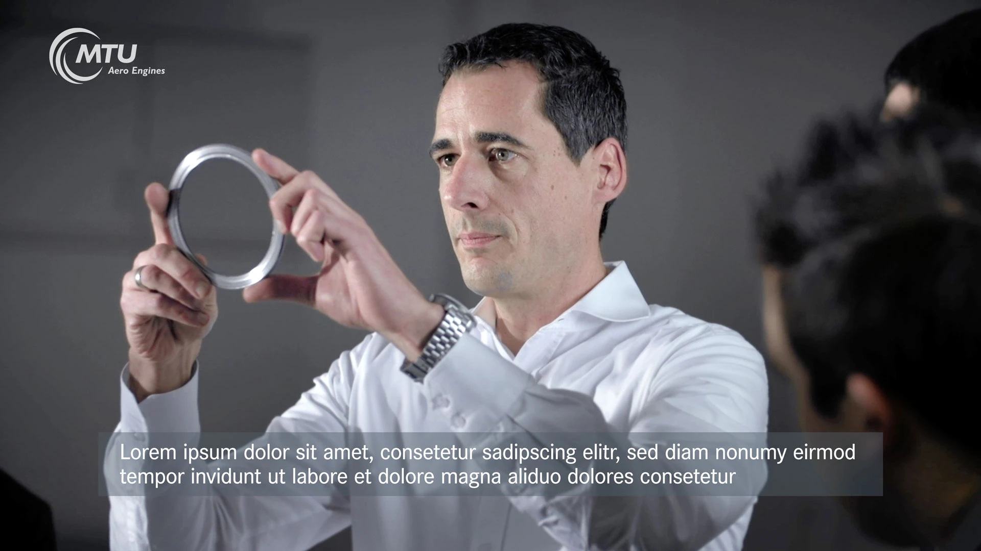
Subtitles are used in foreign-language segments to show the corresponding translation.

Subtitles are always shown on a gray (MTU blue gray), transparent box in negative, white copy. The box has a fixed height and is no wider than the “title safe area.”

The text sequence can be freely selected according to the situation, but viewers should be given enough time to read the text.

Box format

Width: title safe area
Height: 250 px (UHD)
Position: bottom edge of title safe area
Color: MTU blue gray (81-94-105 rgb), transparency: 45%

Typography

Copy: Corporate S Medium 90 px (UHD), line height 95 px
Alignment: left-justified
Position: Offset to left of safe title: 90 px (UHD), height: centered in box

Box fade-in/fade-out time: 20 frames
Typography start fade-in/fade-out time: 10 frames (delay)
Text change: 0.00 sec (hard cut)

For more details see data sheet „Subtitles“.

Download of master and sample files.

Important: Please observe the specific guidelines for Facebook and Twitter.

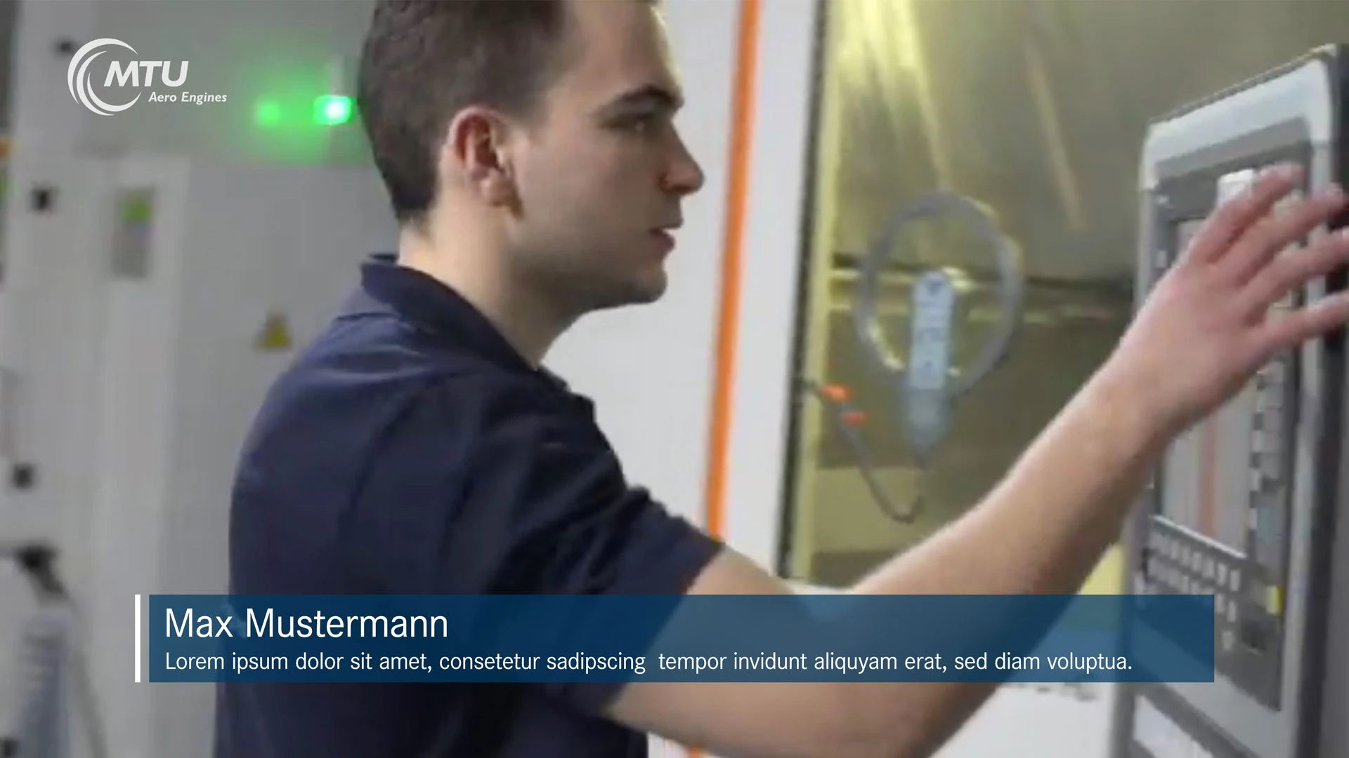
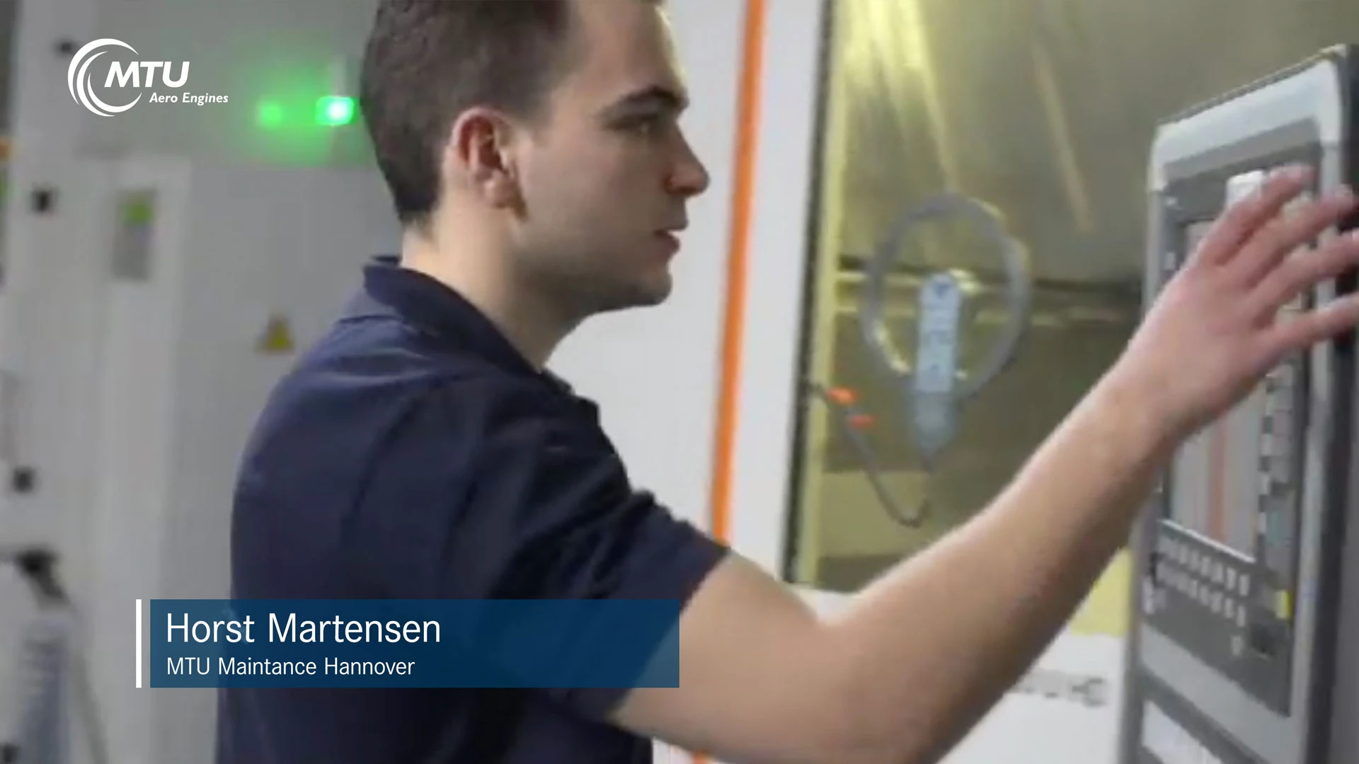
Lower Third

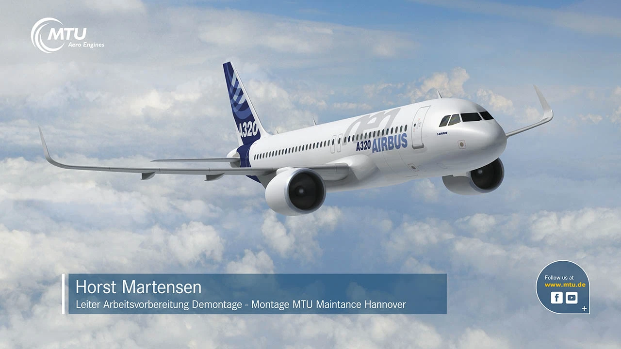
Lower thirds are used to indicate a person’s name and function.

This involves the animated hoisting of a blue (MTU dark blue) box on which the text should be shown in negative white, preceded by a style element in the form of a stroke with an animated light-spark effect.

The box should measure half the “title safe area” with minimal width, and may extend to no more than the full “title safe area,” taking a protection zone at the end of the text into account.

The text sequence can be freely selected according to the situation, but viewers should be given enough time to read the text.

Box format

Width: min. (50% of title safe area) up to max. (100% of title safe area in UHD)
Height: 250 px (UHD)
Position: bottom left in title safe area
Color: MTU dark blue (0-57-99 rgb), transparency: 45%

Typography

Headline: Corporate S Regular 120 px (UHD)
Subheadline: Corporate S Regular 70 px (UHD), line height 100 px
Alignment: left-justified

Fade-in/fade-out time (animated): 15 frames/0.4 sec

For more details see data sheet „Lower Third“.

Download of master and sample files.

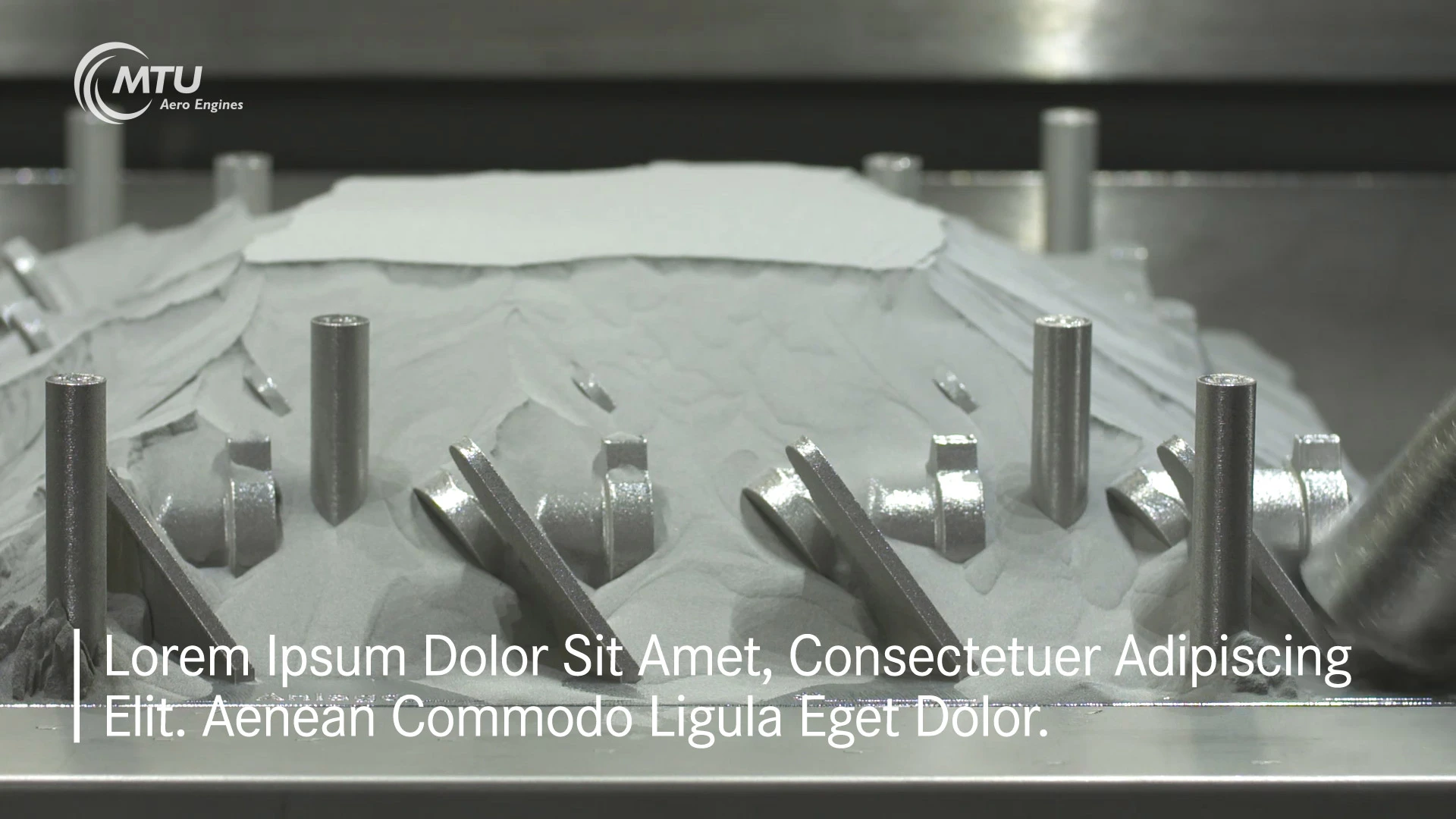
Basic text

Basic text is used to aid general understanding of films without sound and to explain what is happening in the picture. The basic text should be different from the voice-over; it should be kept shorter to enable viewers to read it faster.

Basic text 16x9 format

Font: Corporate S Regular, 160 px (UHD), line height 160 px
Alignment: left-justified
Vertical stroke: width 15 px (UHD), height corresponds to the total height of the lines of text plus 15 px both above and below
Text width: safety action zone
Text position: bottom edge of the text runs along the title safe area
Color: white (255-255-255 rgb)

Important: Please observe the specific guidelines for Facebook and Twitter.

Download of master and sample files.

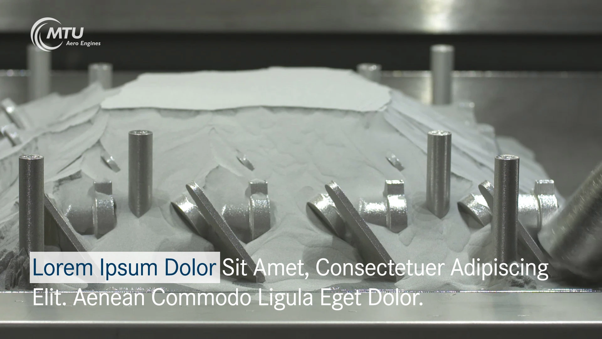
Highlighted text

Highlighted text is used to accentuate the key messages of the film or to highlight product benefits. It conforms to the brand identity while unobtrusively standing out.

Highlighted text 16x9 format

Font: Corporate S Regular, 160px (UHD), line height 190 px (UHD)
Alignment: left-justified
Text frame position: left 20px (UHD) from the safety action zone, bottom edge of the text runs along the title safe area
Font color: in the box: MTU dark blue (0-57-99 rgb), outside the box: white (255-255-255 rgb)
Box width: width corresponds to the width of the highlighted text plus 20 px (UHD) on the left and 20 px (UHD) on the right.
Box height: 200 px (UHD)
Box color: white (255-255-255 rgb), transparency: 80%

Important: Please observe the specific guidelines for Facebook and Twitter.

Download of master and sample files.

Call-out

The call-out is an additional film element used to highlight additional comments or information; for instance, an upcoming trade fair.

It may appear in either an animated or static format. Depending on the film’s content, the call-out can be positioned on the upper or lower right-hand side inside the safe action zone.

The call-out may appear at any point in the film, but the viewer needs to have enough time to absorb the information.

The call-out always consists of negative-space white text on a blue (MTU Dark Blue) background, and must be of a specified size.

Format of the call-out

Height: 330 px (UHD)
Position: on the far right inside the safe action zone; when positioned above, top edge flush with the MTU logo. When positioned below, lower edge flush with safe title zone.
Background color: MTU Dark Blue (0-57-99 rgb), transparency: 60%

Typeface

Copy headline: Corporate S Medium, White (255-255-255 rgb)
Copy headline highlighting: Corporate S ExtraBold, White or MTU Orange (249-183-0 rgb)

Fade-in time of call-out animation: 14 frames

For further details, see the Call-out data sheet.

Download the master and sample files.