Typography

The MTU corporate typeface

new

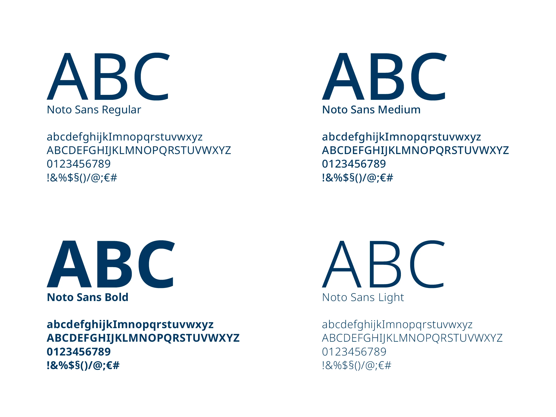
MTU’s corporate typeface is Noto Sans. It is a Google font and freely available.

Noto Sans is functional, modern, open, and suitable for international use. Its clear design and neutral, contemporary appearance underline MTU’s technological focus. Noto Sans is used in both digital and analog applications and is noted for its high degree of design flexibility.

It completely replaces the previous corporate typeface, Corporate S / A.

The Noto Sans font can be downloaded here:
fonts.google.com/noto/specimen/Noto+Sans
Please note the license terms:
fonts.google.com/noto/specimen/Noto+Sans/license

Exception

new

If Arial must be used as an alternative typeface, this must be agreed on in advance with Corporate Communications.

Formatting

new
Text hierarchies

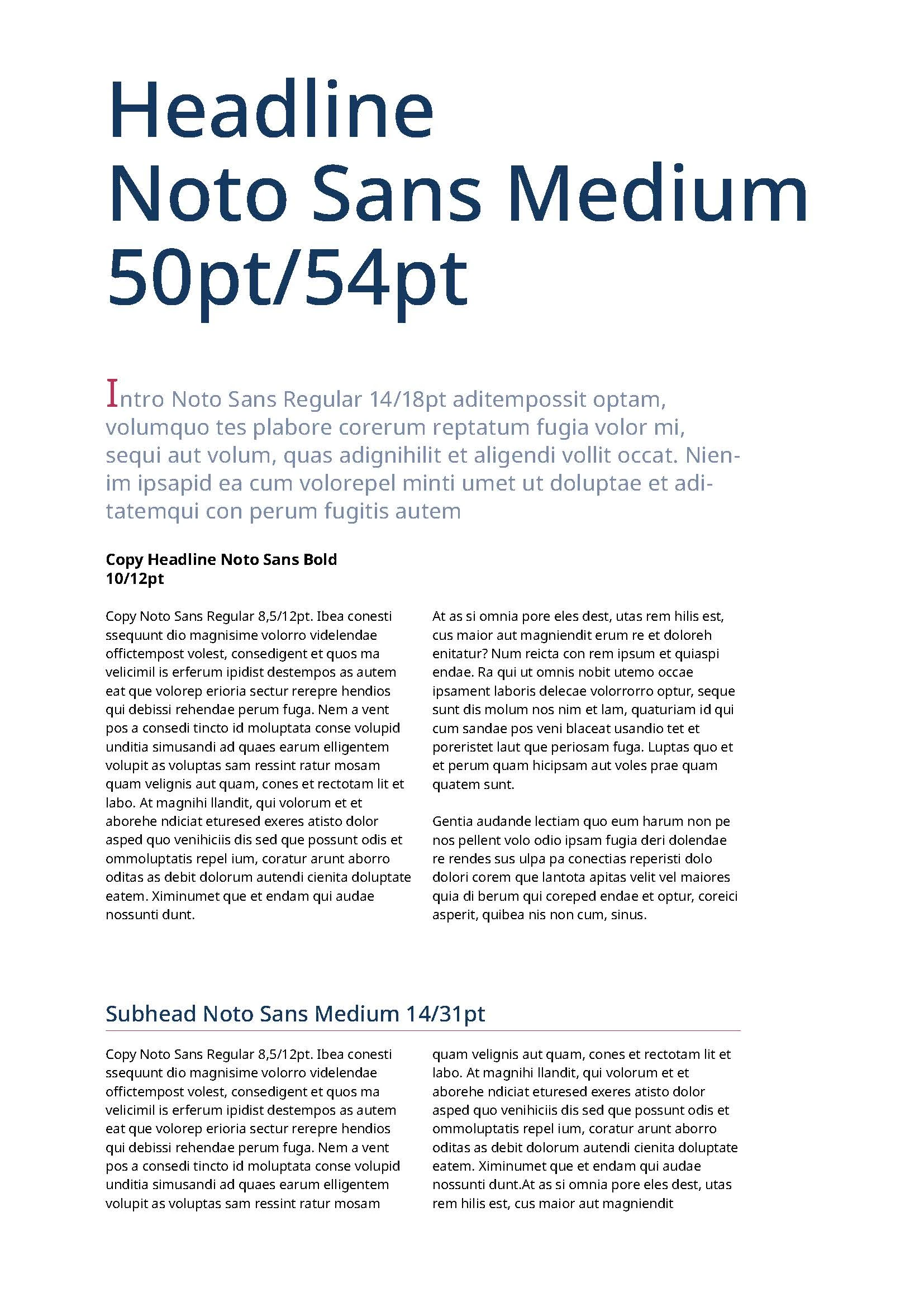
Clear text hierarchies deliver a compelling overall image and facilitate typographic design. They ensure that the formatting is thoroughly regulated, from the title to the body text. The following paragraphs provide more detail. Where sizes are not explicitly specified, the design examples shown here serve as a guide for the sizes of hierarchy levels relative to each other. To ensure a uniform design, digital InDesign templates can be used.

Headlines

Headlines are set in Noto Sans Medium, 15–50 pt, in MTU dark blue.

Subheadlines

Subheadlines use Noto Sans Bold, 10–12 pt, in black.

Intros

Intros are set in Noto Sans Regular, 14 pt, with line spacing of 18 pt. The first letter is emphasized as an initial in 25 pt, MTU berry.
The body text color is MTU dark blue (48% gradation).

Copy texts

Copy texts (body texts) use Noto Sans Regular, 8.5 pt, with a line spacing of 12 pt.
Footnotes, captions, and marginalia are set in Noto Sans Regular, 6 pt.

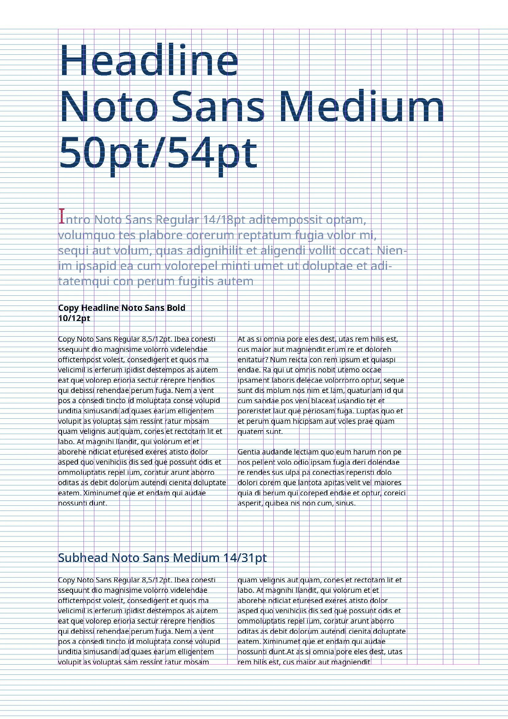
The entire typographic system is based on a 6-point baseline grid, which is mandatory in all print applications. All text elements—from headlines to footnotes—are aligned with the grid.

Font colors: Analog use

The font colors depend on the content, medium, and background color. Sufficient contrast must be ensured in all cases. The following stipulations apply:

Use Font Color
Headline Noto Sans Medium MTU-Darkblue (100 %)
Intro/Teaser Noto Sans Regular MTU-Darkblue (48 %)
Intro-Initiale Noto Sans Regular MTU-Berry
Subheadline Noto Sans Bold Black
Copy text Noto Sans Regular Black

For use on dark backgrounds—such as MTU gray 5, darkblue, or similar colors—the font should be set in white. This ensures optimum legibility and a clear, high-quality visual effect.

Use of italics

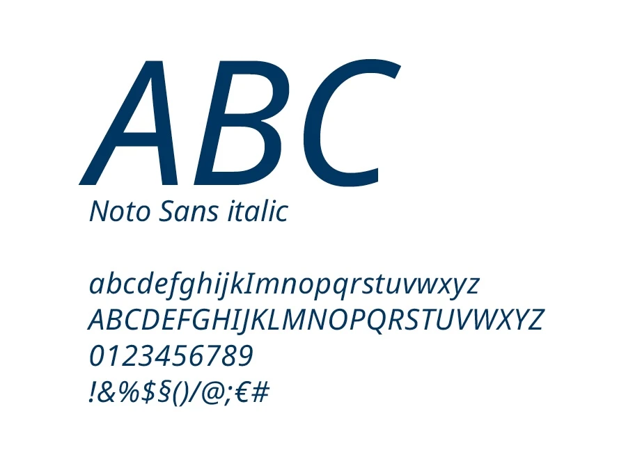
In all bilingual print publications, the English version—i.e. the second language—is consistently set in Noto Sans Italic. This creates a clear visual distinction from German, the main language.

  • Introduction / Teaser: The introductory text is set in MTU gray 5 with a 48% gradation. This approach corresponds to the setting of the German introduction in MTU dark blue 48% and thus ensures design consistency.In the second language version, the initial within the introductory text / teaser is also emphasized by being set in MTU berry (italic).
  • Title (cover): Main titles on the cover are set in MTU dark blue 48%.
  • Copy text (body text): Continuous copy text is set in MTU gray 5.
  • Subheadline: Sublines appear in MTU gray 5 (100%).

The general rule still applies: Italics are not used in publications that appear exclusively in one language. An exception to this is possible only in special cases and must always be approved in advance by the Corporate Communications department.

Use in digital media

Binding rules for the use of typography in digital media (e.g. website, app, social media, PowerPoint, etc.) are currently being developed. They will be defined in a separate chapter.