• en
    • de
  • Contact
  • Login/Registration
MTU Corporate Design Portal
  • MTU Corporate Design Portal MTU Corporate Design Portal
  • Brand
    • Our brand core story
    • Brand
  • Brand
    • Our brand core story
    • Brand
  • Basic elements
    • Logo
    • Colors
    • Typography
    • Design elements
    • Design grid
    • Visual language
    • Graphics
    • Icons
  • Basic elements
    • Logo
    • Colors
    • Typography
    • Design elements
    • Design grid
    • Visual language
    • Graphics
    • Icons
  • Applications
    • Advertisements
    • AV-Media
      • Production
      • Post-production
      • Adaptation for various channels
      • Archiving film material
    • Brochures
    • Business papers
    • PowerPoint assistant
    • Print media
    • Signage
    • Flags
    • Events
    • Promotional items
  • Applications
    • Advertisements
    • AV-Media
    • Brochures
    • Business papers
    • PowerPoint assistant
    • Print media
    • Signage
    • Flags
    • Events
    • Promotional items
  • Digital Media
    • Social Media Guidelines
    • Guidelines for developers
    • Developing service applications
    • Digital Branding Guidelines
  • Digital Media
    • Social Media Guidelines
    • Guidelines for developers
    • Developing service applications
    • Digital Branding Guidelines
  • Downloads
  • Deutsch
  • Login/Registration
  • Everything revolves around the logo
  • Protected space
  • Logo placement
  • Hierarchical placement of the MTU logo and another logo
  • Minimum size
  • Logo size in DIN formats
  • Use of color
  • Instructions for use
  • What is not allowed

Logo

  • Corporate Design
  • Basic elements
  • Logo

Everything revolves around the logo

new

The MTU Aero Engines logo is a graphically rendered word/design mark of our brand. It is an essential component of the corporate design and visualizes the corporate identity.

Our logo does more than simply identify the sender. It is a powerful symbol of MTU’s reliability, innovative strength, and global significance.

To ensure that the logo remains recognizable and can achieve its full effect, binding rules for its use apply.
These are simple, clear, and consistent—and form the basis for a uniform brand image across all channels.
Everywhere in the world, in every application, on any medium.

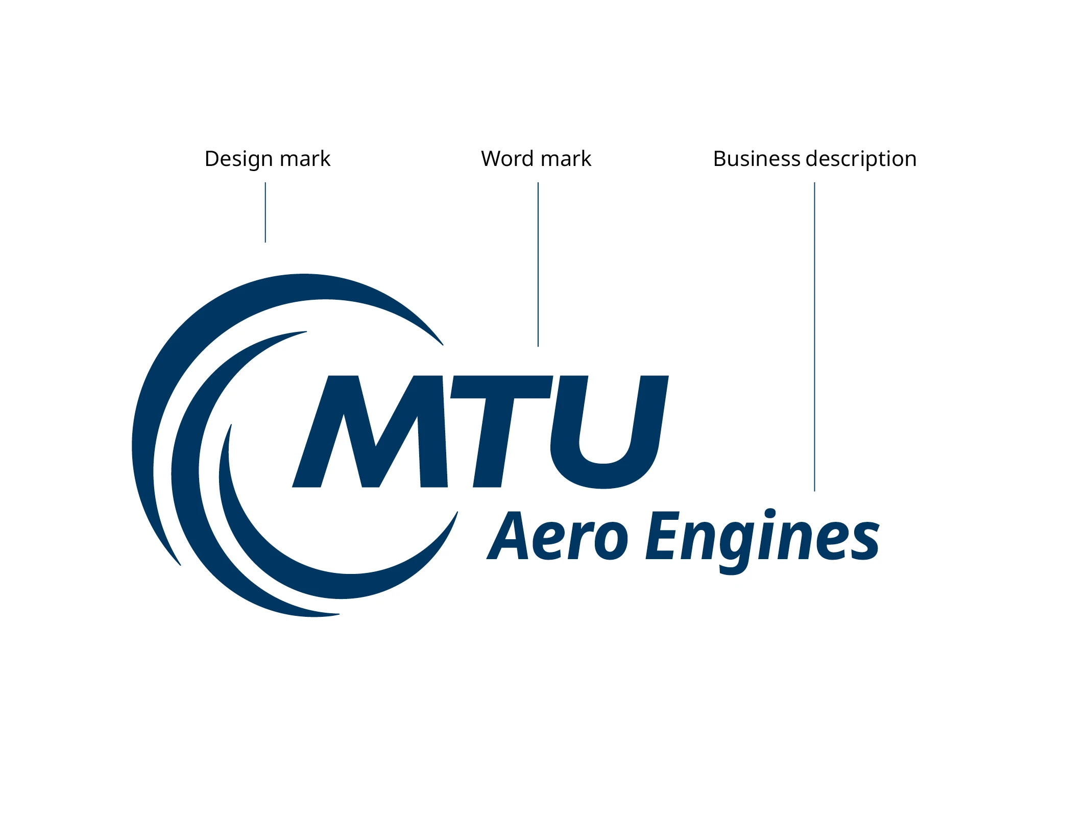
The logo consists of three elements:

  • The unmistakable design mark, which is based on a rotating fan, suggesting the nature and dynamics of our company.
  • The italics of the word mark, which represent a company that is steeped in tradition. In the aviation industry, the three letters “MTU” stand for safe and reliable advanced engine technology and innovations of the highest caliber.
  • The business descriptor: Aero Engines, MTU Power, or Maintenance, which clearly designates the business area.
Protected space

new

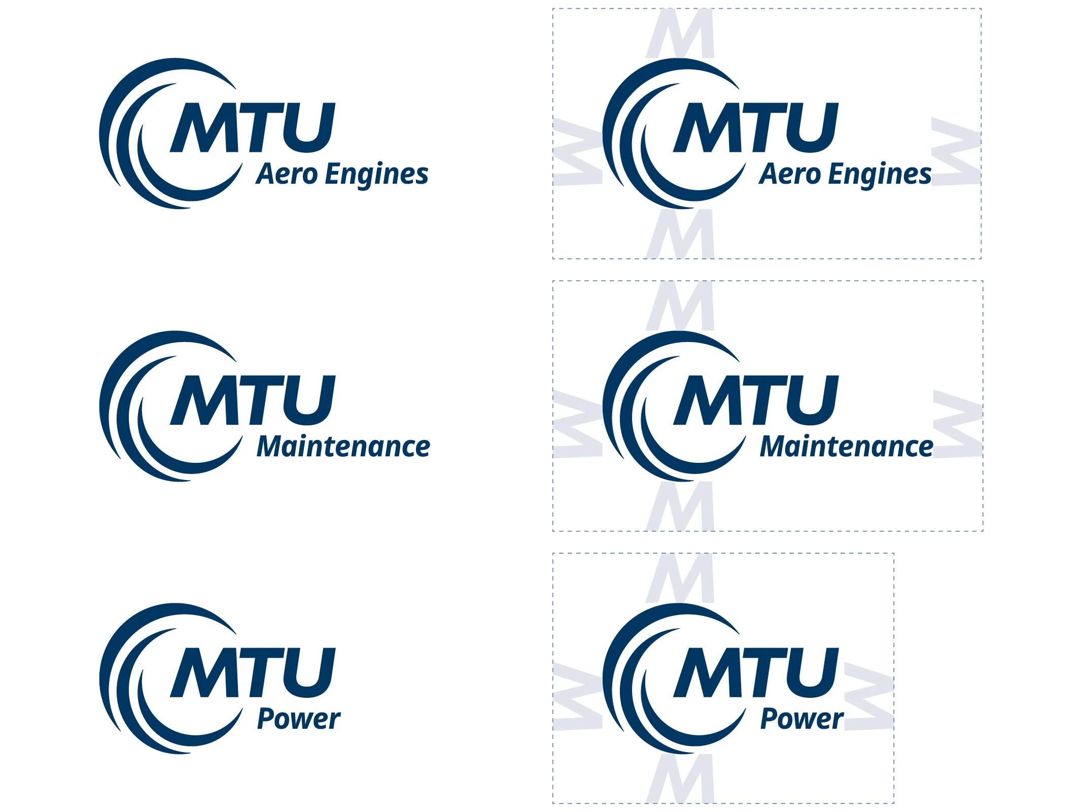
To ensure the legibility and impact of the logo, it is surrounded by a defined protected space.

The necessary minimum extent of this space varies depending on the size of the MTU logo. However, it corresponds to at least the height and size of the letter “M” in MTU. No text elements, images, or graphic lines may be placed within this protected space.

logo-schutzraum_deu_eng

Logo placement

new

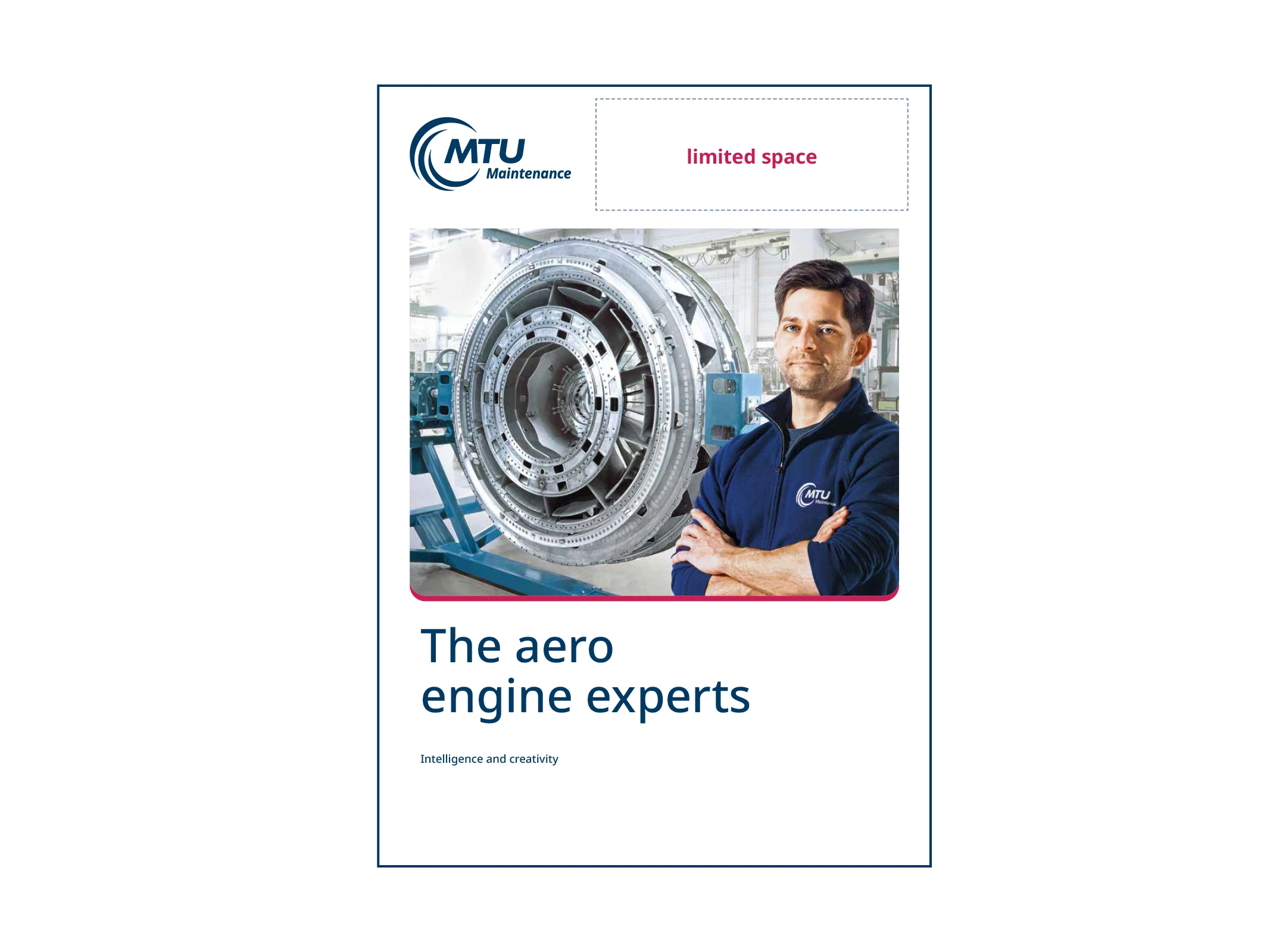
The MTU logo is usually positioned in the top or bottom left-hand corner. It is surrounded by protected space. This space should always be free of other elements such as page numbers, text, images, etc. In special cases (e.g. for certain ad or moving image formats), the placement can be adjusted.

In addition to the protected space, which may not be filled, special rules also apply to what is known as the “restricted space.” No other logos are allowed in the restricted space. You can find supplementary information on this below.

In special cases, other placements must be coordinated with MTU Marketing Communications (see “Hierarchical placement of the MTU logo and another logo”).

cover_eng

Hierarchical placement of the MTU logo and another logo

new

If other logos, such as an internal campaign logo* or partner or product logos, are to be used in addition to the MTU logo, these must never be placed to the right or left of it, i.e. at the same height. This horizontal level is described in the following as the “restricted space.” You can find more details on this under “Logo placement.”

*As a rule, it is not permitted to use or create a (center- or topic-specific) logo. If an exception needs to be made, a custom solution can be found in coordination with Corporate Communications (see excerpt from the MTU Corporate Design Guidelines).
In exceptional cases, custom solutions can be found subject to consultation and coordination with Corporate Communications (excerpt from the MTU Corporate Design Guidelines).

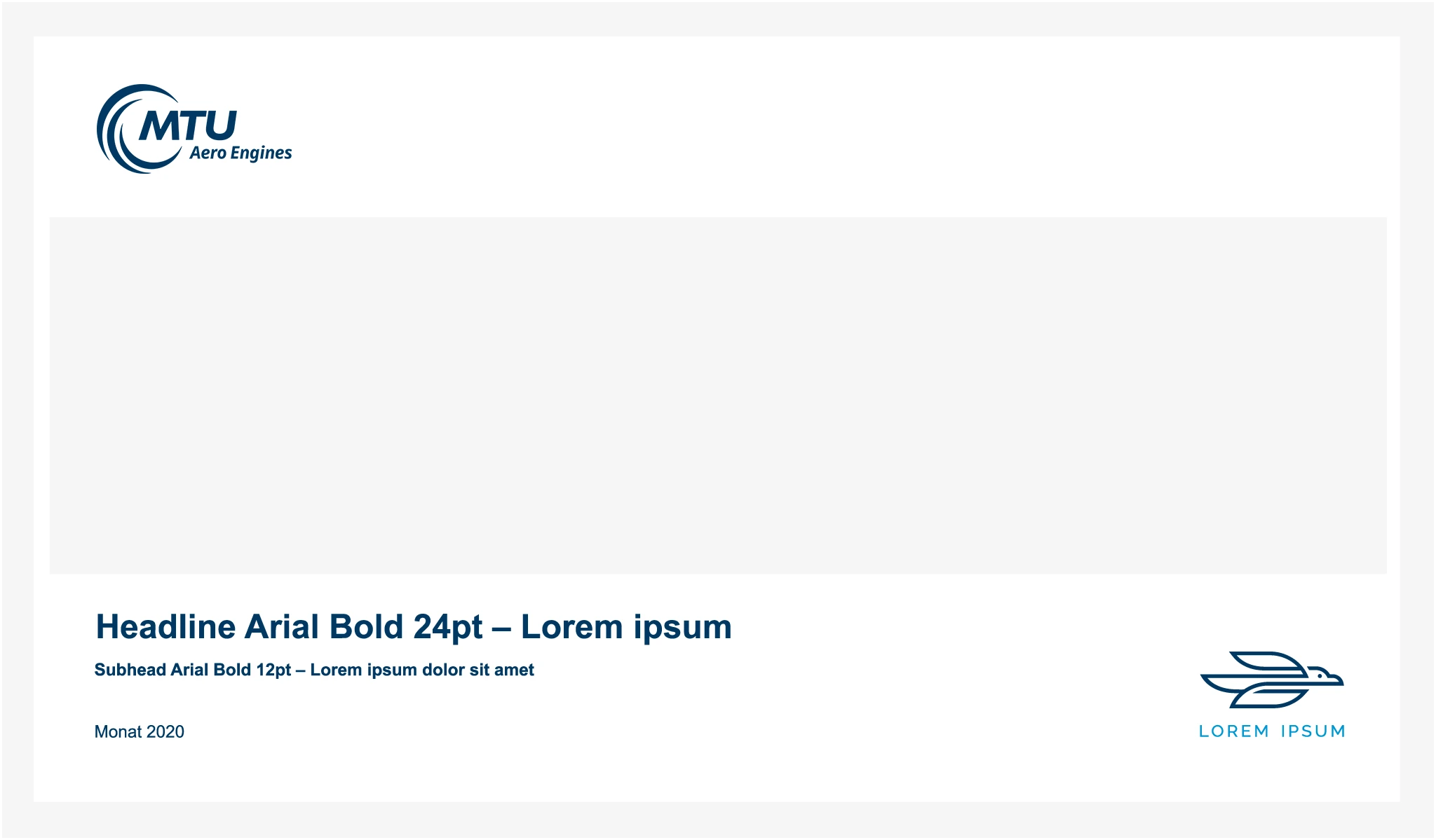
Example using a PowerPoint title slide

In this example, the additional campaign logo is correctly displayed subordinate to the MTU company logo. It does not compete with it and plays on a different level.

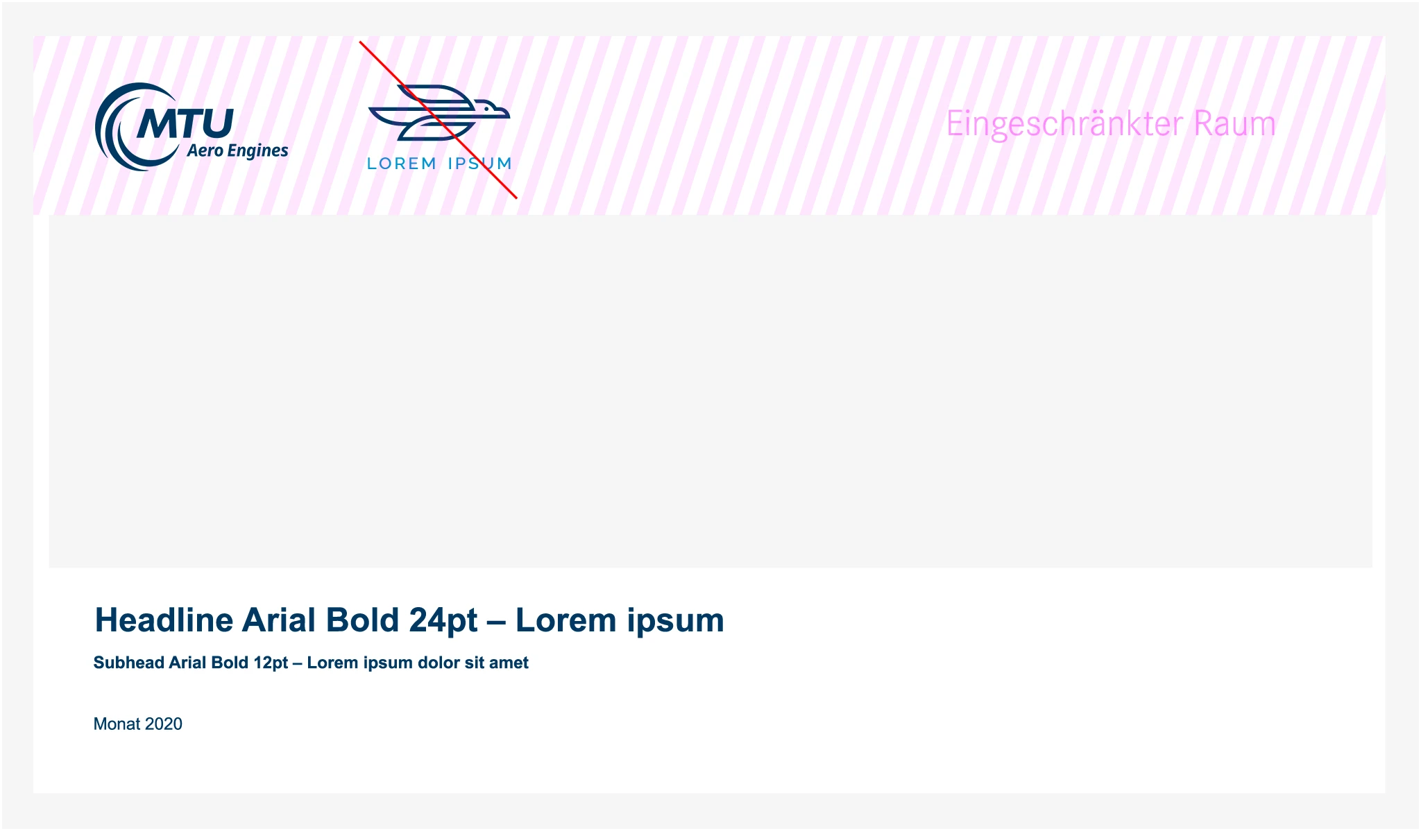
This slide is an example of incorrect placement of an additional campaign logo.

It was inserted to the right of the MTU logo so that the logos are in competition from a design perspective. The dashed area indicates the “restricted space” where no other logo may be placed.

Special cases: Campaign logo placement

When placing campaign logos, there are a few special cases that differ from the basic rules. These placements may be used in individual cases in coordination with MTU Marketing Communications.

Minimum size

new

The minimum height of the logo with business descriptor is 10 mm.

If the design mark needs to be smaller than 10 mm for certain small-format media, the logo without business descriptor can be used with a height of up to 5 mm.

Important specification: The logo without business descriptor may currently be integrated only in the favicon of the website. As an alternative, if there is not enough space available, the wording “MTU Aero Engines,” “MTU Maintenance,” or “MTU Power” can be used on its own.

The use of the logo without business descriptor is an exception and always requires the approval of Corporate Communications.

Logo size in DIN formats

new

To ensure a consistent appearance, the logo size for common print formats is defined as follows:

DIN A4 formats

  • Front cover: Logo height 28 mm
  • Back cover: Logo height 20 mm

DIN portrait formats

  • Front cover: Logo height 20 mm
  • Back cover: Logo height 15 mm

Further application instructions can be found in the brochures section.

Use of color

new

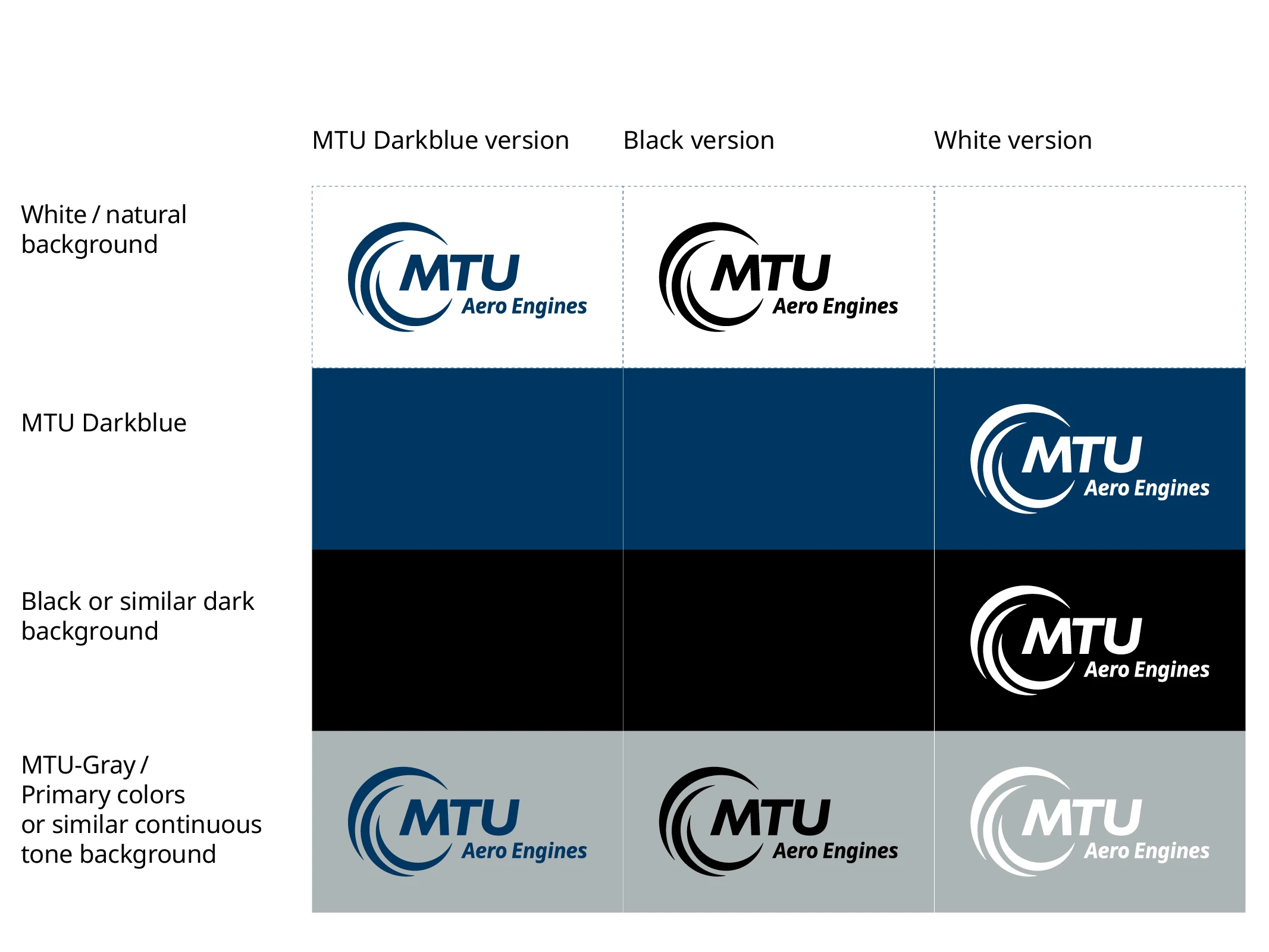
To ensure the recognizability of the MTU logo, we would like to limit the number of color options—especially against different backgrounds. Our aim is to maintain the strong brand effect of the logo and not to impair it by using too many colors.

The figure below shows the different possibilities for presenting a logo. Three basic color configurations can be used on different backgrounds.

The MTU logo may be used in the following variants:

It can generally be used on colored fill areas, provided the contrast is sufficient for optimum legibility. The general contrast and accessibility requirements of the style guide apply here. MTU dark blue is recommended as the main fill color.

The negative version of the logo is also used for special printing processes, e.g. embossing or engraving.

Please login to get access to related downloads for this content.

Instructions for use

new
Always consistent

To ensure the success of MTU’s identity, all publications must be uniform in appearance in accordance with our high standards.

In this section we show examples of incorrect use of our logo. Please ensure that these remain the only examples.

The MTU logo may not be changed or modified. This guarantees that the logo consistently conveys the desired impression of reliability. Always reproduce the original artwork.

What is not allowed

new

To ensure that the logo always appears professional and consistent, the following is expressly prohibited:

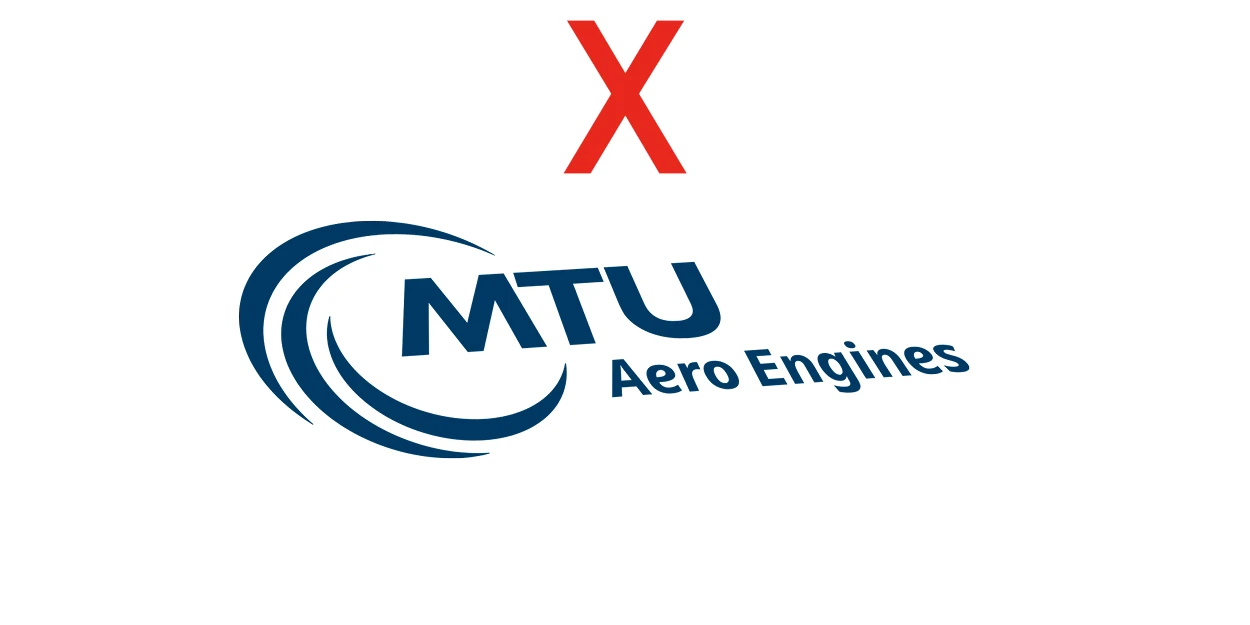
  • Distortions, rotations, tilting
  • Use in undefined colors
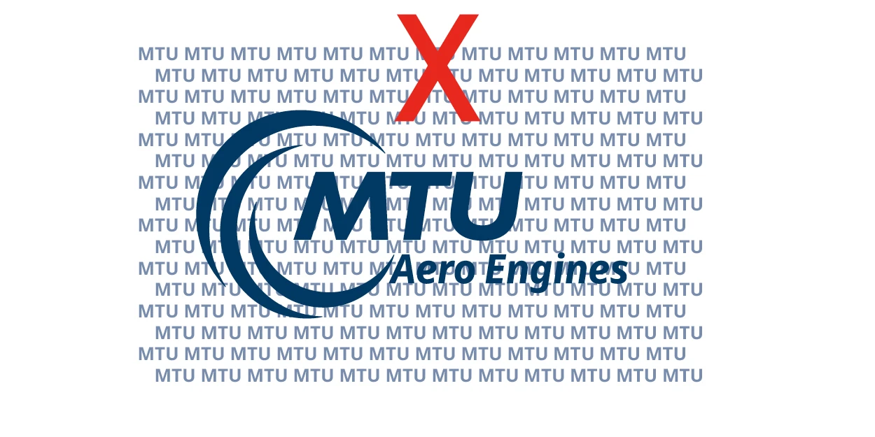
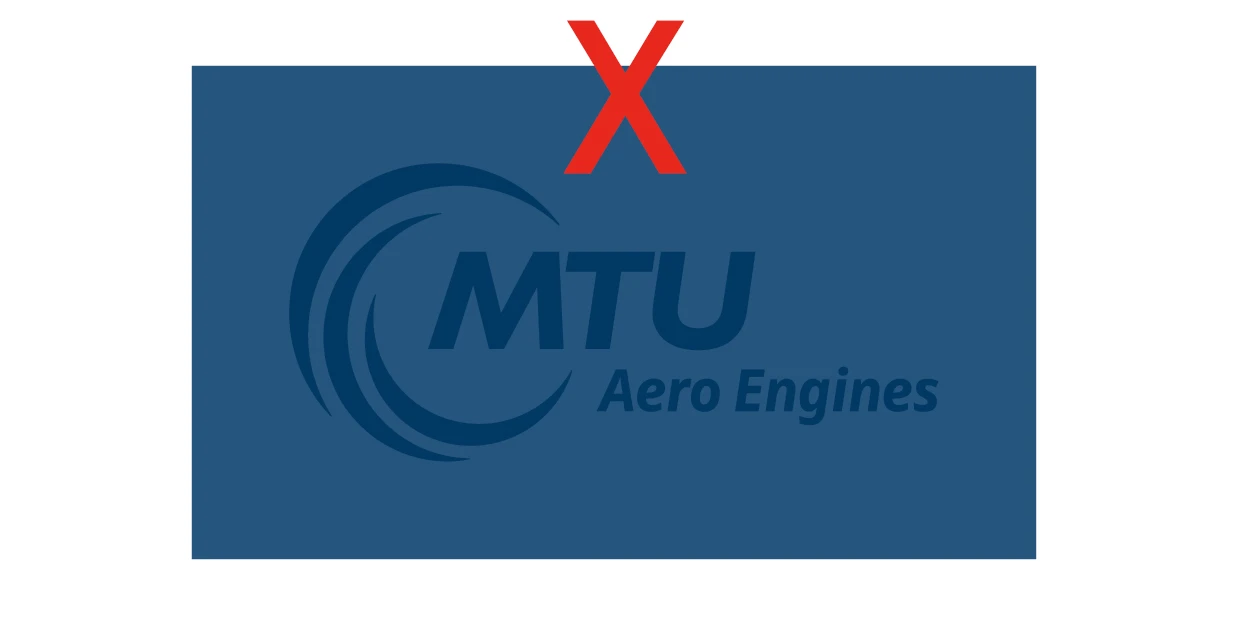
  • Use on busy backgrounds without sufficient contrast
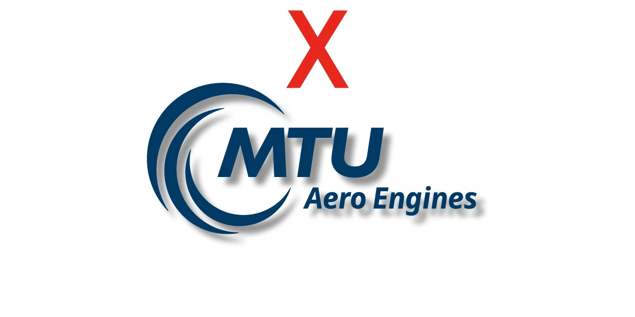
  • Addition of shadows, effects, outlines, or animations
  • Use smaller than the defined minimum sizes

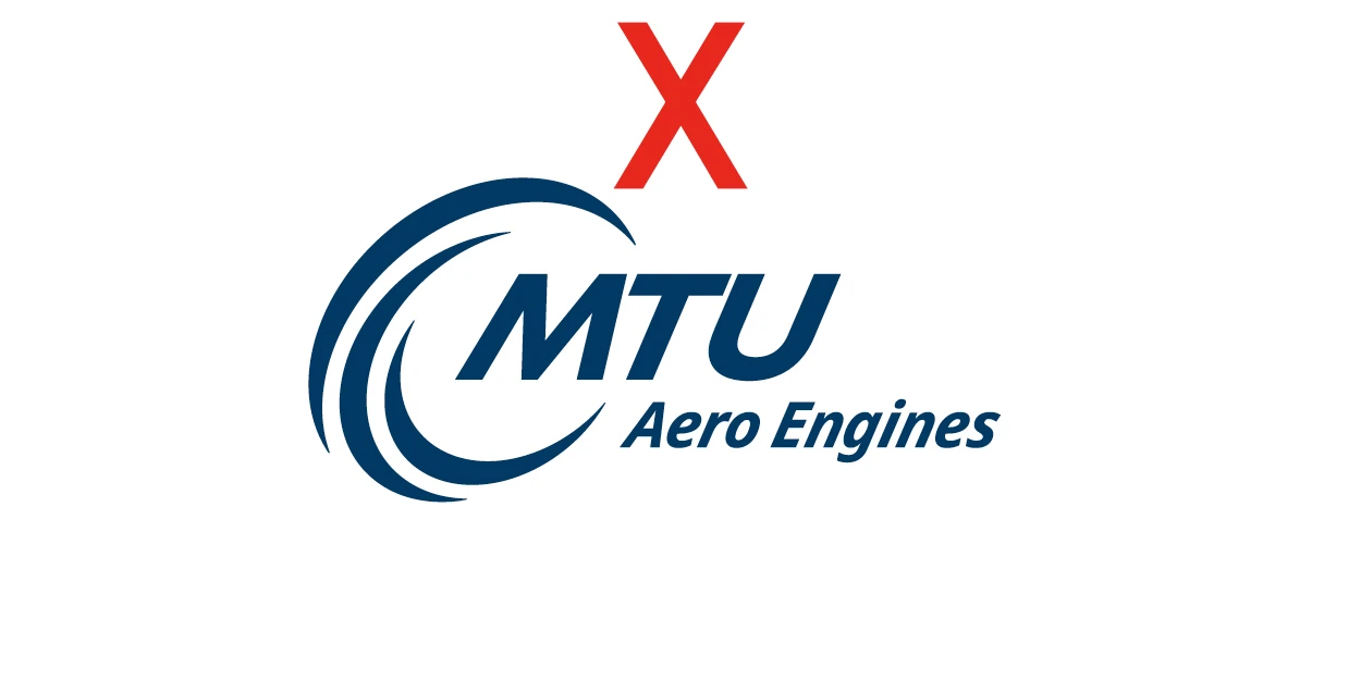
logo_donts_proportion

Ensure that the elements of the logo are used in the correct size and with the specified spatial relationship.

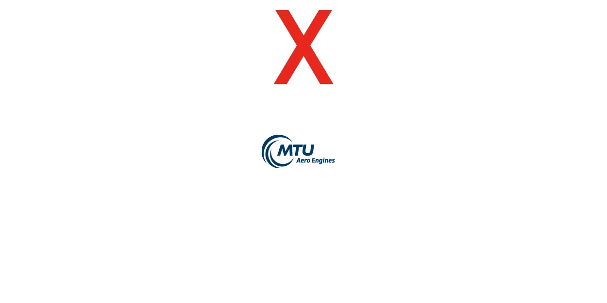
logo_donts_zu_klein

The logo should always be reproduced in a legible size, i. e. not below minimum size.

logo_donts_kursiv

The logo must not be tilted.

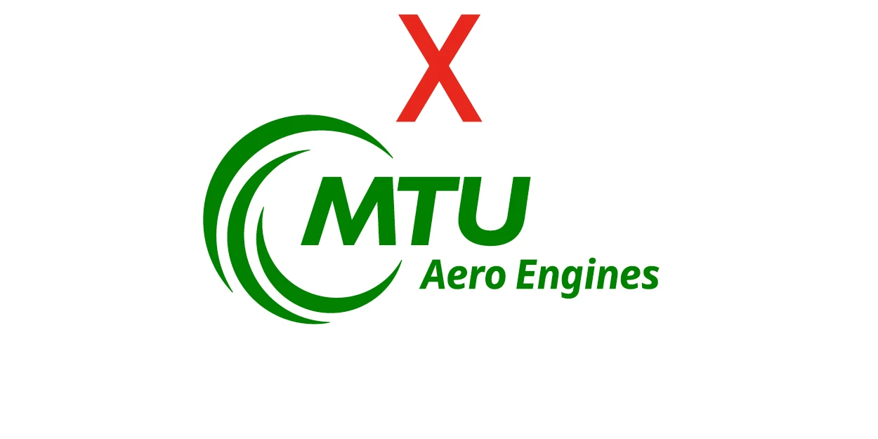
logo_donts_falsche_farbe

Always use the specified logo colors.

logo_donts_perspektive

Ensure that the logo is reproduced from approved original master drawings that have not been modified or distorted.

logo_donts_schatten

Do not add any effects to the logo, such as shadows.

logo_donts_lesbarkeit

Always use the logo on a background that does not impair legibility.

logo_donts_kontrast

Reproduce the logo on a sufficiently contrasting background.

logo_donts_ohne

Always ensure that the three elements that comprise the logo are shown.

Ensure that the elements of the logo are used in the correct size and with the specified spatial relationship.

The logo should always be reproduced in a legible size, i. e. not below minimum size.

The logo must not be tilted.

Always use the specified logo colors.

Ensure that the logo is reproduced from approved original master drawings that have not been modified or distorted.

Do not add any effects to the logo, such as shadows.

Always use the logo on a background that does not impair legibility.

Reproduce the logo on a sufficiently contrasting background.

Always ensure that the three elements that comprise the logo are shown.

You may also be interested in these sections:

Design elements

Visual language

Icons

  • Contact
  • Terms of Use
  • Imprint
  • Privacy Statement
  • Sitemap
MTU Aero Engines

© 2025 MTU Aero Engines AG