Design elements

Design components of our brand

This chapter brings together all the core visual components that define MTU’s appearance: logo, colors, typography, visual language, graphics, icons, and other design elements.
They form the basis for consistent and high-quality design across all media. Clear guidelines and practical examples support confident use.
The aim is to create a uniform brand identity that is recognizable and visually conveys MTU’s values.

Our key visual

new

Our key visual—a stylized turbine—symbolizes energy and movement. As a decorative design element, it makes our presence recognizable and offers visual depth. It is used in various ways; for example, in fill areas or to accentuate content. For a consistent effect, certain design rules must be observed regarding, say, placement, scaling, and use of color.

There are 2 possible forms of presentation:

  • Line key visual
  • Fill area key visual

Colors: MTU primary colors

Do's / Don'ts

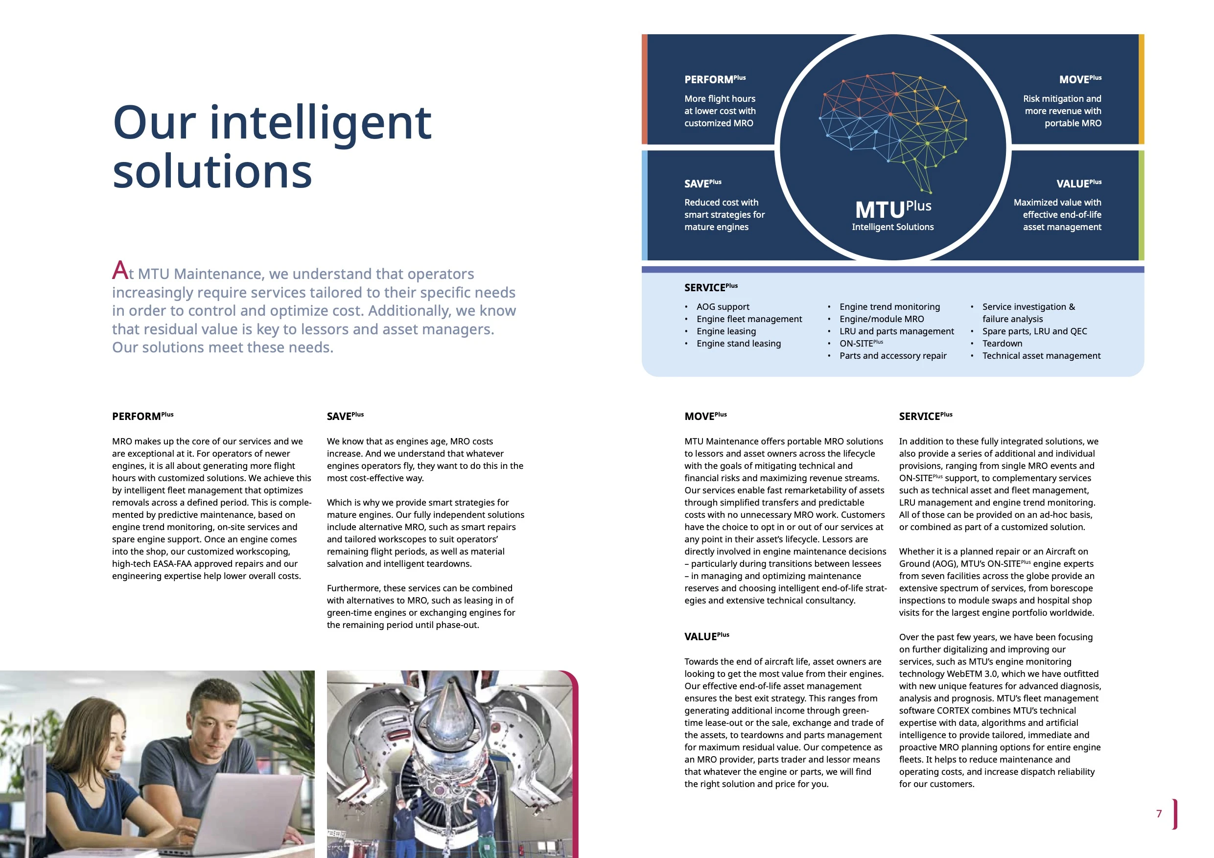
Rules for using the key visual
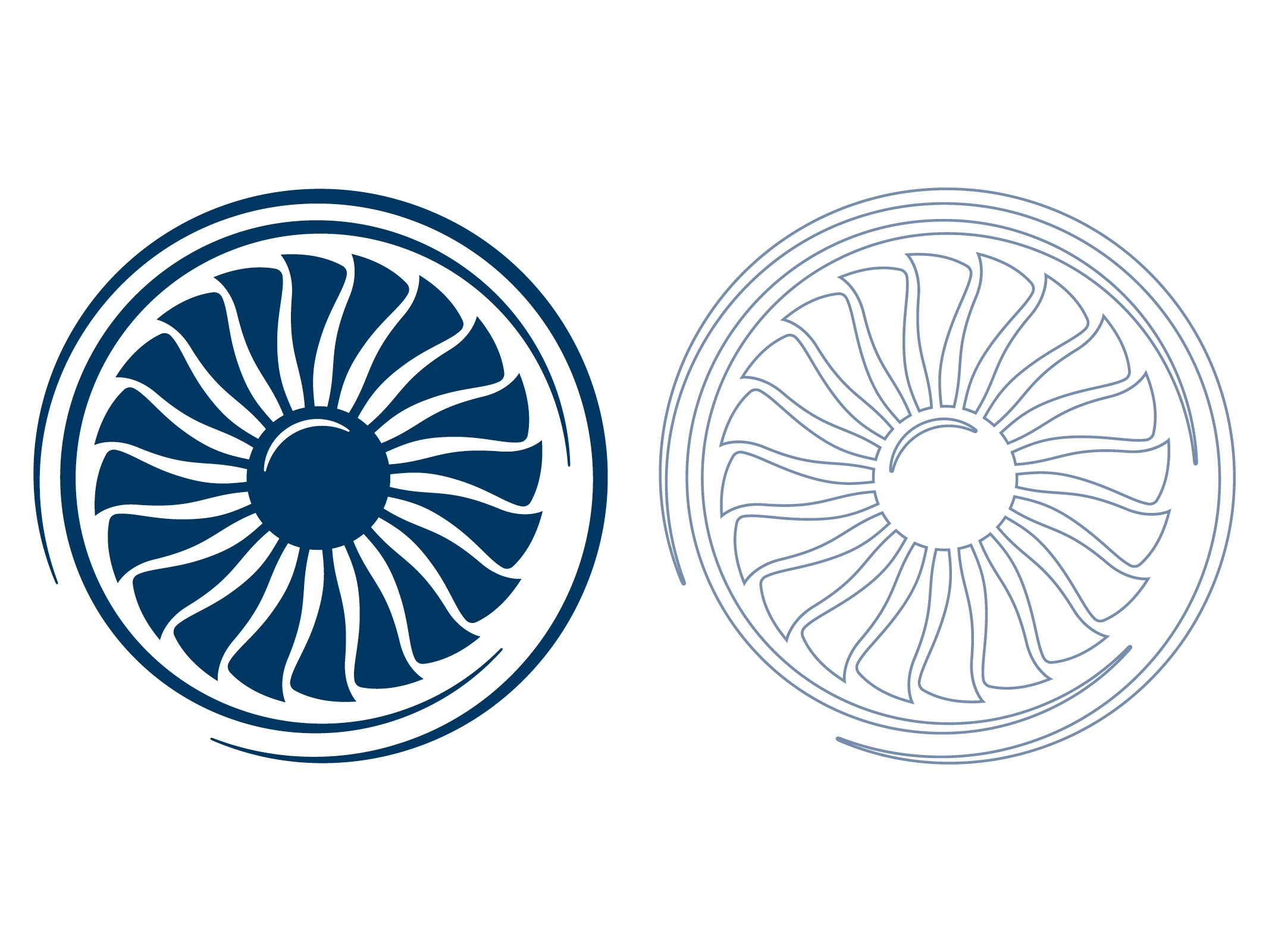
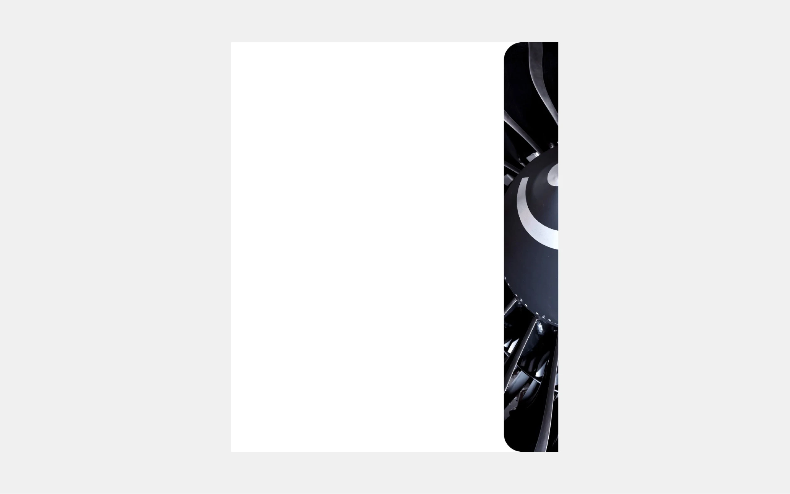
Depiction

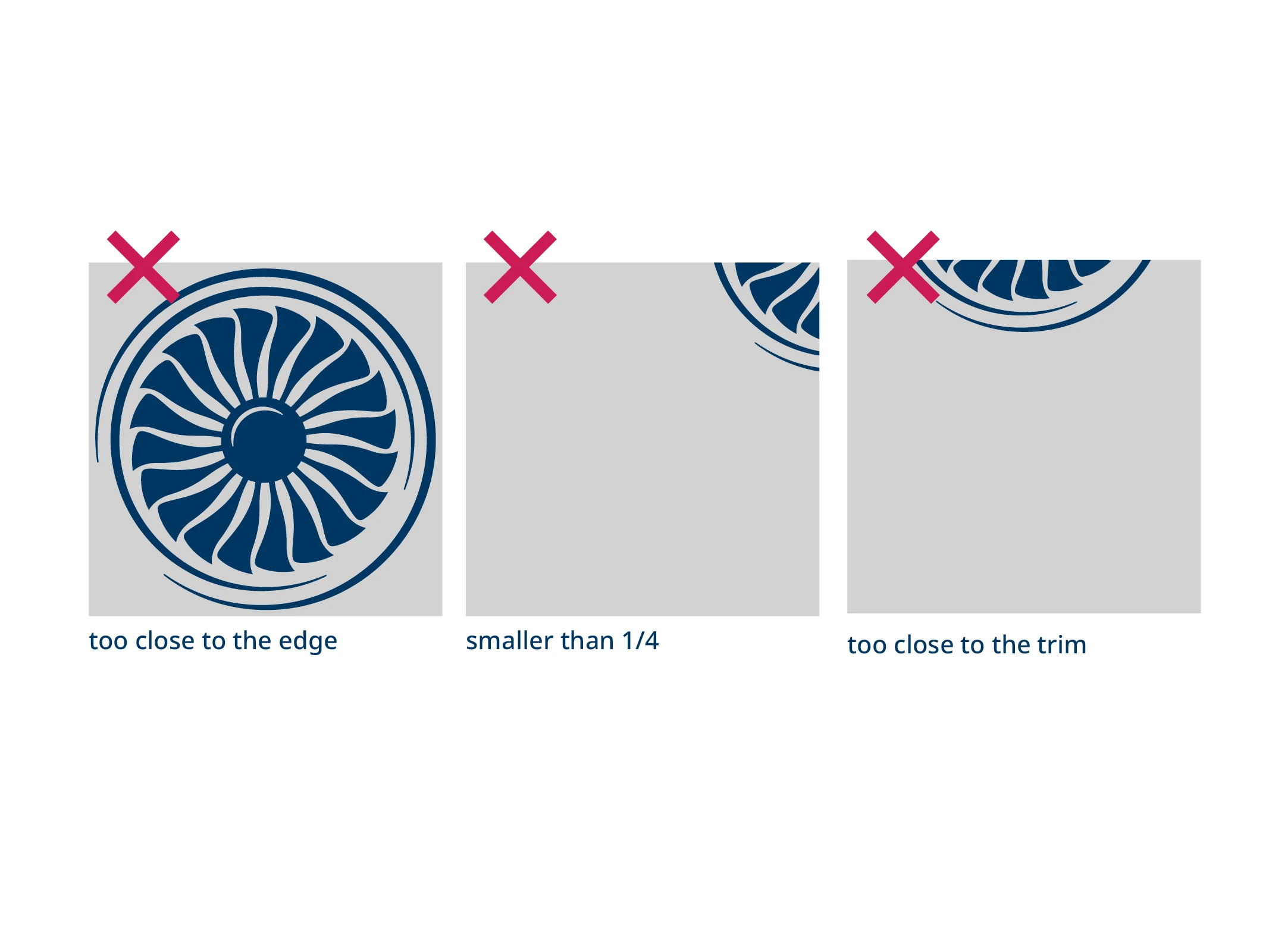
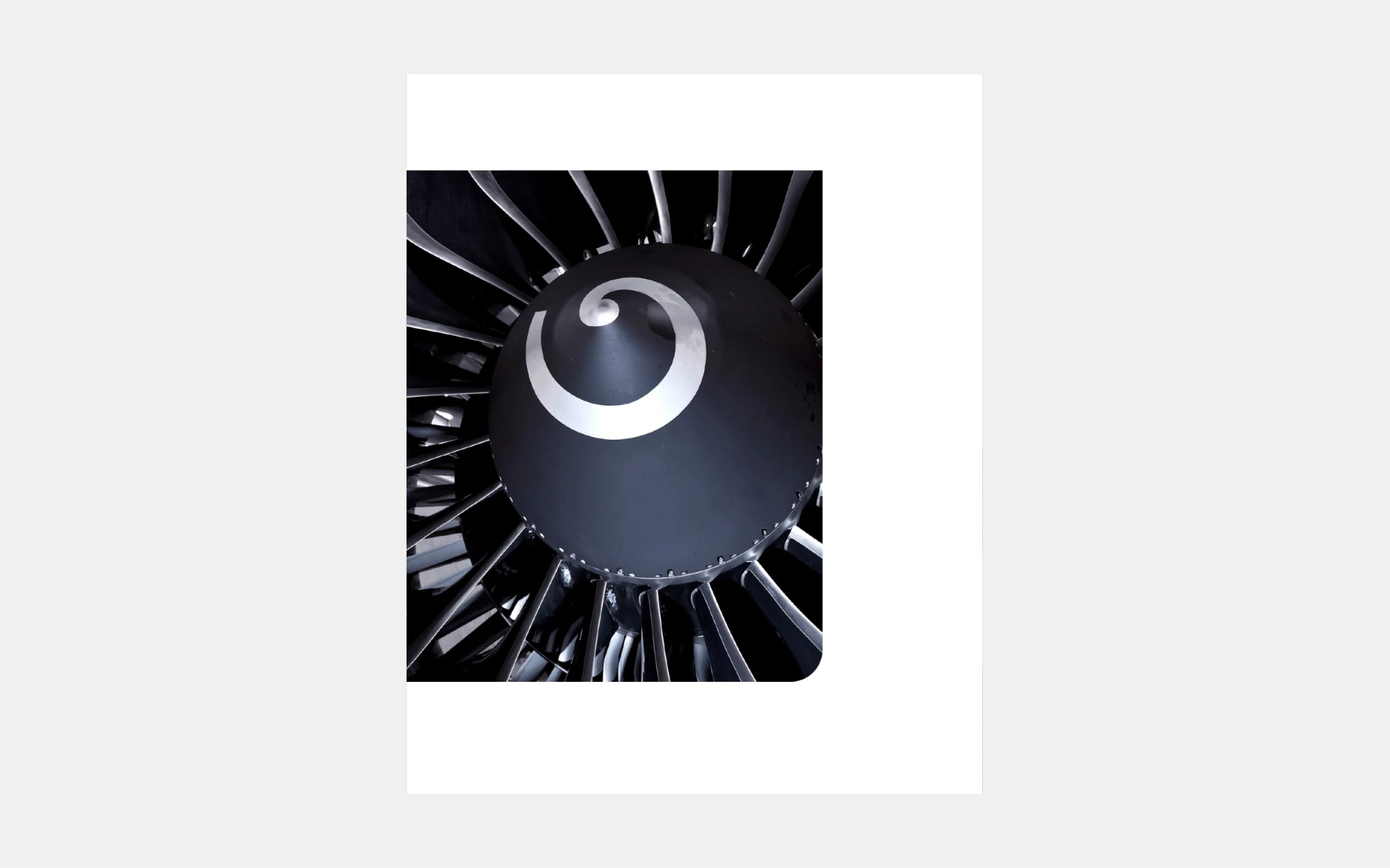
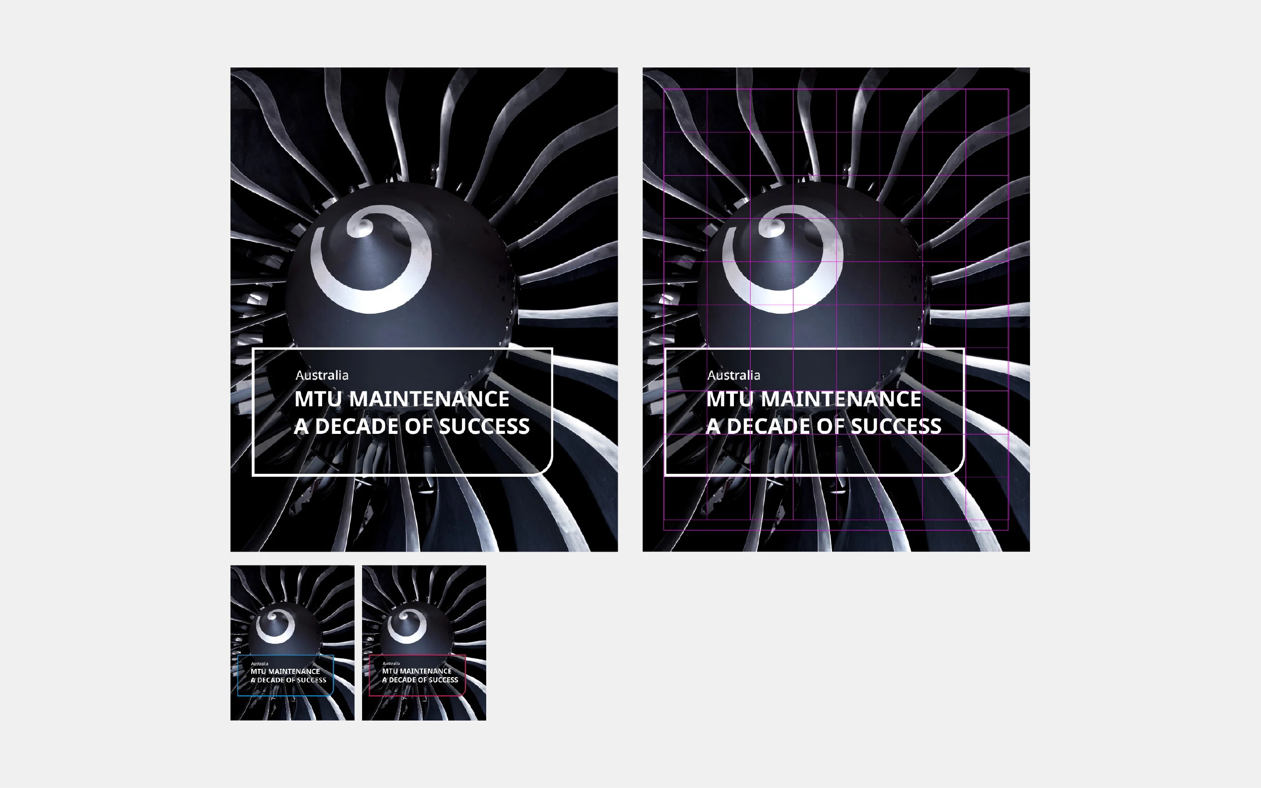
Depiction in full: When the fan is depicted in full, it should be centered and placed in a clear, unobstructed area.

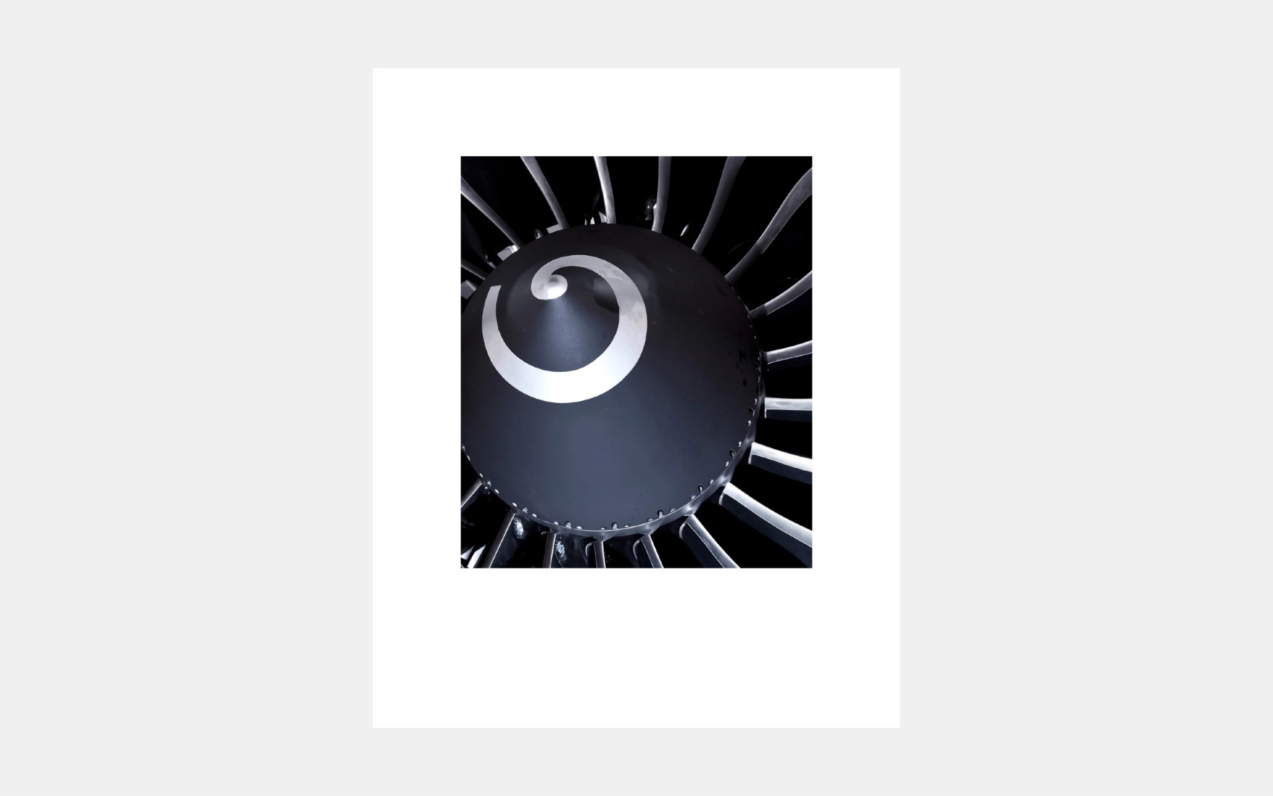
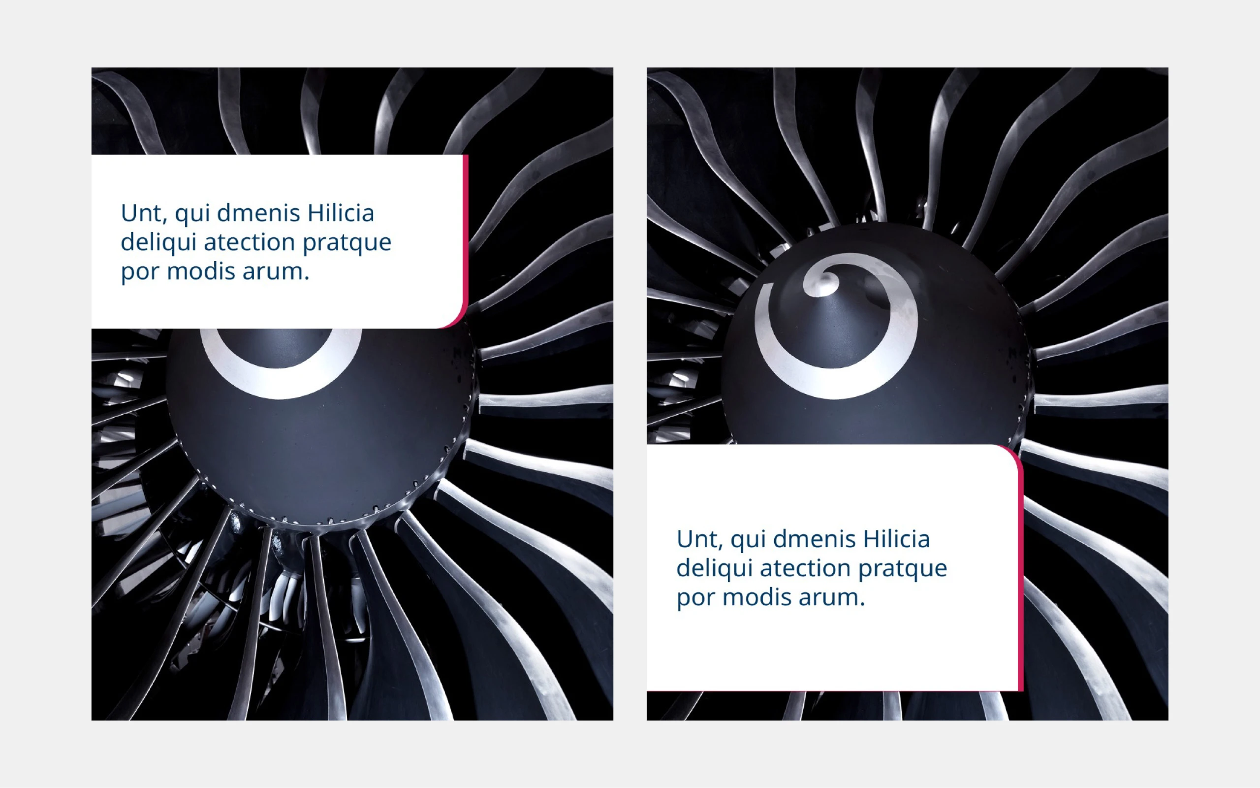
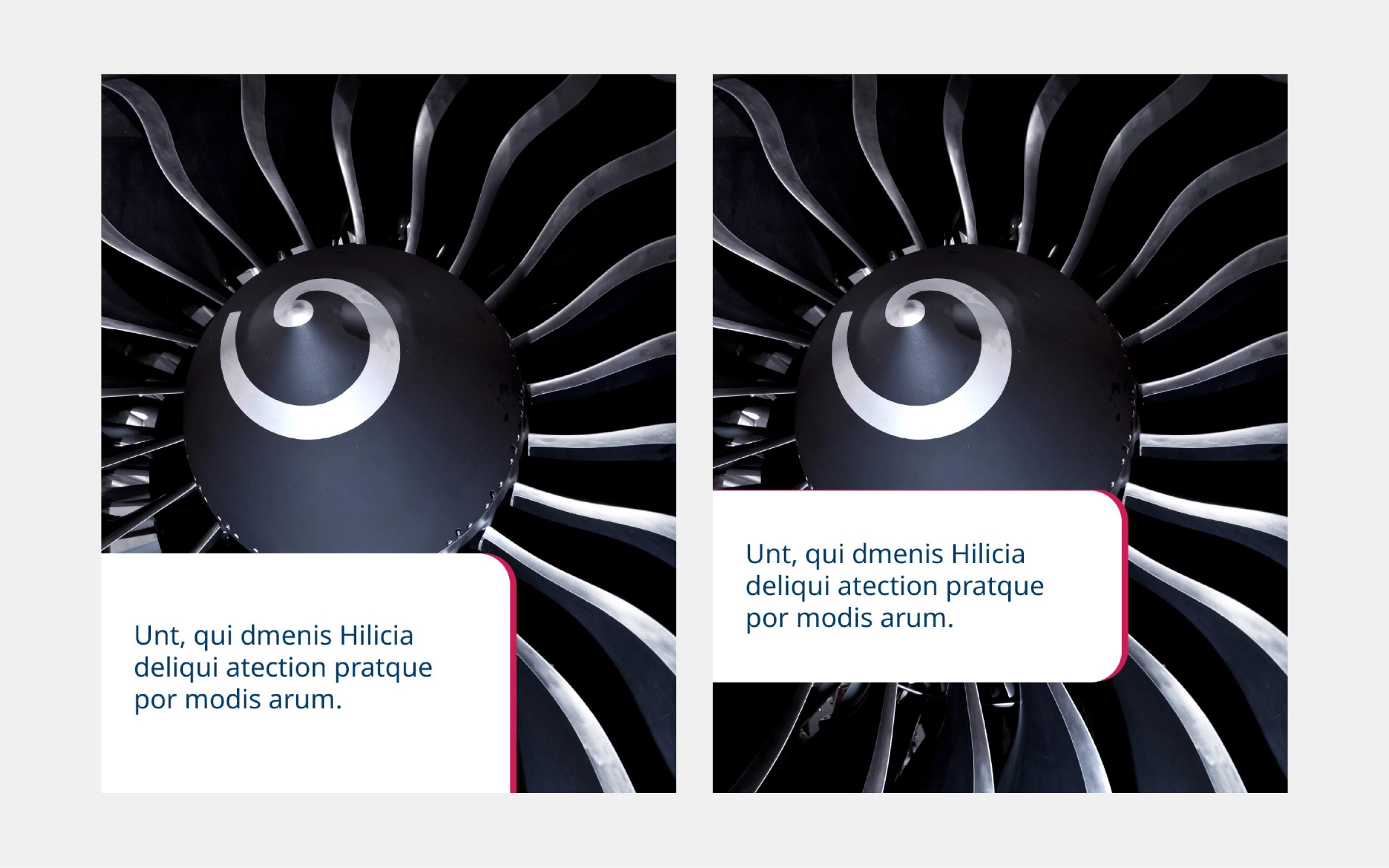
Adjusted depictions: In the case of half- or quarter-cut depictions, care should be taken to ensure that the cuts appear harmonious and not arbitrary.
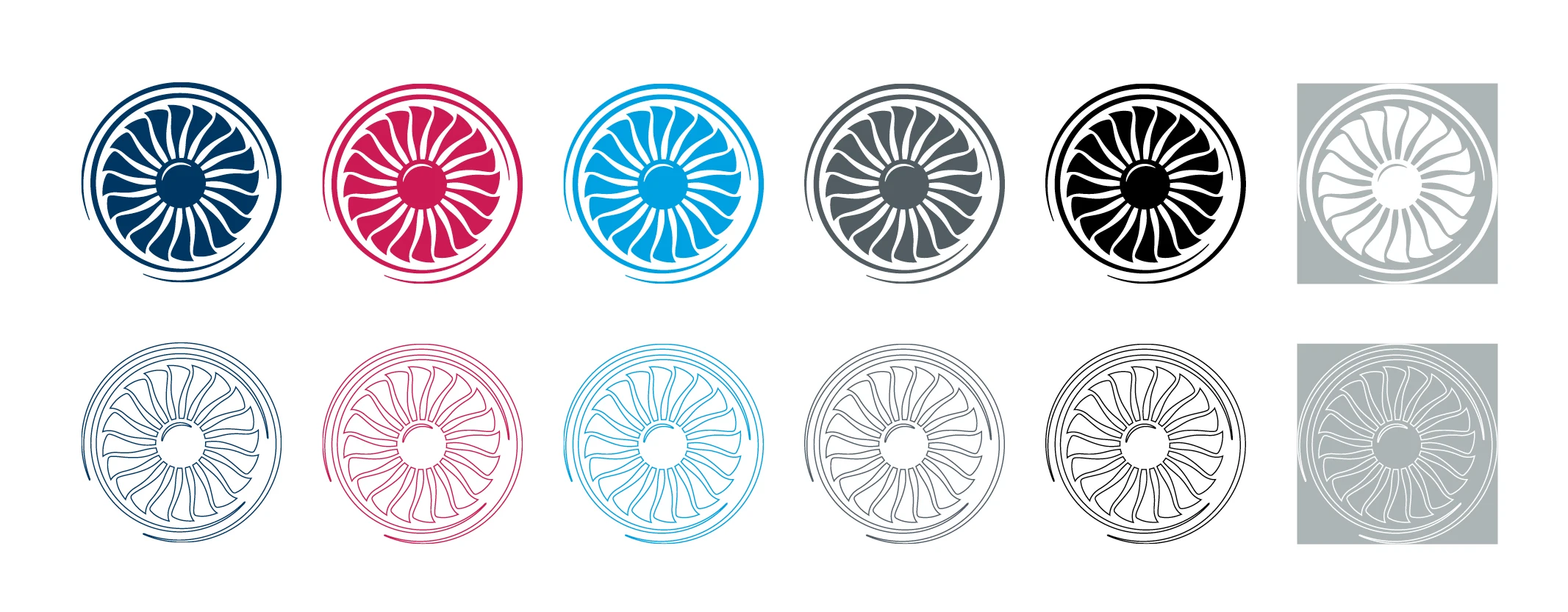
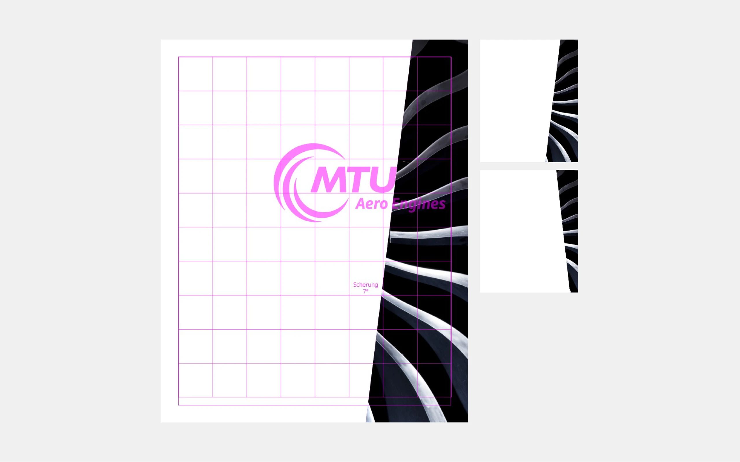
Colors

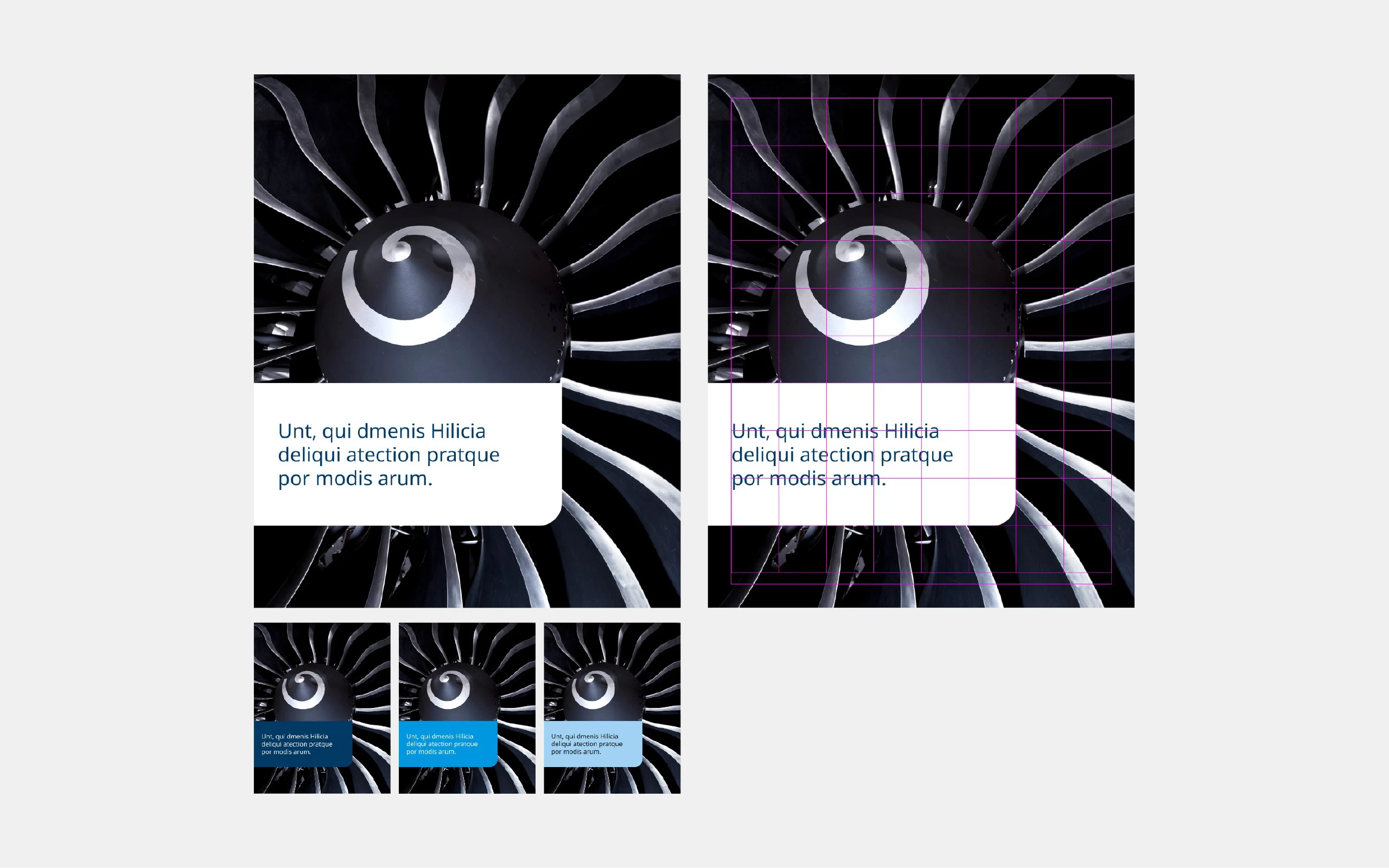
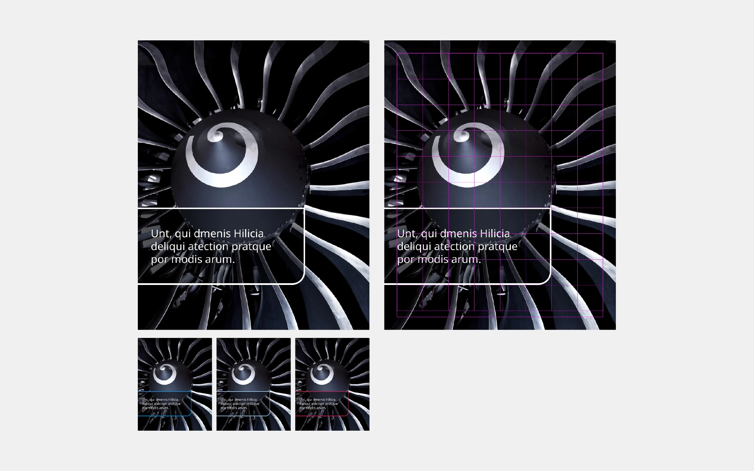
Color palette: The key visual is used only in the primary colors, as well as in white and black.

Contrasts: Make sure that the fan contrasts sufficiently with the background to guarantee its visibility and impact.

Placement

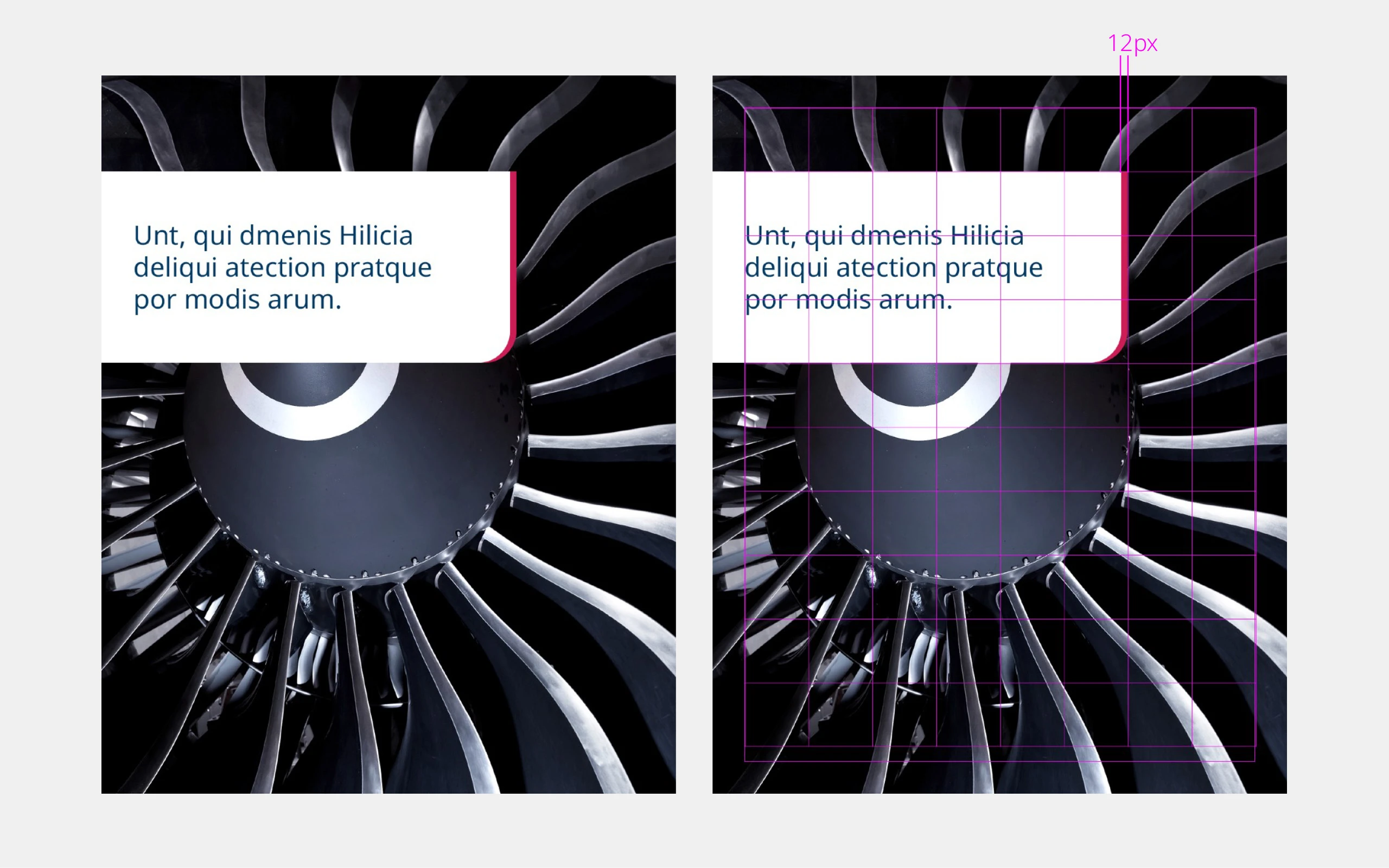
Spacing: Provide enough space between the key visual and other graphic elements and text to ensure its impact.

Orientation: The fan can be placed in different positions (left, right, top, bottom) as long as the overall composition remains harmonious.
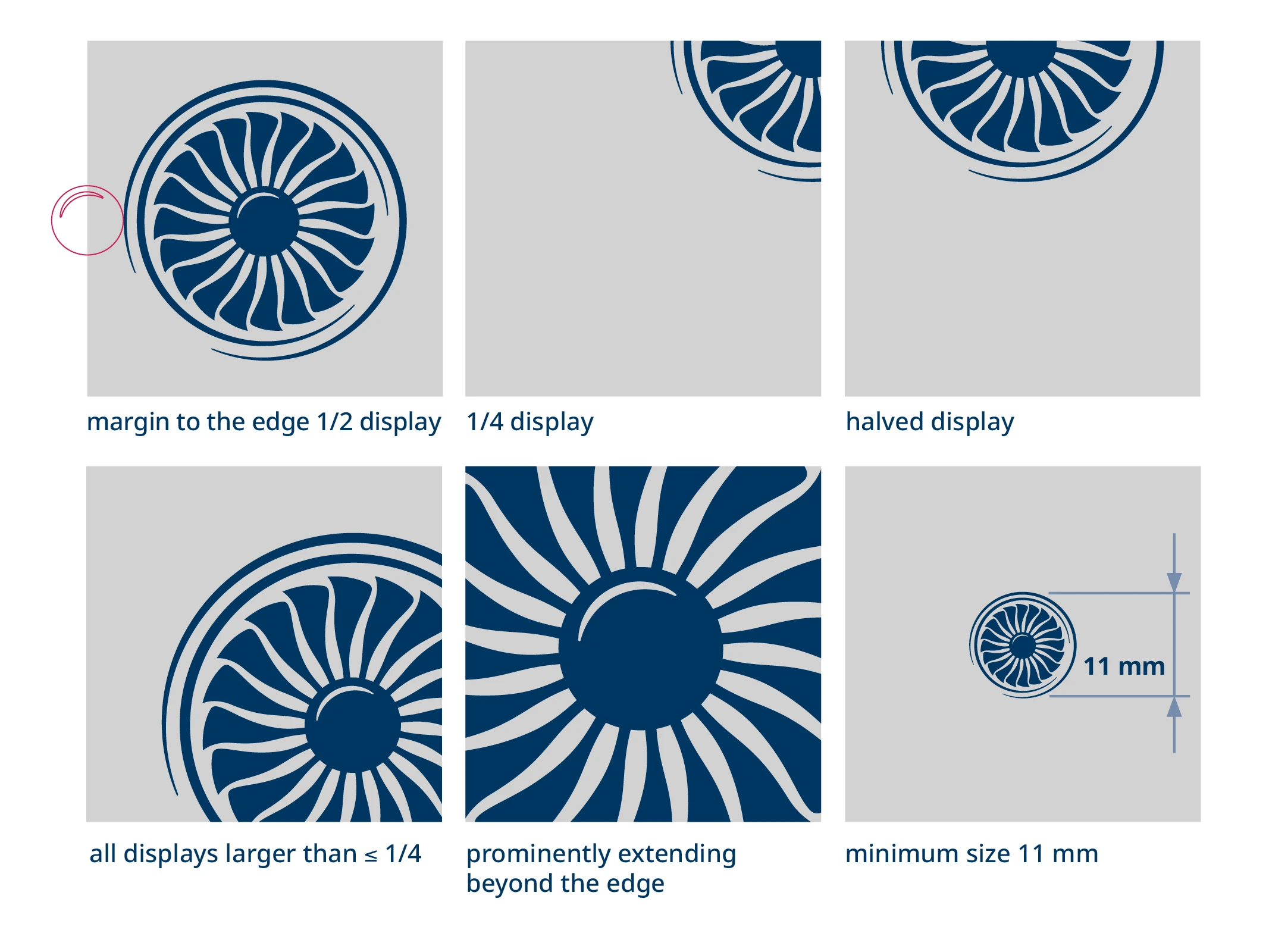
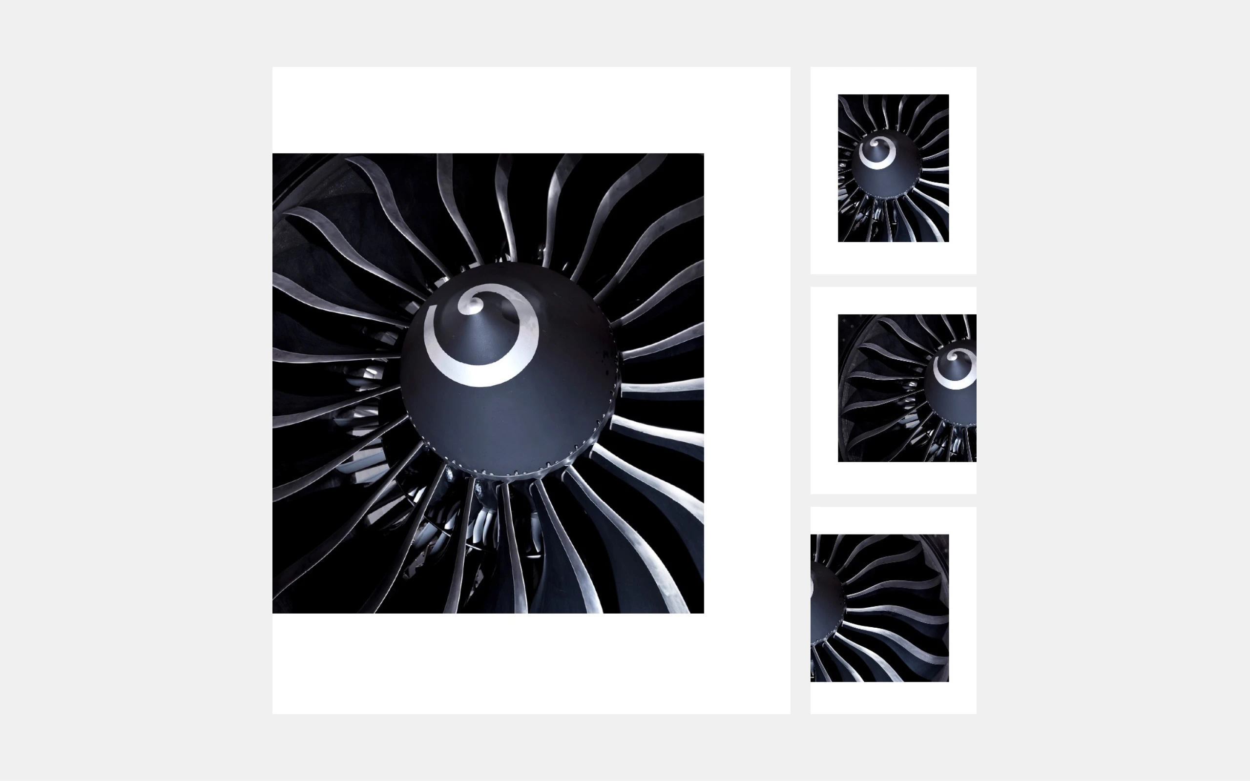
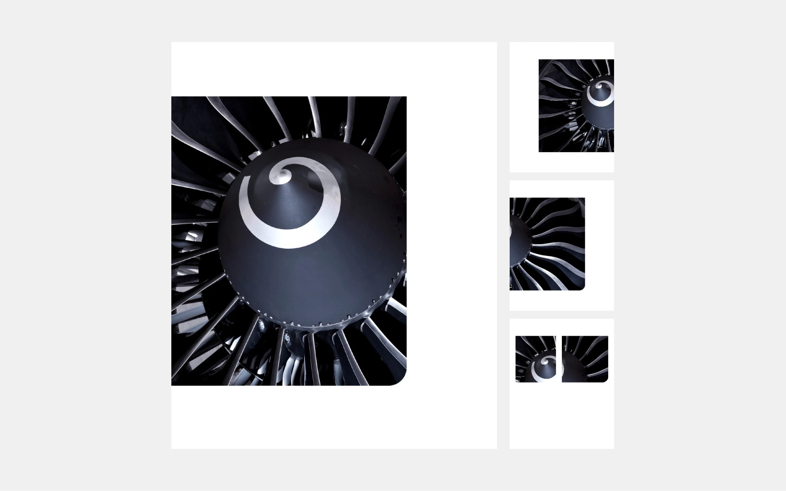
Size

Scaling: The fan can be used in different sizes, but shouldn’t be displayed smaller than a defined minimum size in order to preserve details and recognizable features.

Integration with other elements

Make sure that the fan harmonizes with texts and other graphic elements.

Responsive design

For digital applications, the fan should also look good on different screen sizes and at different resolutions. Test the readability and visibility in different formats.

Claim Passion for Engines

new

The MTU word/design mark

Our word/design mark combines the claim and key visual into a single powerful unit. The “Passion for Engines” makes the passion of our employees visible—their motivation to set standards with precision, innovative strength, and a focus on the future. The stylized turbine reinforces this message by visually representing energy, dynamism, and driving force. But it’s when the two components work together that they achieve their full effect: The words and the image merge into a strong expression of our identity and give our brand recognizability and depth.

Thanks to its clear design, the word/design mark can be used flexibly—on websites, social media, in print products, presentations, for trade fair graphics, or as an animated element—and thus ensures a consistent, recognizable brand presence across all formats.

Rules for using the claim

Presentation: The claim is always used in full in the variants provided. Color adjustments/changes are not permitted.

Contrasts: Make sure that the claim contrasts sufficiently with the background to guarantee its visibility and impact.

Placement

Spacing: Provide enough space between the claim and other graphic elements and text to ensure its legibility and impact.

Combination with the MTU logo: The claim may be placed at a sufficient distance from the MTU logo or in a line with the MTU logo at the bottom of the page. The claim must not be larger than the MTU logo.

New image accent element – image framing (analog media)

new

The MTU berry image frame, which has the appearance of a bracket, is a fresh graphic element that visually emphasizes selected images. The bracket is used on a text/image page and acts as an open frame.

The following must be observed when placing the bracket:

  • Cover: Below the image
  • Inside pages: Right or left toward the spine or below the image (it must fit harmoniously into the overall layout
    This image frame is not used together with full-area images that take up an entire page.

Design specifications:

  • Color: MTU berry (defined primary shade)
  • Line thickness: This is based on the height of the baseline grid -> 6 pt
  • Distance to the edge of the image: Flush with the edge of the image, whereby the corners of the image are then rounded
  • Length of the line: Corresponds to the complete edge of the image on the selected page
  • Use: Selectively and sparingly to achieve a clear visual effect