Typography

The MTU corporate typeface
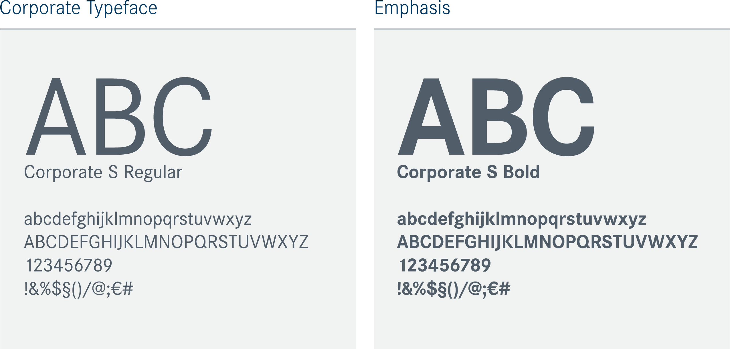
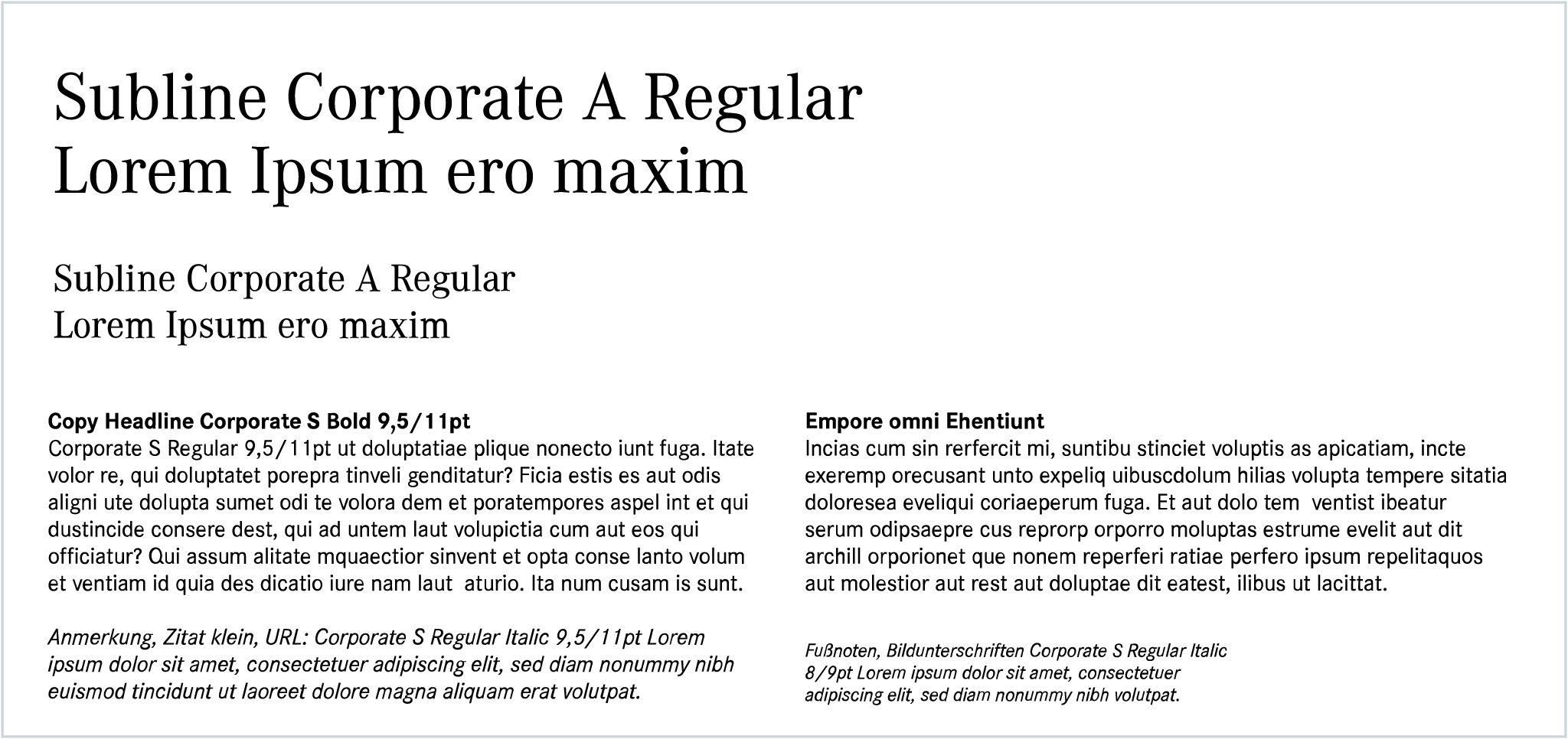
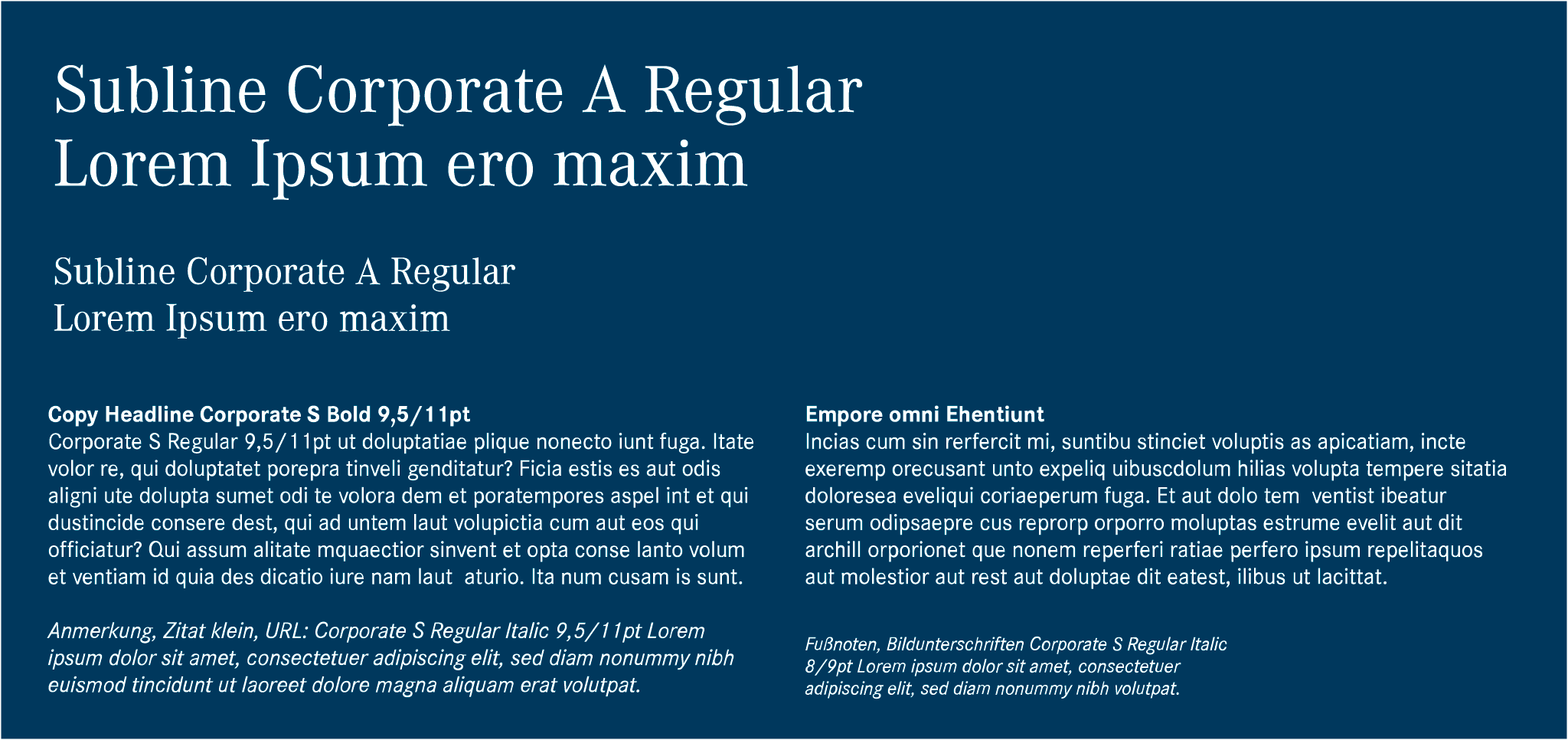
Corporate S Regular

The Corporate S Regular sans serif corporate typeface has become an important part of the company’s long tradition. It fits seamlessly into MTU’s corporate design and has become a defining feature and a sign of belonging.

Corporate S Bold

Corporate S Bold’s strong lines make it suitable for emphasis.
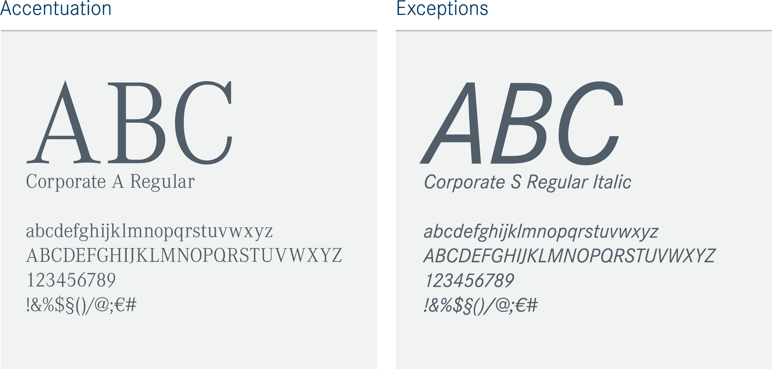
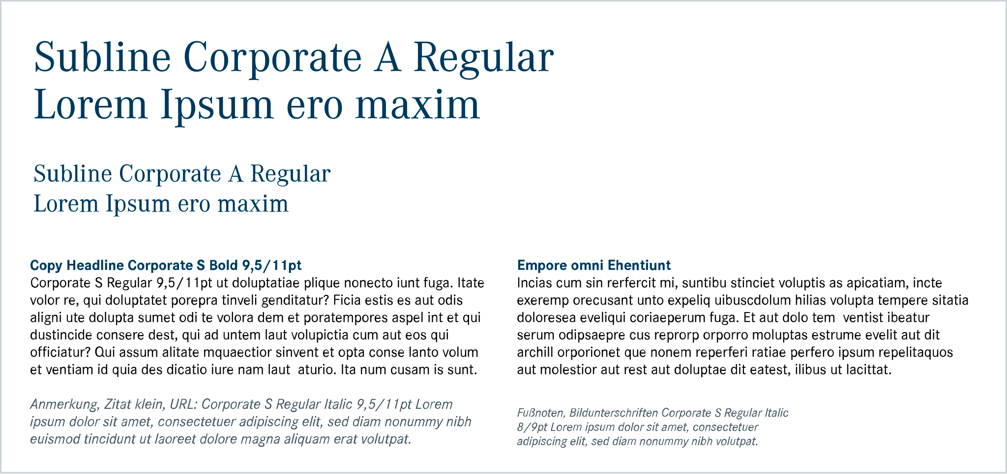
Corporate A Regular

Alternatively, the Antiqua variant (Corporate A Regular) can also be used for accentuation, especially in headlines and quotations. However, it is for use only in print and may not be used for copy text.

Corporate S Regular Italic

The third option for emphasis is to use Corporate S Regular Italic. However, this must be used with discretion so as not to disturb the overall picture. Examples of suitable use cases are footnotes or captions.
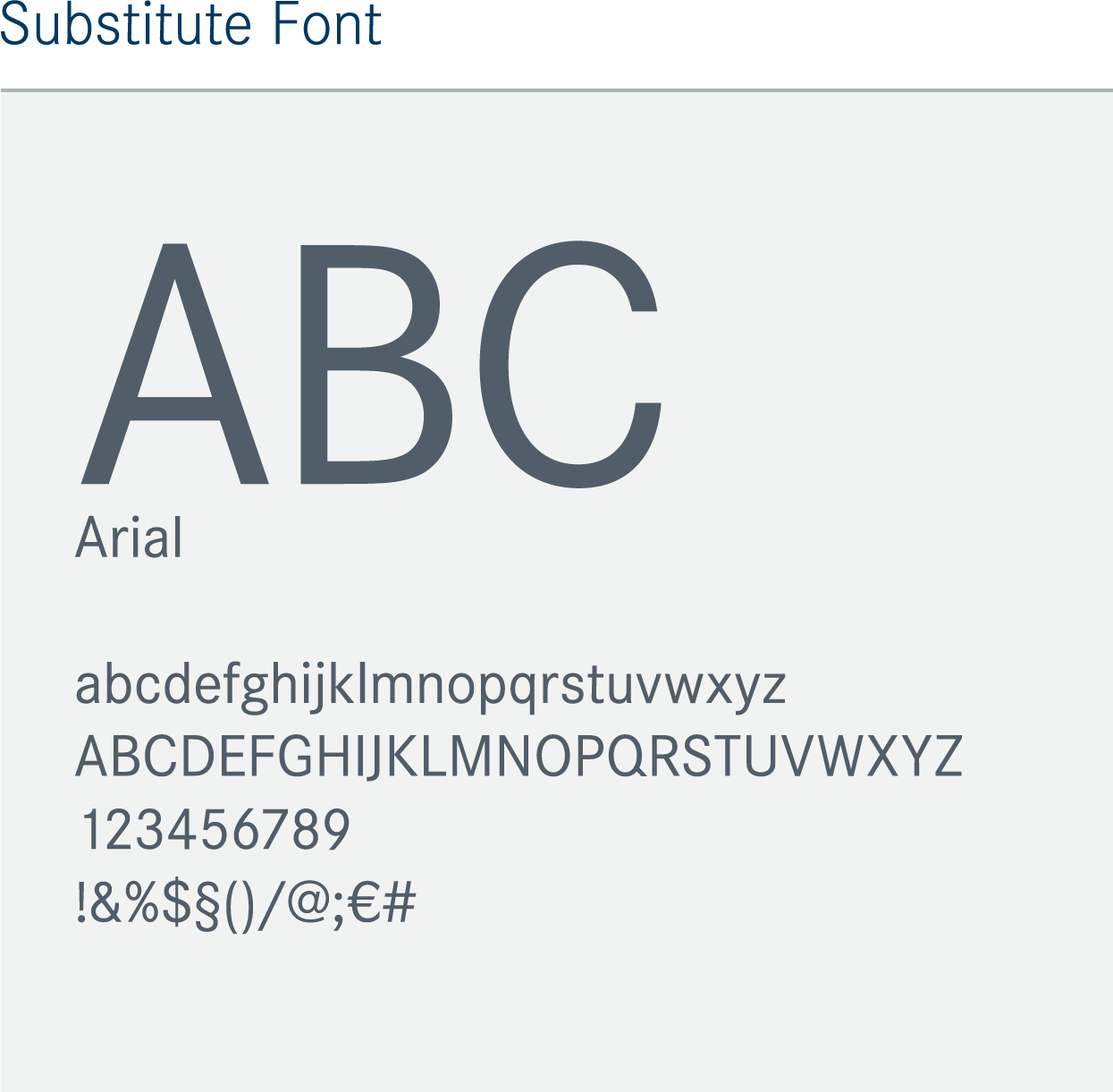
Substitute font

The substitute font Arial may be used only where it is not possible to use the corporate typeface, e.g. in Word templates.

Information: Font license

Corporate is a licensed and copyright protected font set from URW Type Foundry, and for this reason cannot be made available for download. Corporate’s typefaces, for example, are available individually or in font set packages from www.fontshop.de.

Corporate S and A are also available within the Adobe Creative Cloud license as a standard font set and in the Pro version as an enhanced font set.

https://fonts.adobe.com/fonts/corporate-s
https://fonts.adobe.com/fonts/corporate-a

Formatting

Text hierarchies

Clear text hierarchies deliver a compelling overall image and facilitate typographic design. They ensure that the formatting is thoroughly regimented, from the title to the body text. The following paragraphs provide more detail.

Where sizes are not explicitly specified, the design examples shown here serve as a guide for the size ratio of hierarchy levels to each other.

Font elements

Headlines

For headlines, you can choose between Corporate S Bold and Corporate A Regular. However, the following applies: in cases where Corporate S Regular does not dominate the overall impression, for example because the copy text is short, the Corporate A Regular should not be used. This ensures that the corporate typeface remains the visual core of the communication.

Sublines / Subtitles

Sublines align with the choice of typeface for the respective headline.

Copyheaders

Using Corporate S Bold in dark blue makes the copy header stand out from the copy text. It must have the same font size as the copy text.

Copytext

Use of the Corporate S Regular corporate typeface characterizes the copy text’s entire appearance.

Footnotes / Notes

Footnotes and notes can alternatively be set in Corporate S Italic to distinguish them from the copy text.

Information: Font elements

  • In individual cases, justified deviations are possible. Special agreement must be sought in advance from MTU Marketing Communications.
    In all cases, the top priority should be to preserve MTU’s familiar appearance.
  • More details about typefaces, sizes and colors are provided in the individual measures.
  • The design guidelines for digital media are provided in a separate section, as the design requirements for digital communications differ fundamentally from those in print.

For more information see → digital media.

Font colors

Headlines

The preference for headlines is to use MTU dark blue on a white background. Alternatively, the copy text colors, black or MTU gray 5 are also available. If a dark background is used, a white typeface is preferred. This retains MTU’s clear and high-contrast appearance.

Sublines / Subtitles

Just as with the choice of typeface, the choice of color for the subline also aligns with the headline.

Copy headers

For copy headers, you can choose between MTU dark blue or the copy text color.

Copy text

Black is the preferred color for copy text. MTU gray 5 serves as an alternative, provided its reproduction is technically possible.

Enumerations

The color for bullet points can align with the headline or the copy text.

Footnotes / Notes

Footnotes and notes are to be kept in contrasting black. As with copy text, MTU gray 5 serves as an alternative, provided its reproduction is technically possible.

Information: Font colors

  • In individual cases, justified deviations are possible. Special agreement must be sought in advance from MTU Marketing Communications. In all cases, the top priority should be to preserve MTU’s familiar appearance.
  • More details about typefaces, sizes and colors are provided in the individual measures.
  • The design guidelines for digital media are provided in a separate section, as the design requirements for digital communications differ fundamentally from those in print.

For more information see → digital media.