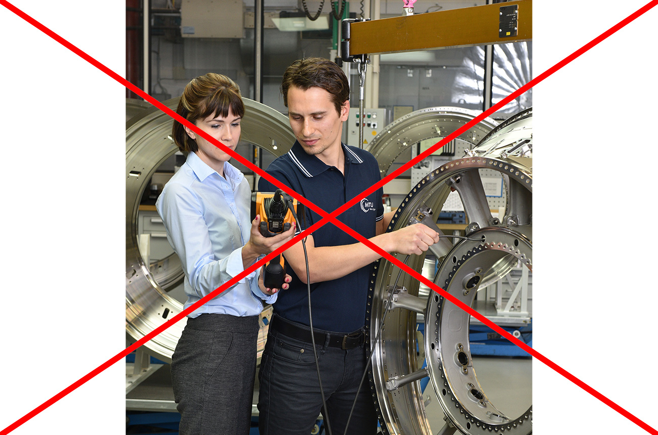
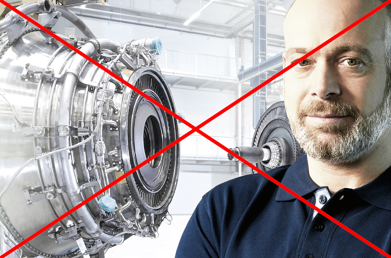
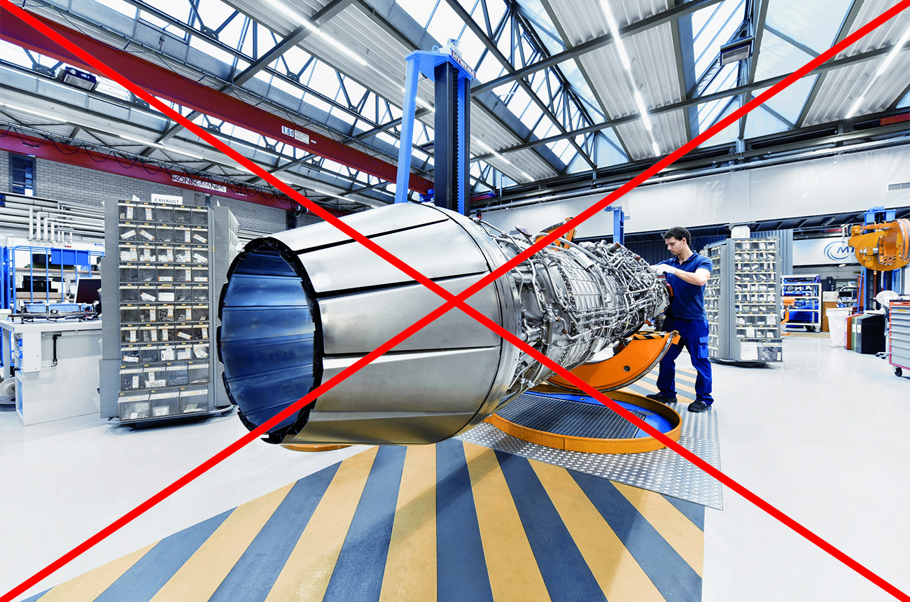
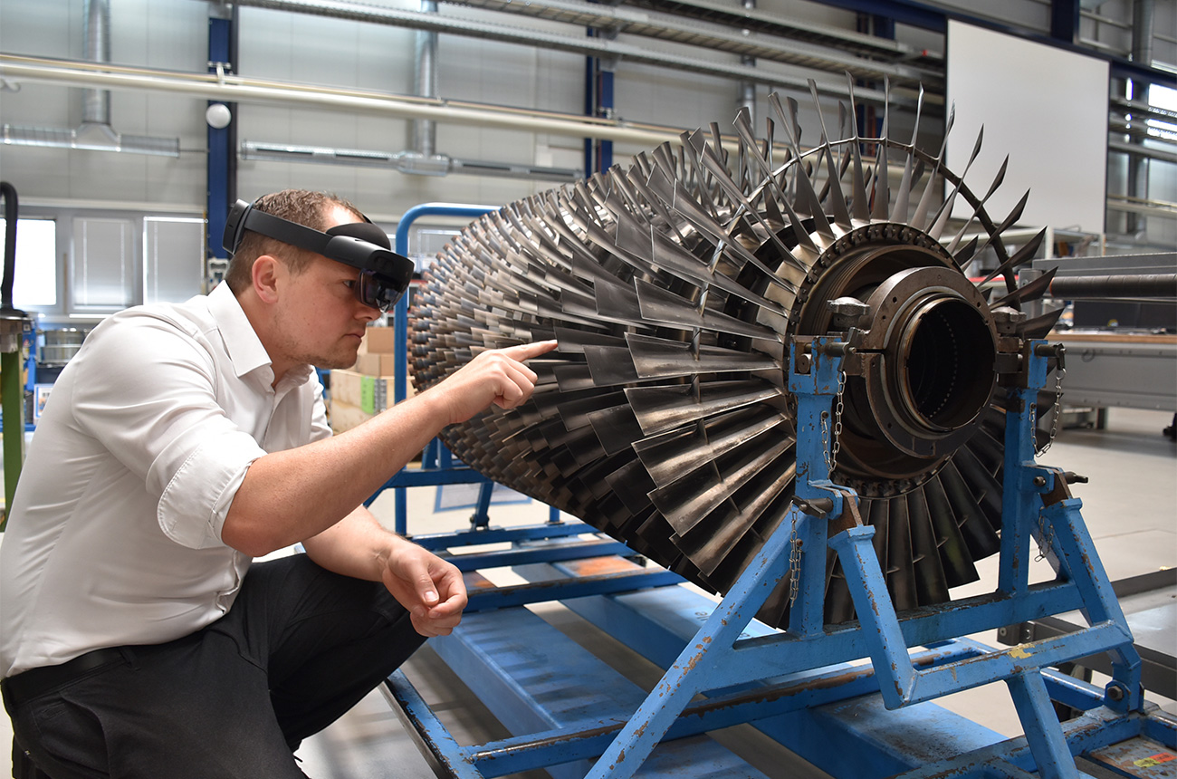
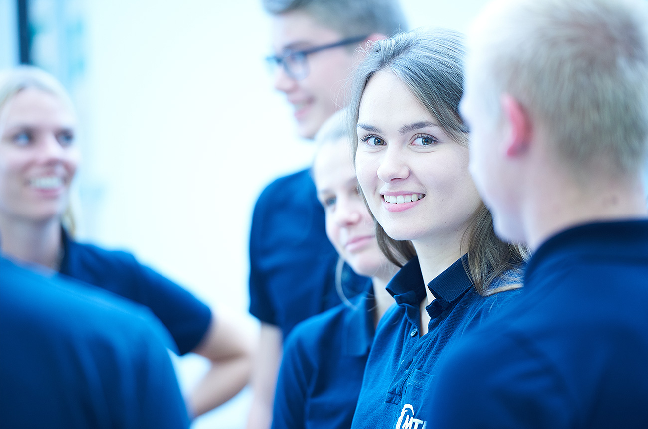
DON’T
The background is very busy, so the image becomes unnecessarily complex and impossible to grasp at a glance.
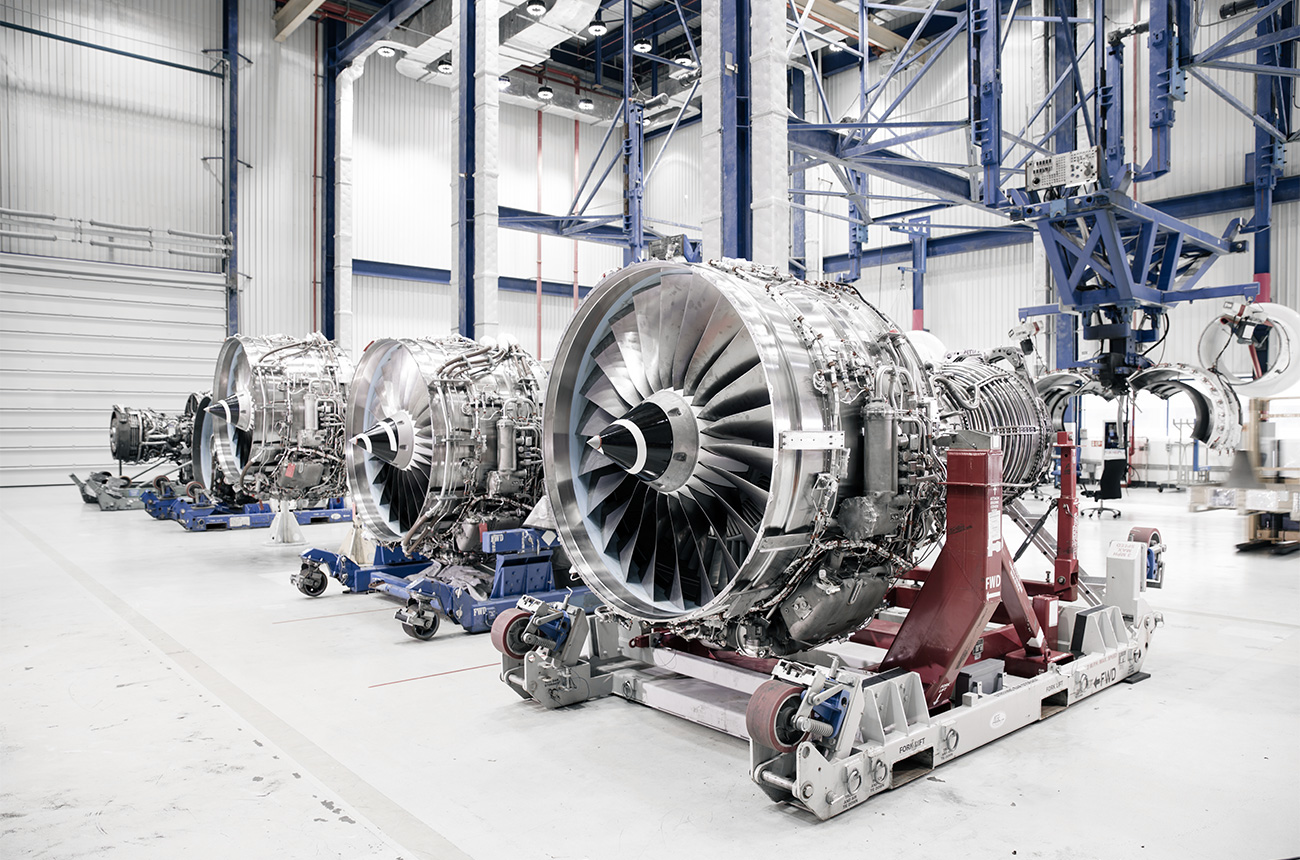
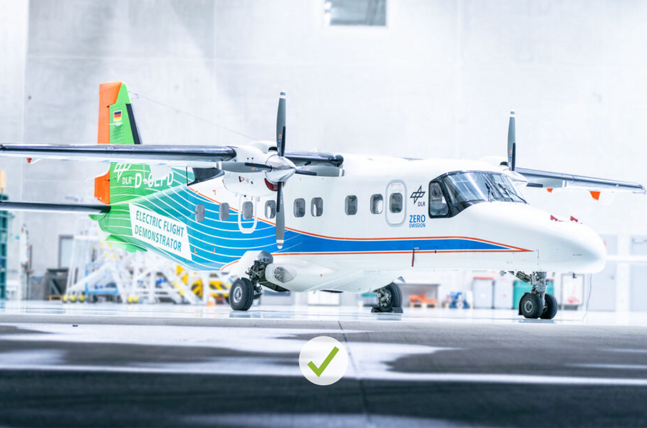
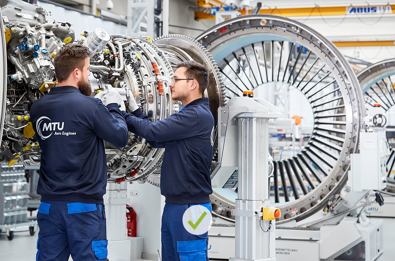
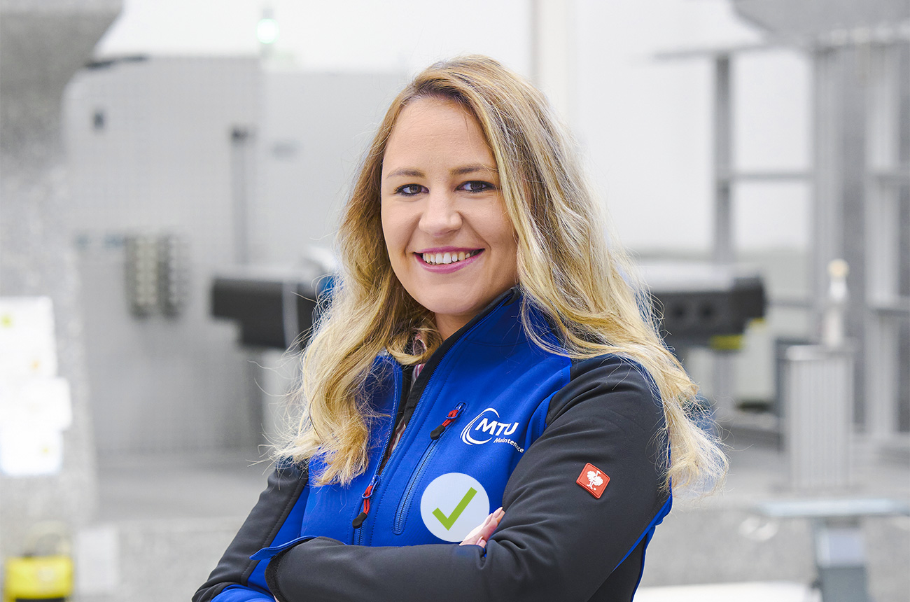
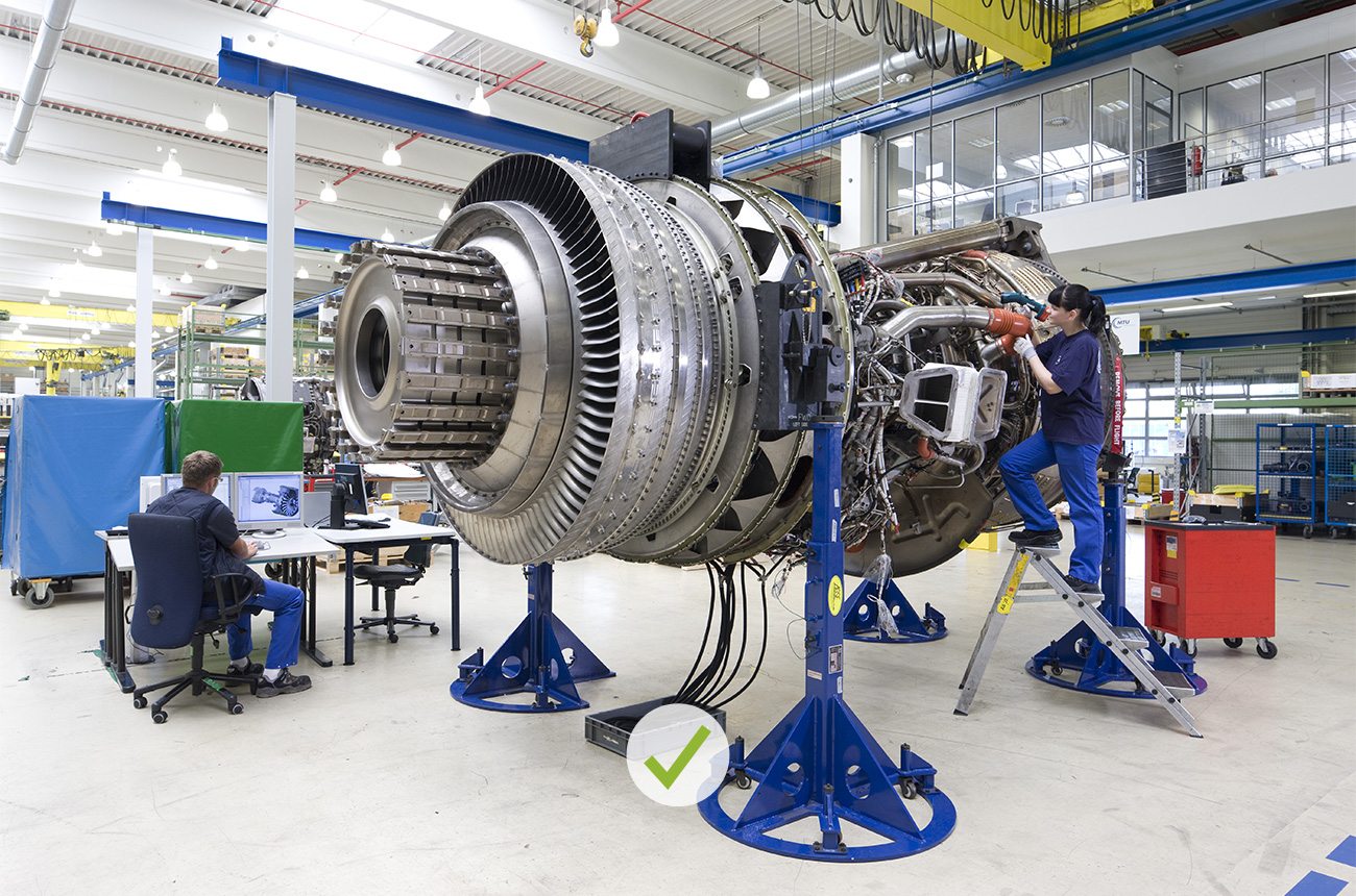
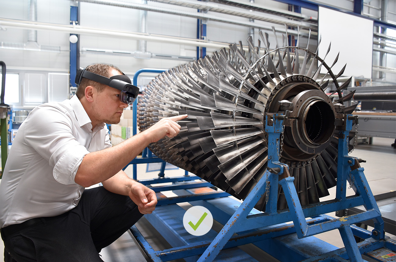
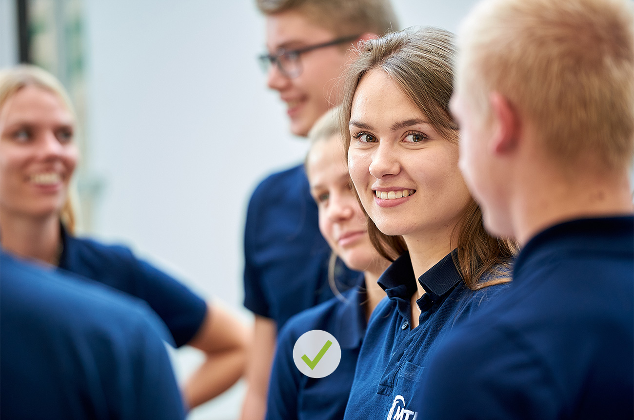
DO
Image easy to grasp, clear visuals, calm atmosphere.
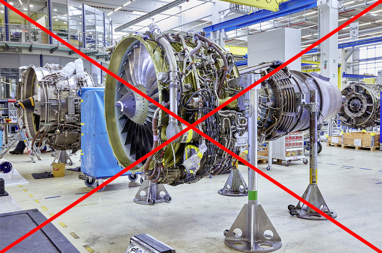
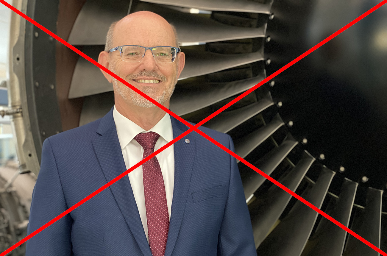
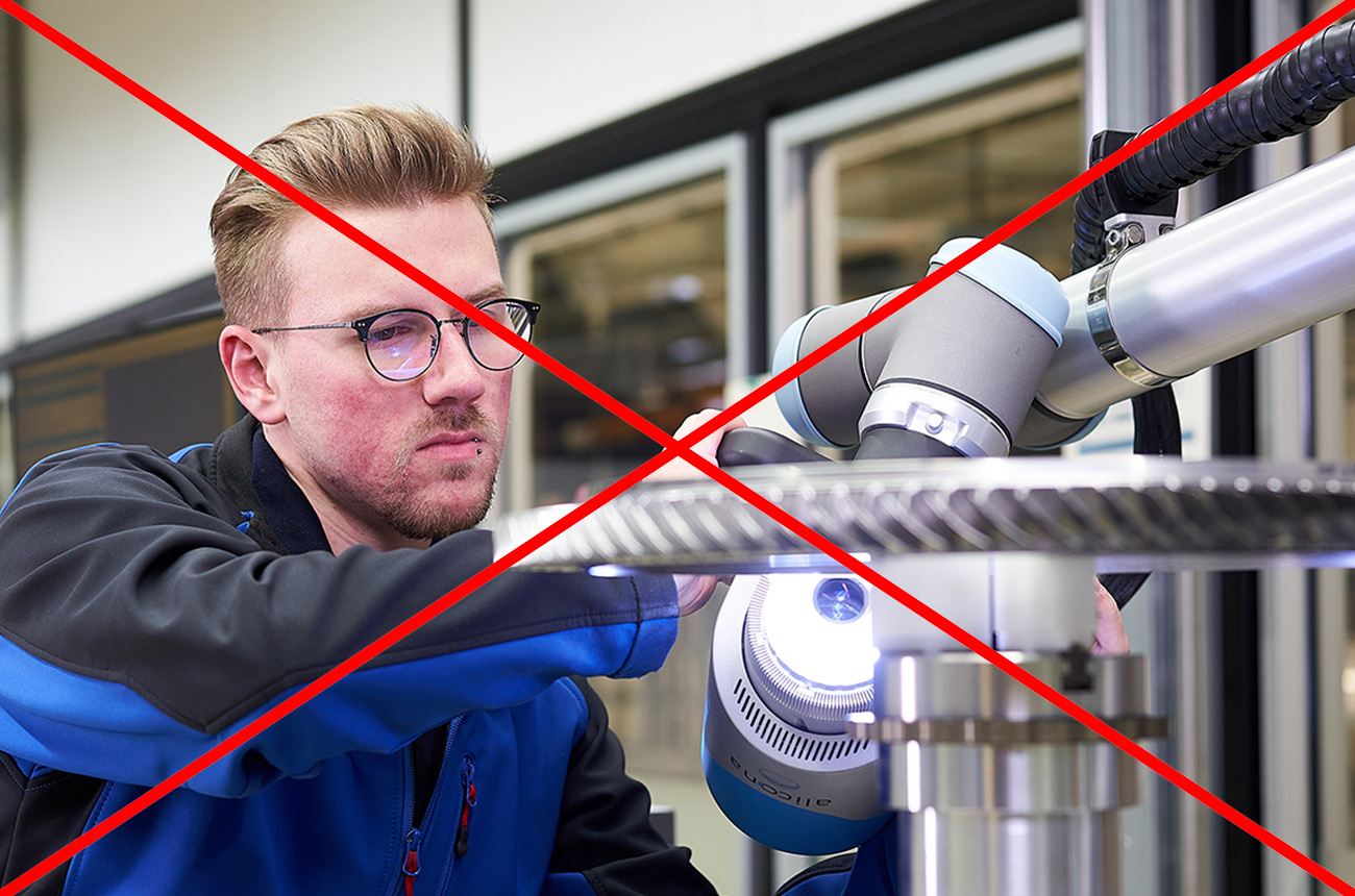
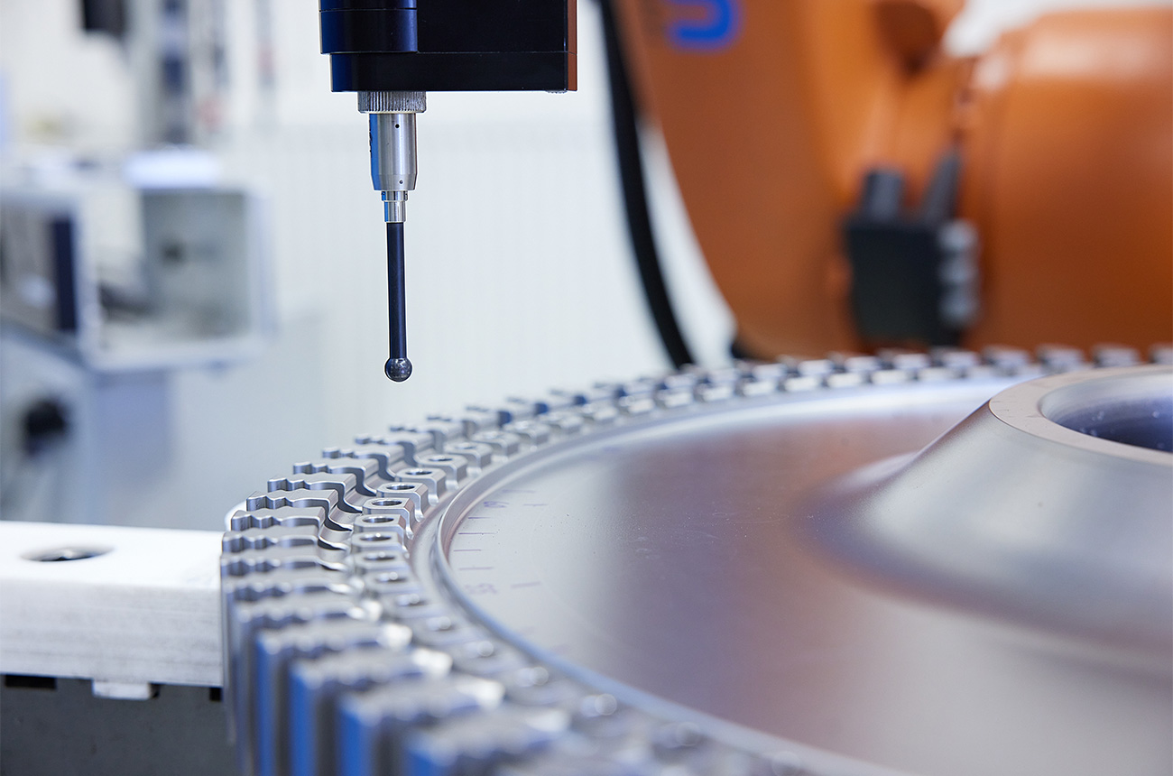
DON’T
The subject disappears into the background; no separation through brightness, sharpness or composition.
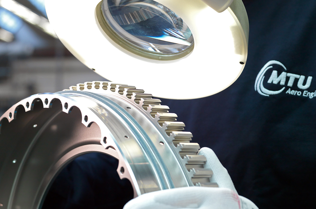
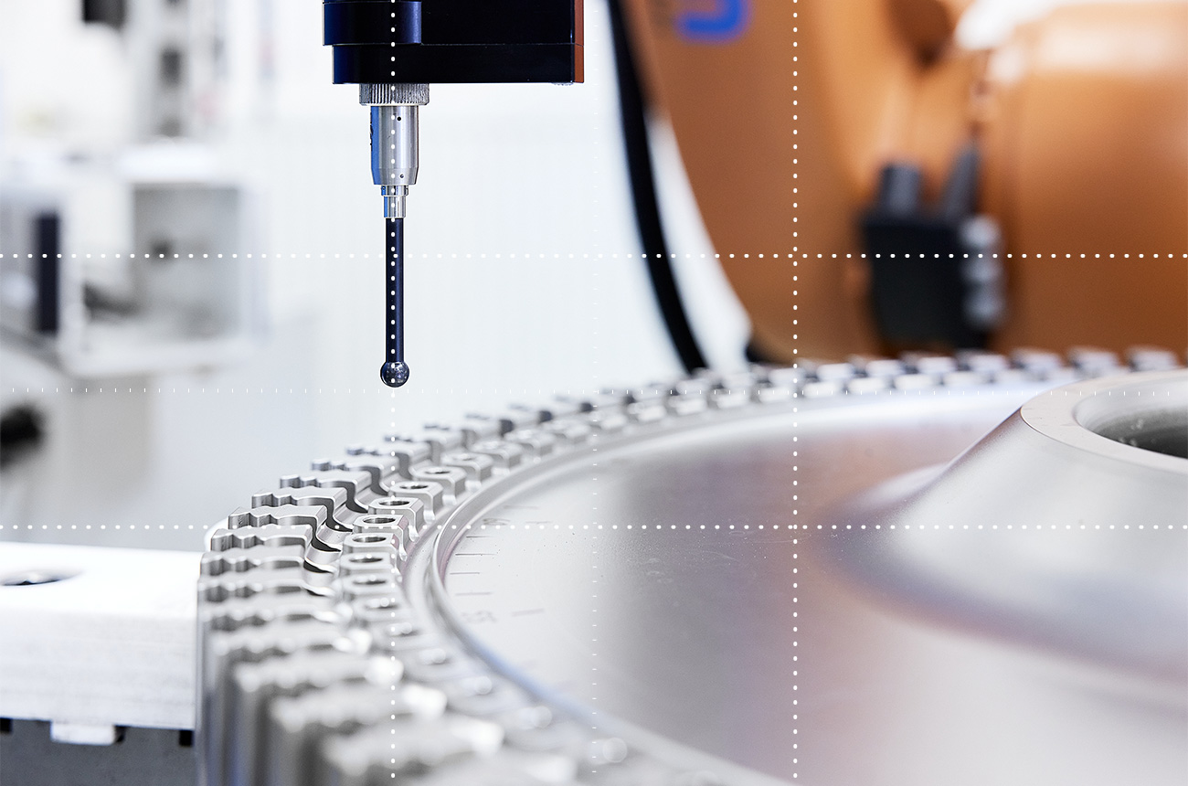
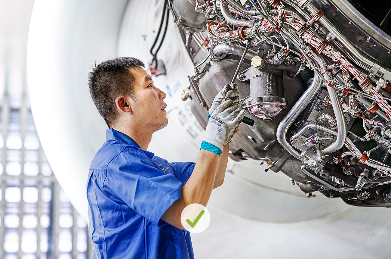
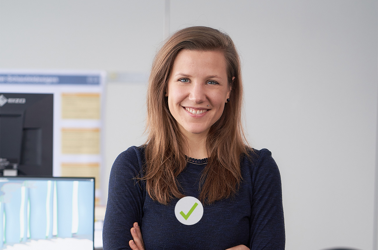
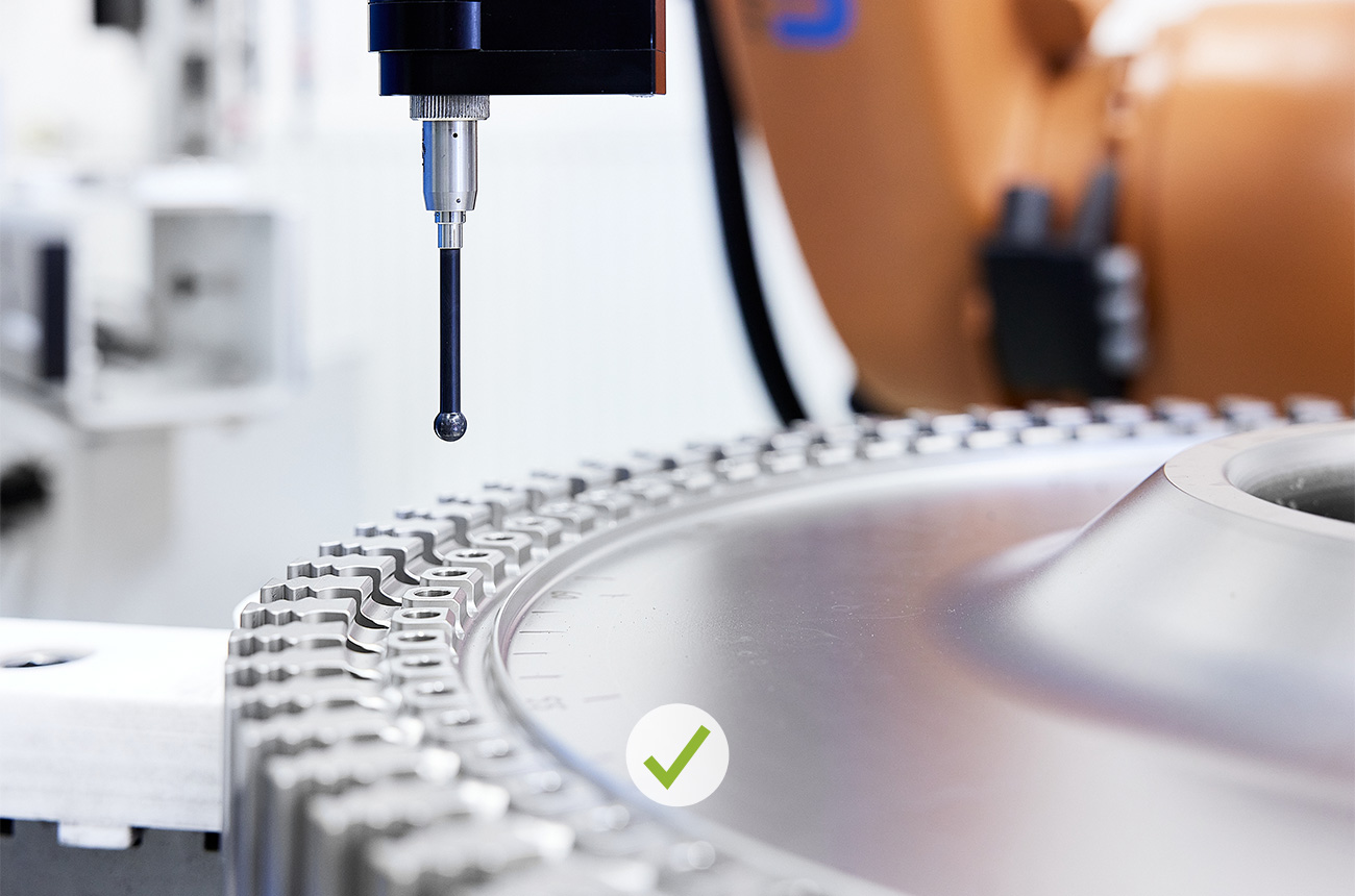
DO
Background blurred, contrast reduced. Good separation, elegant look.
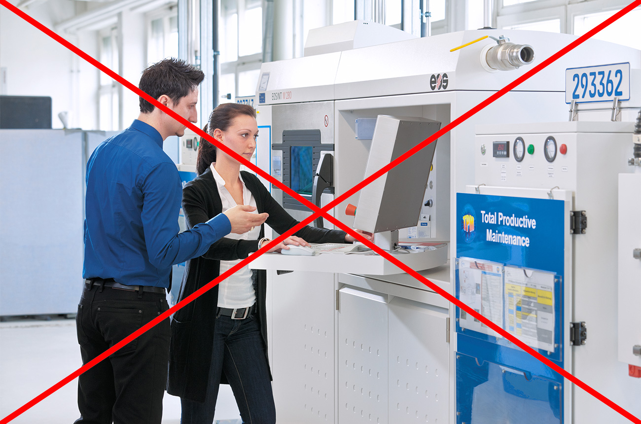
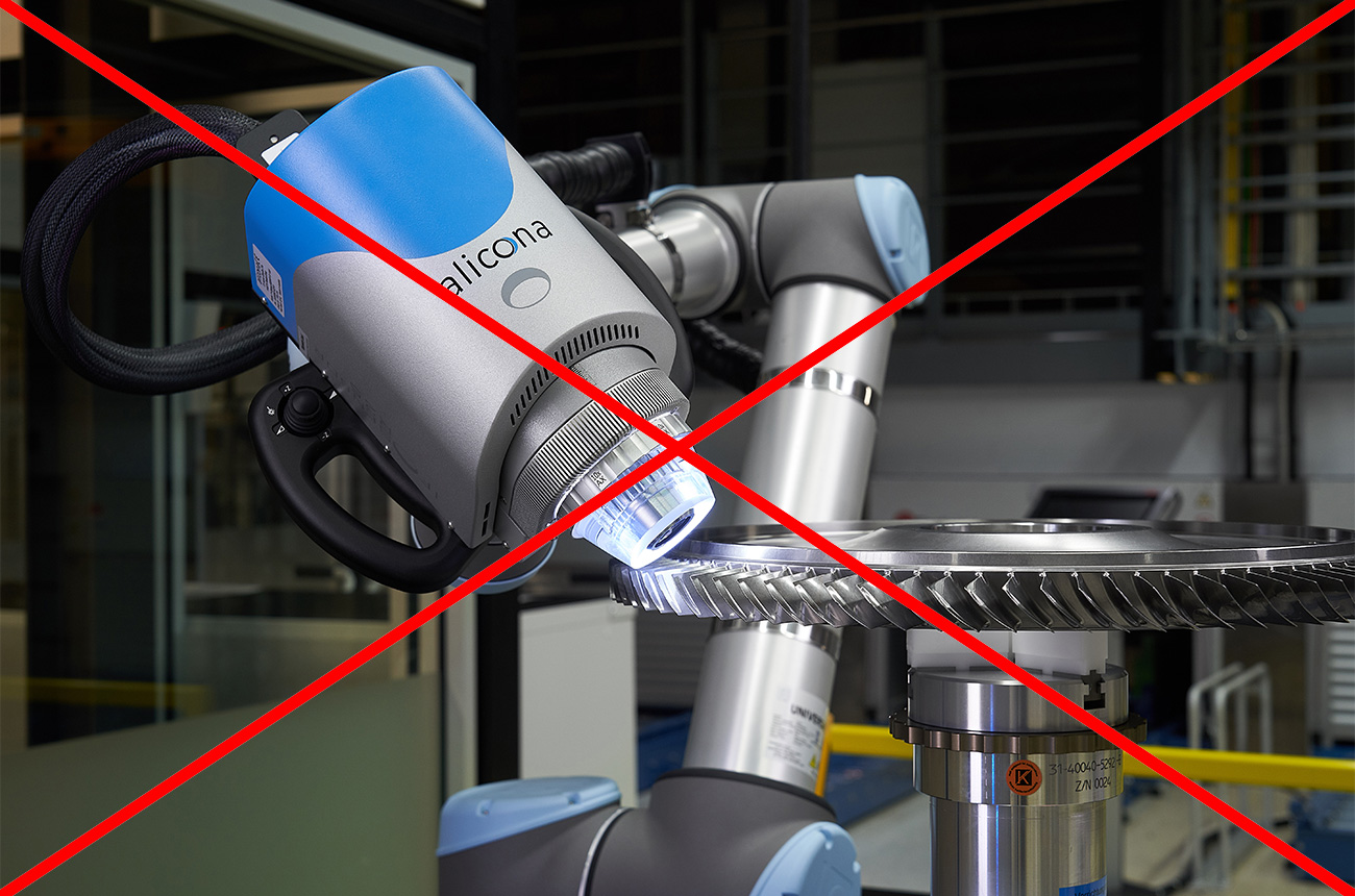
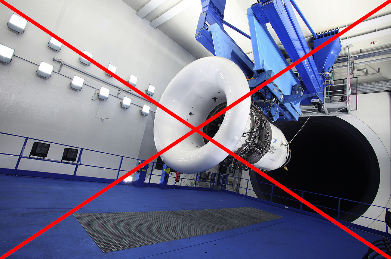
DON’T
Avoid obviously posed shots.
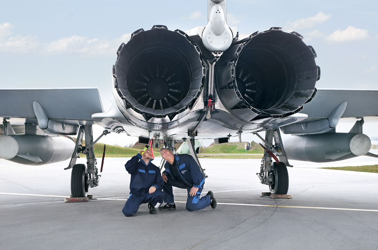
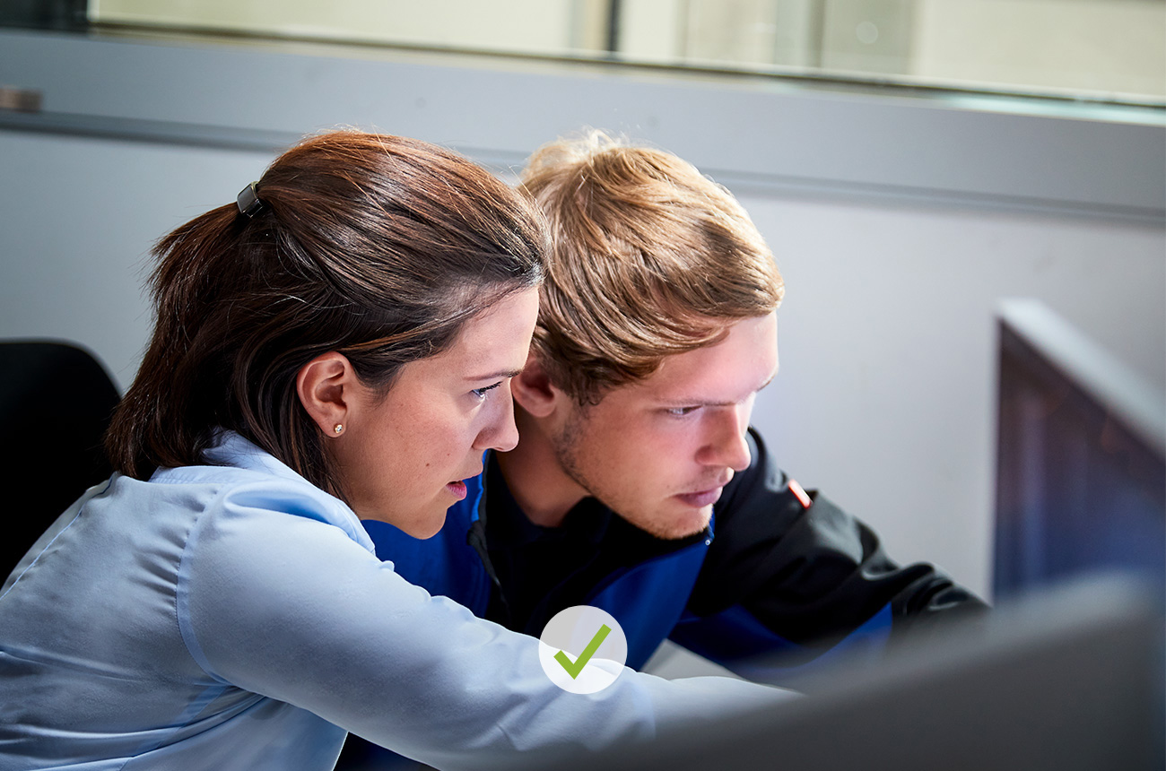
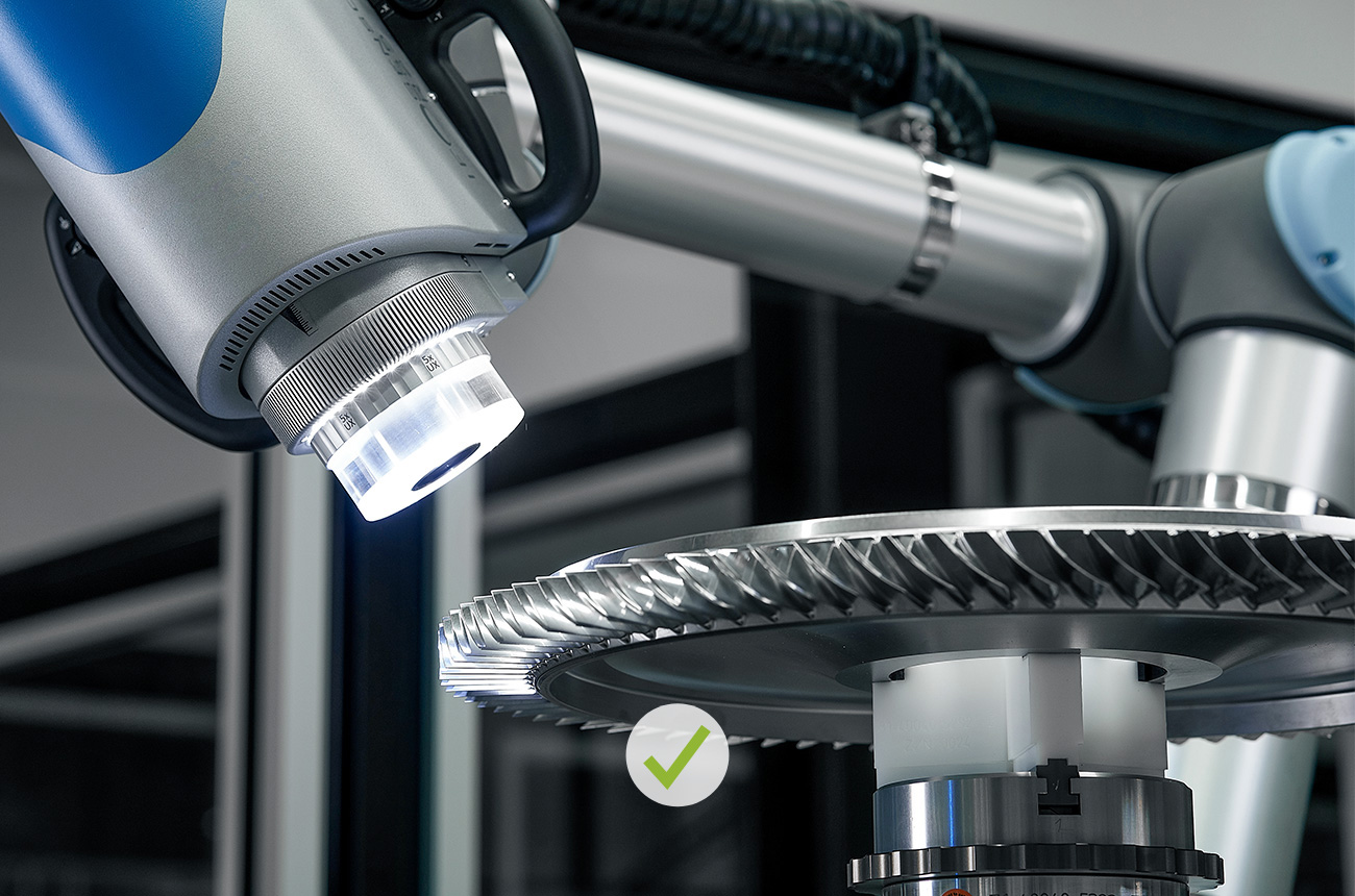
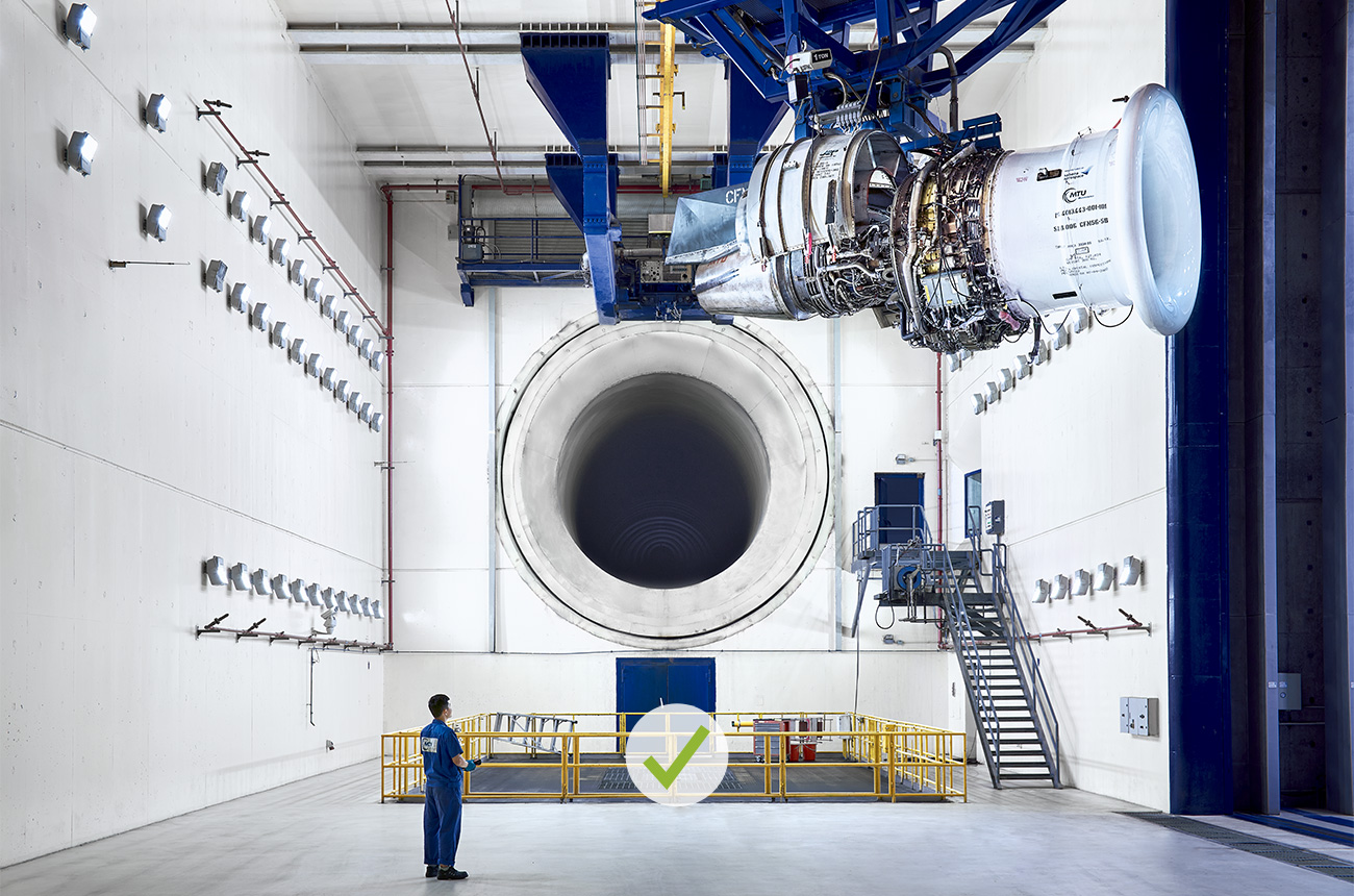
DO
The camera observes from a discreet distance.
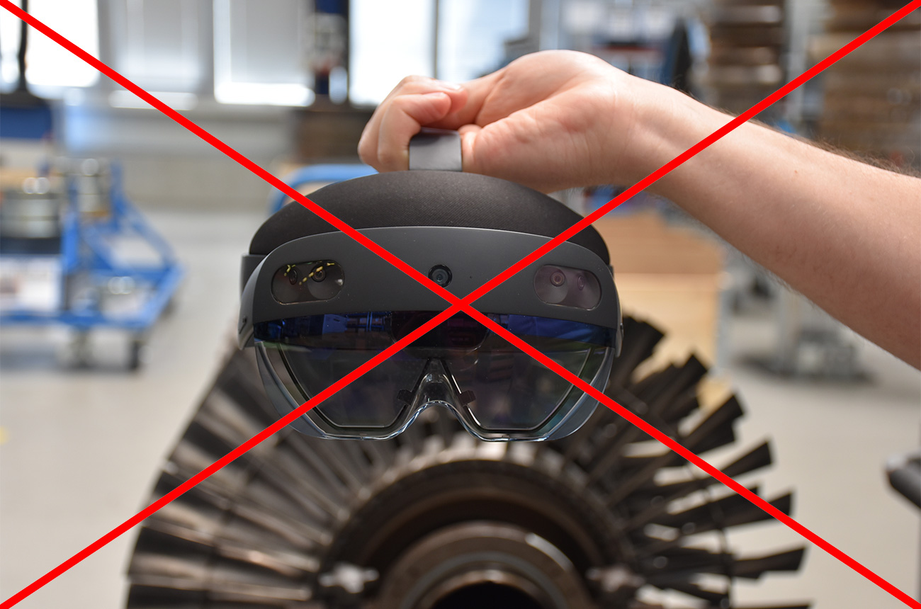
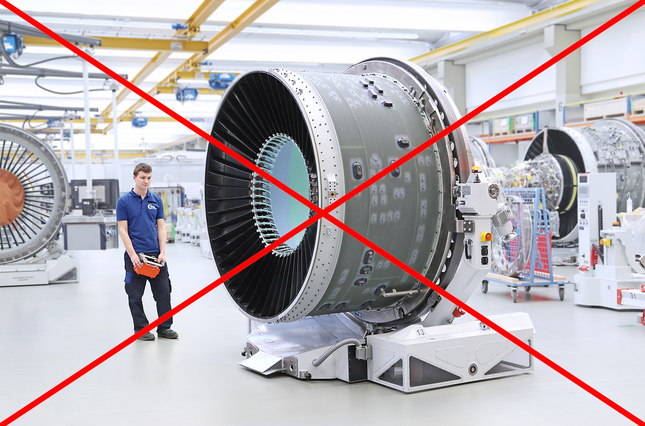
DON’T
This pose looks forced and unnatural. Also, the foreground is not clearly distinguishable from the background.
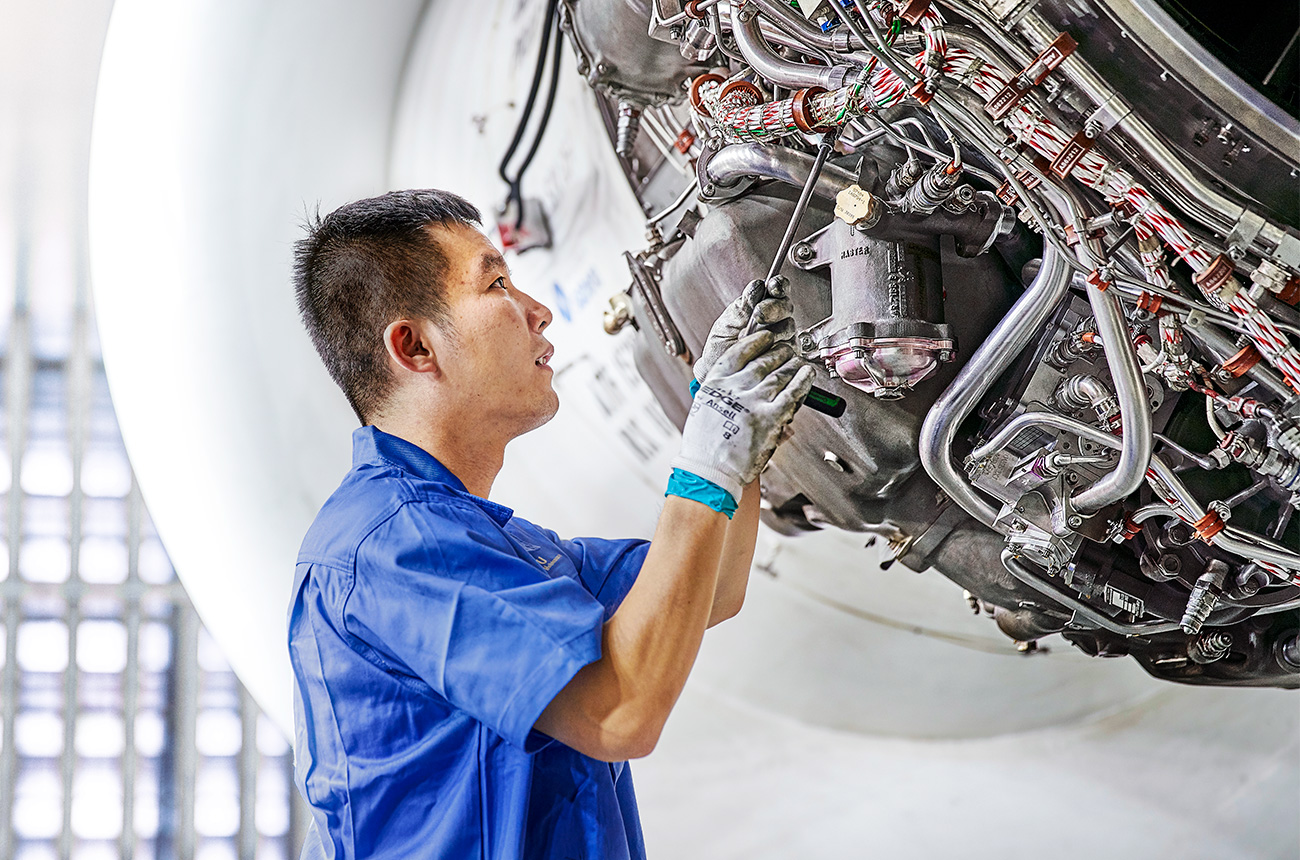
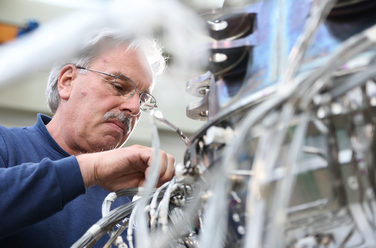
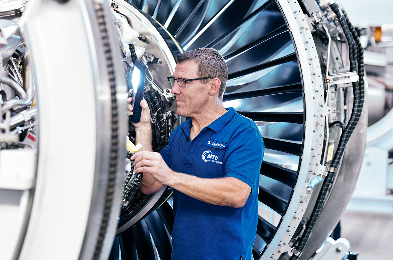
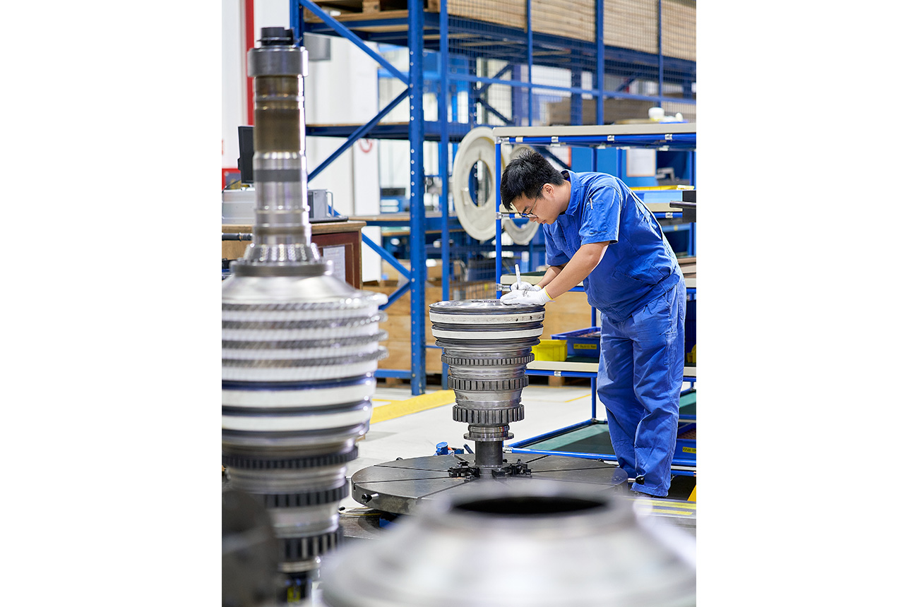
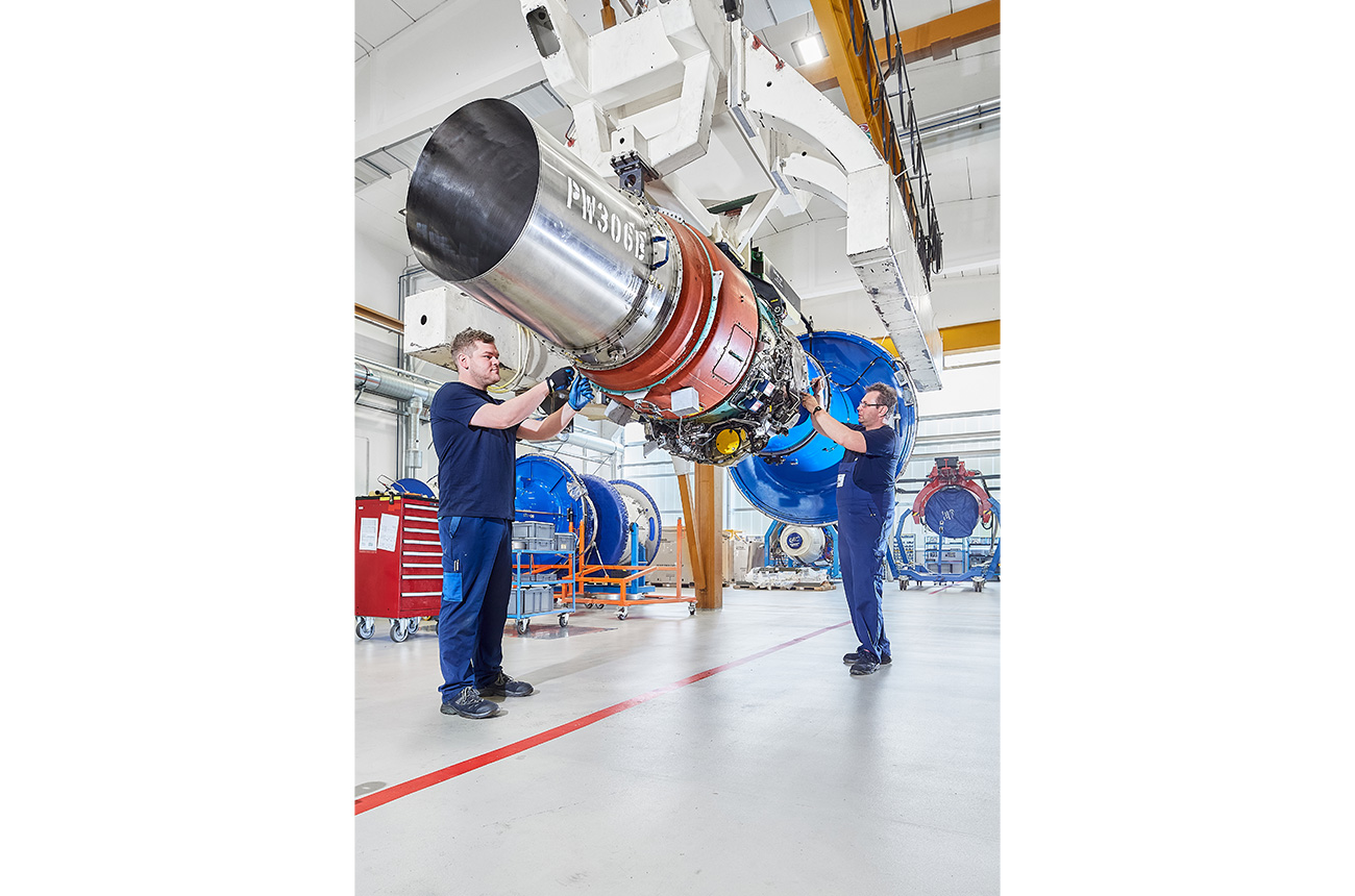
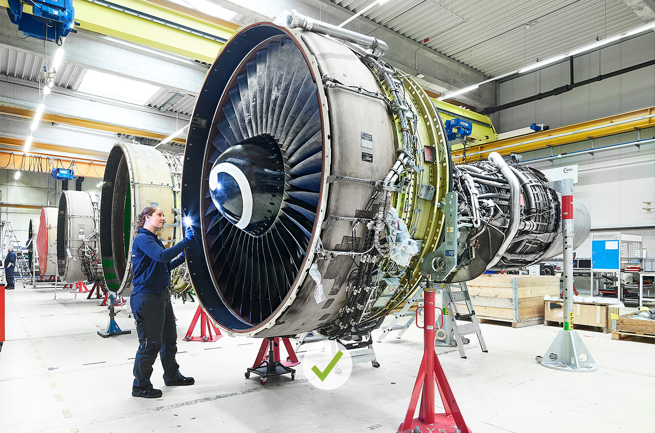
DO
Object in use, credibly staged; its function is recognizable.
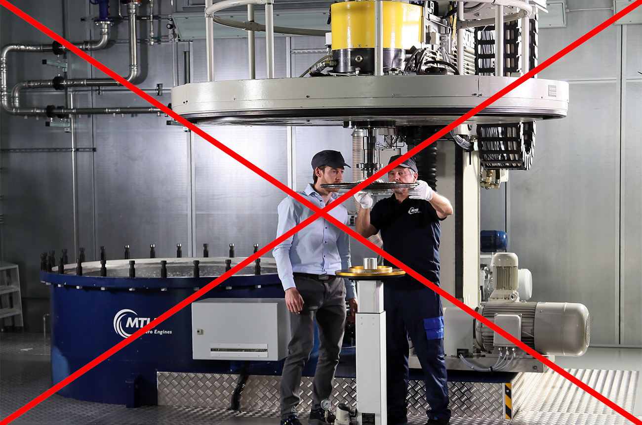
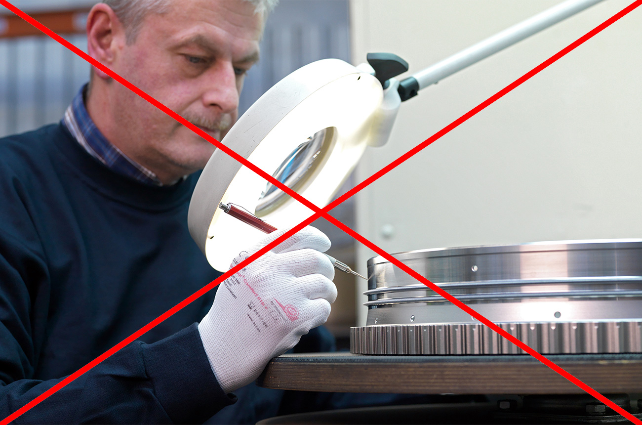
DON’T
Sterile environment, unnatural and cramped posture.
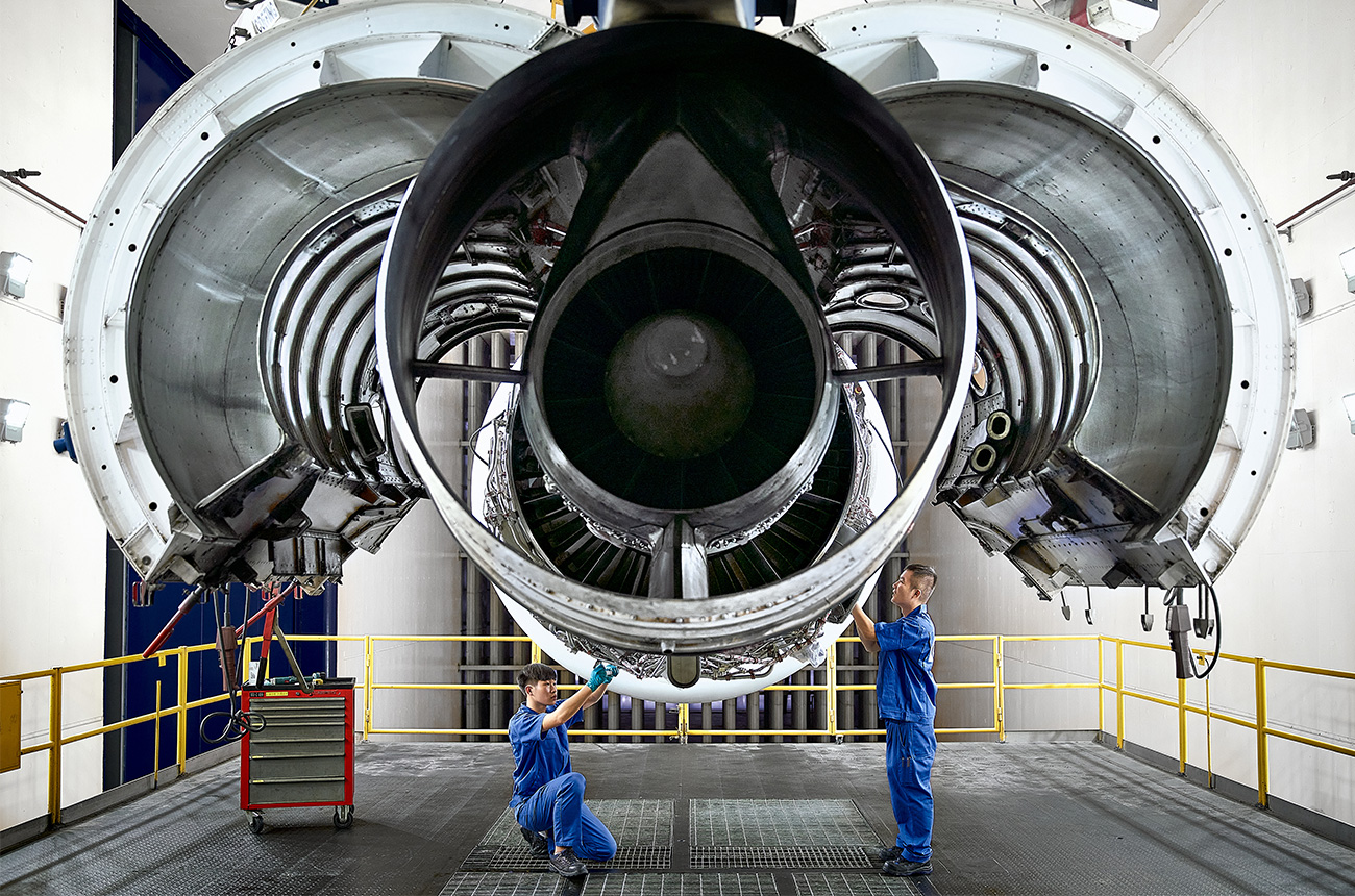
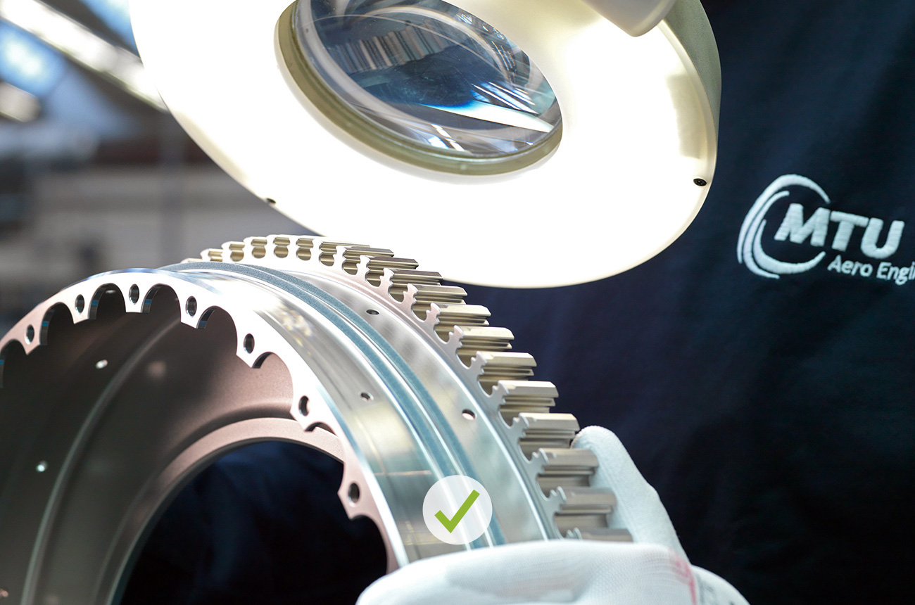
DO
Credible atmosphere, lively and dynamic facial expressions and gestures.
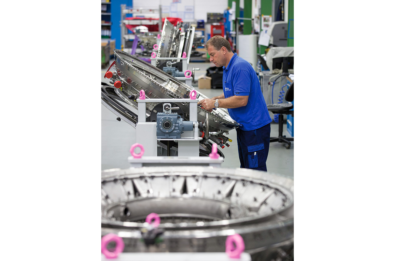
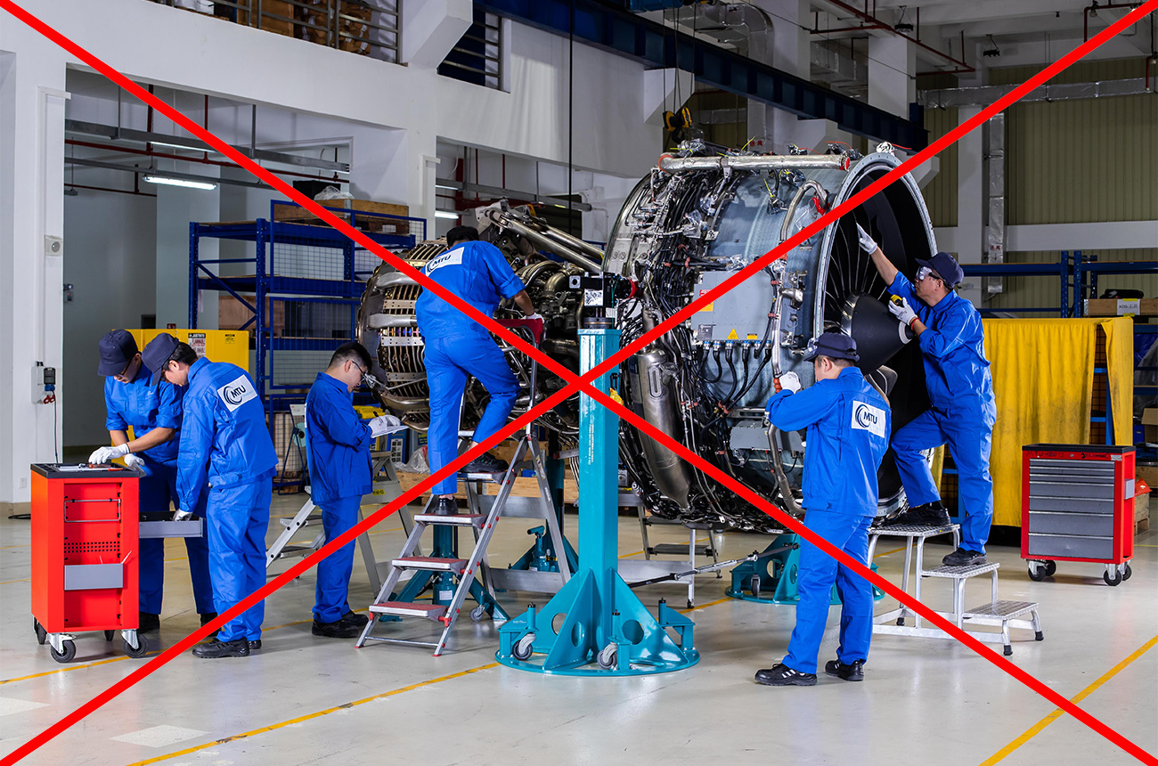
DON’T
Overly staged; looks like people “working on theatrical scenery.”
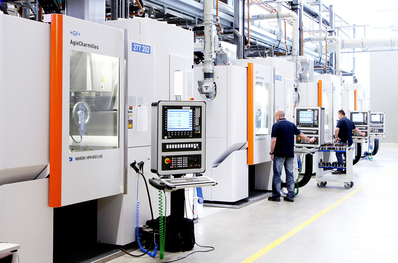
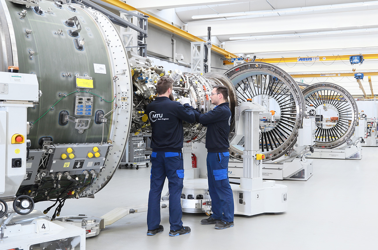
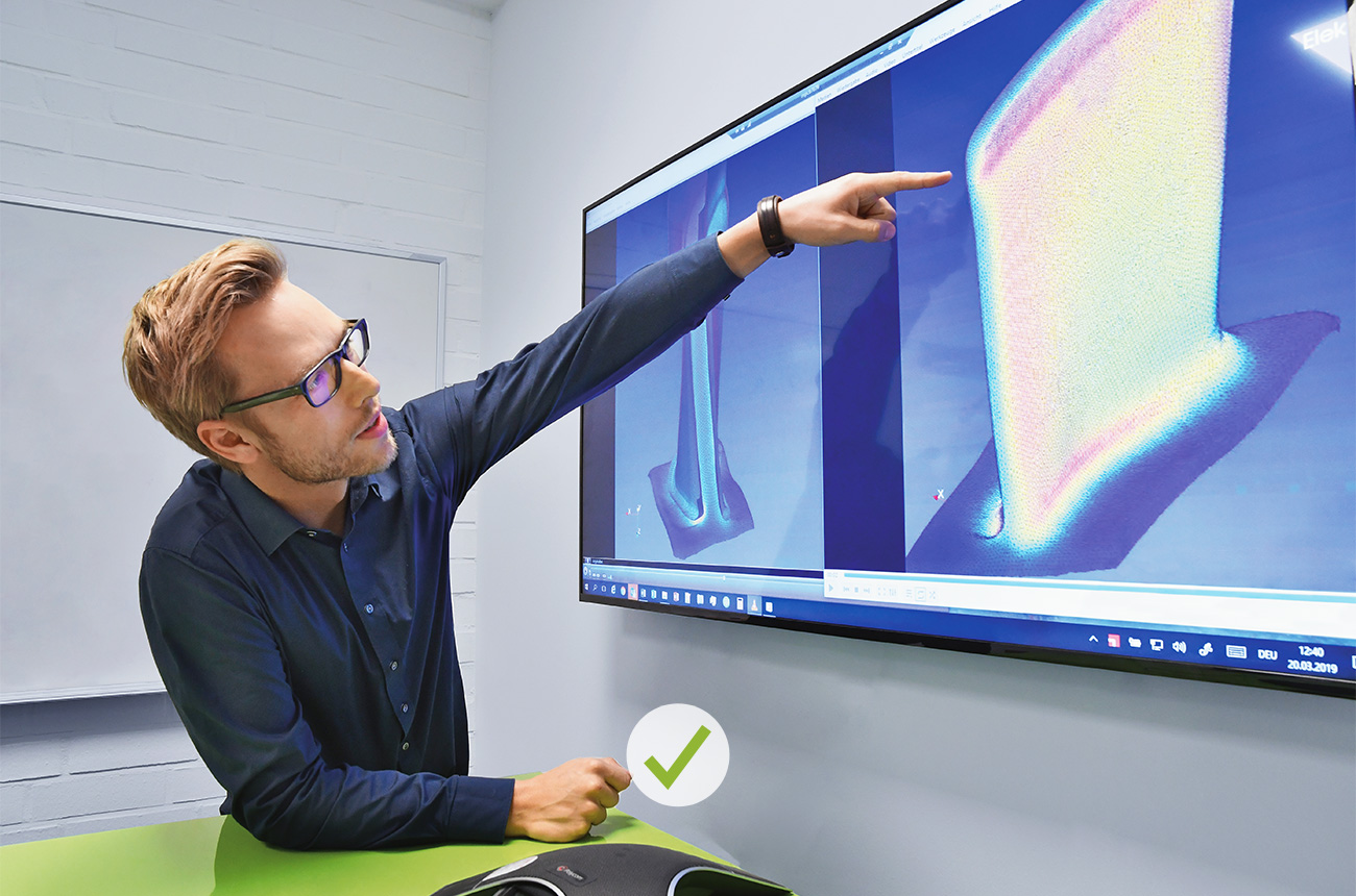
DO
Easy-to-understand action with a clear focus.
DON’T
No low-effort smartphone portraits.
DO
Good lighting, professionally photographed. Natural-looking light, no impression that a flash was used. Ideally, the subject will have had professional makeup.
DON’T
Static, posed, distant—no connection between the protagonists.
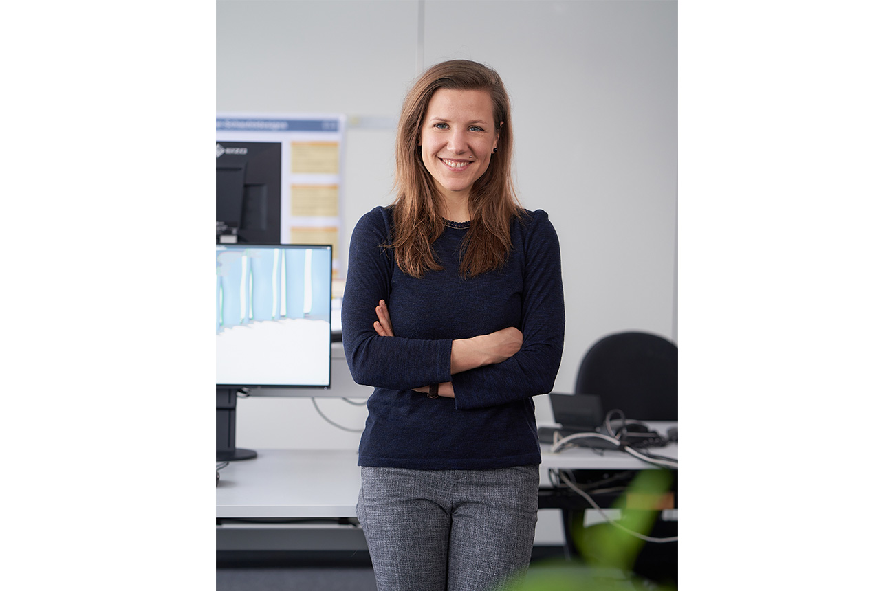
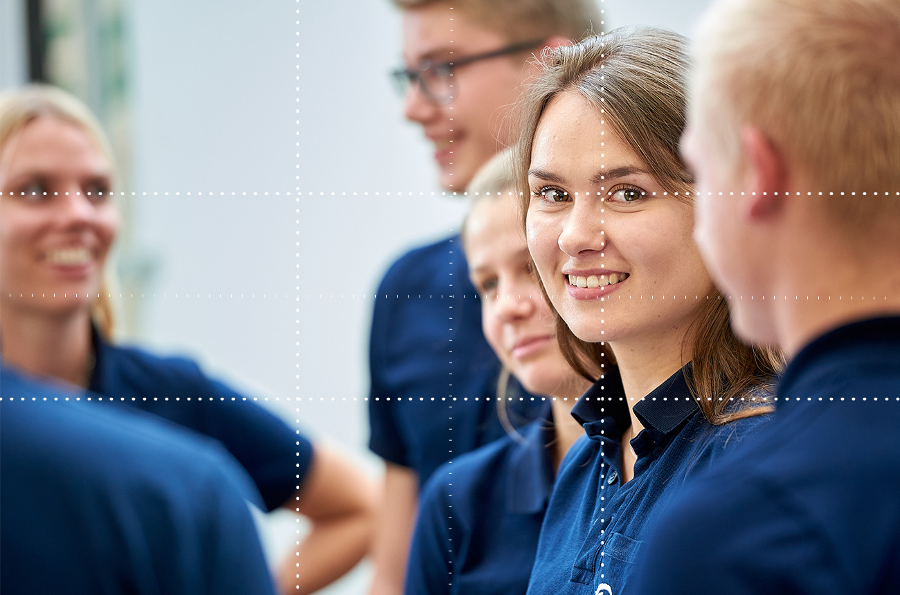
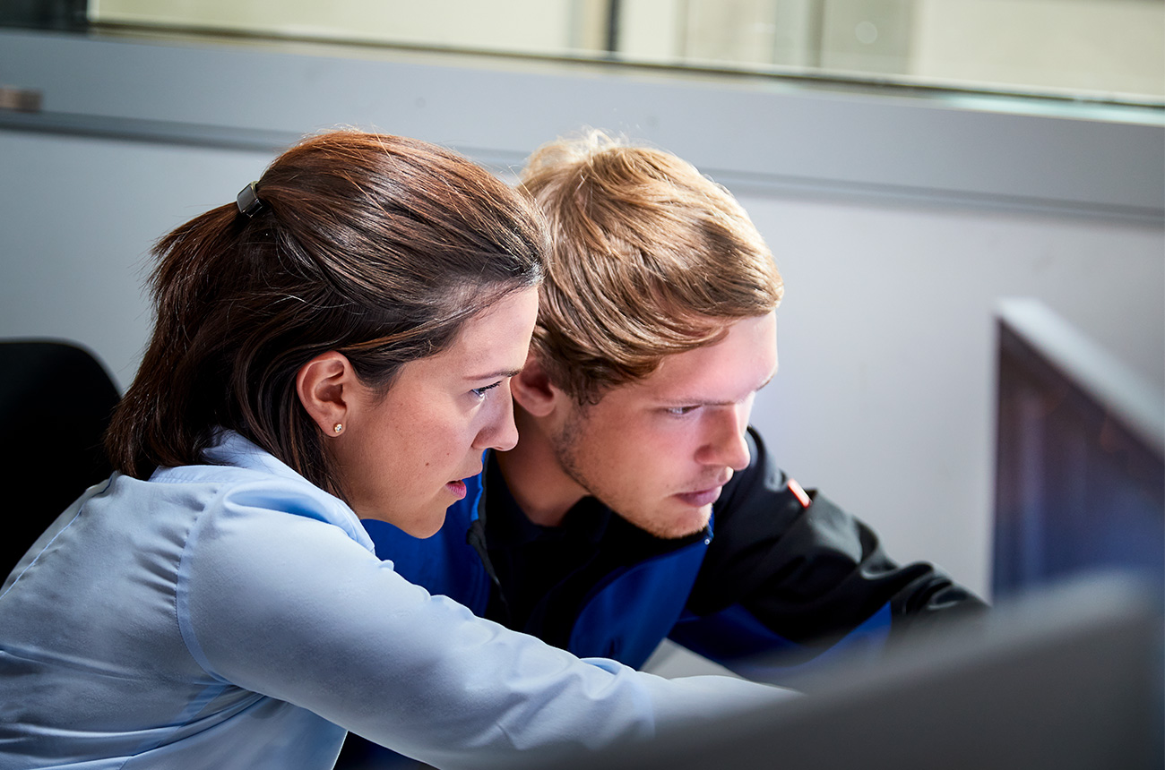
DO
Up close, genuine and credible interaction, focus on people.
DON’T
Facial expression and gaze are tense and unflattering.
DO
Candid gaze and positive demeanor. Pay attention to facial expressions and posture. The image should be dynamic and communicate fun at work. The people are approach-able and friendly. This applies above all to work situations on the shop floor.
DON’T
Bored, passive/uninvolved attitude.
DO
Credible dynamic without exaggeration.
DON’T
Lighting is unnatural and has a dim, “lit by flash” look.
Avoid isolated use of flashes and spotlights as well as colored filters (exception: CTB/CTO if necessary).
DO
Natural-looking light; the overall impression is bright and neutral.
DON’T
Avoid obviously photoshopped compositions as well as mixed light directions / lighting moods.
DO
Shoot in a real location with good light. Backgrounds may/should be calmed/cleaned up in postproduction.
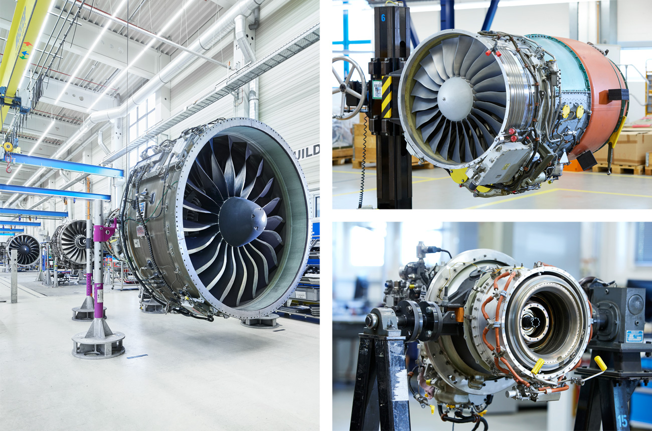
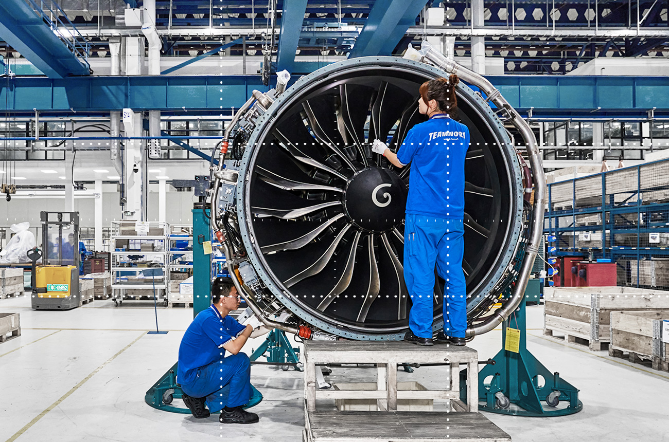
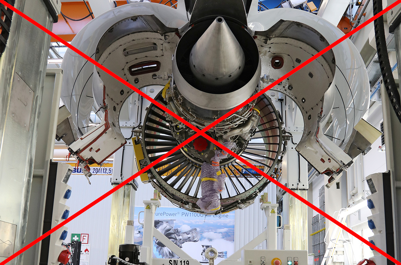
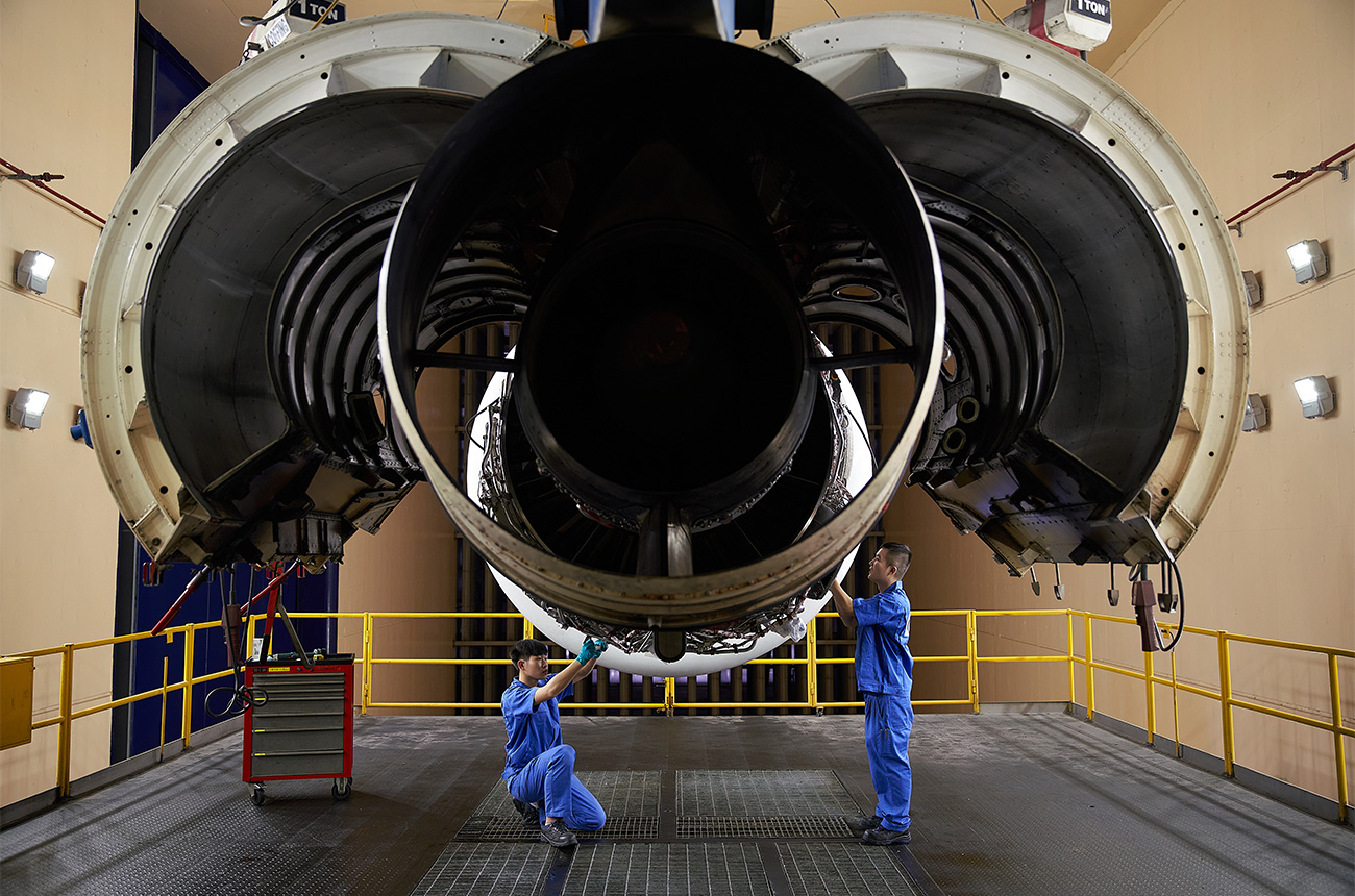
DON’T
Complex image structure, many lines, prominent third-party logo.
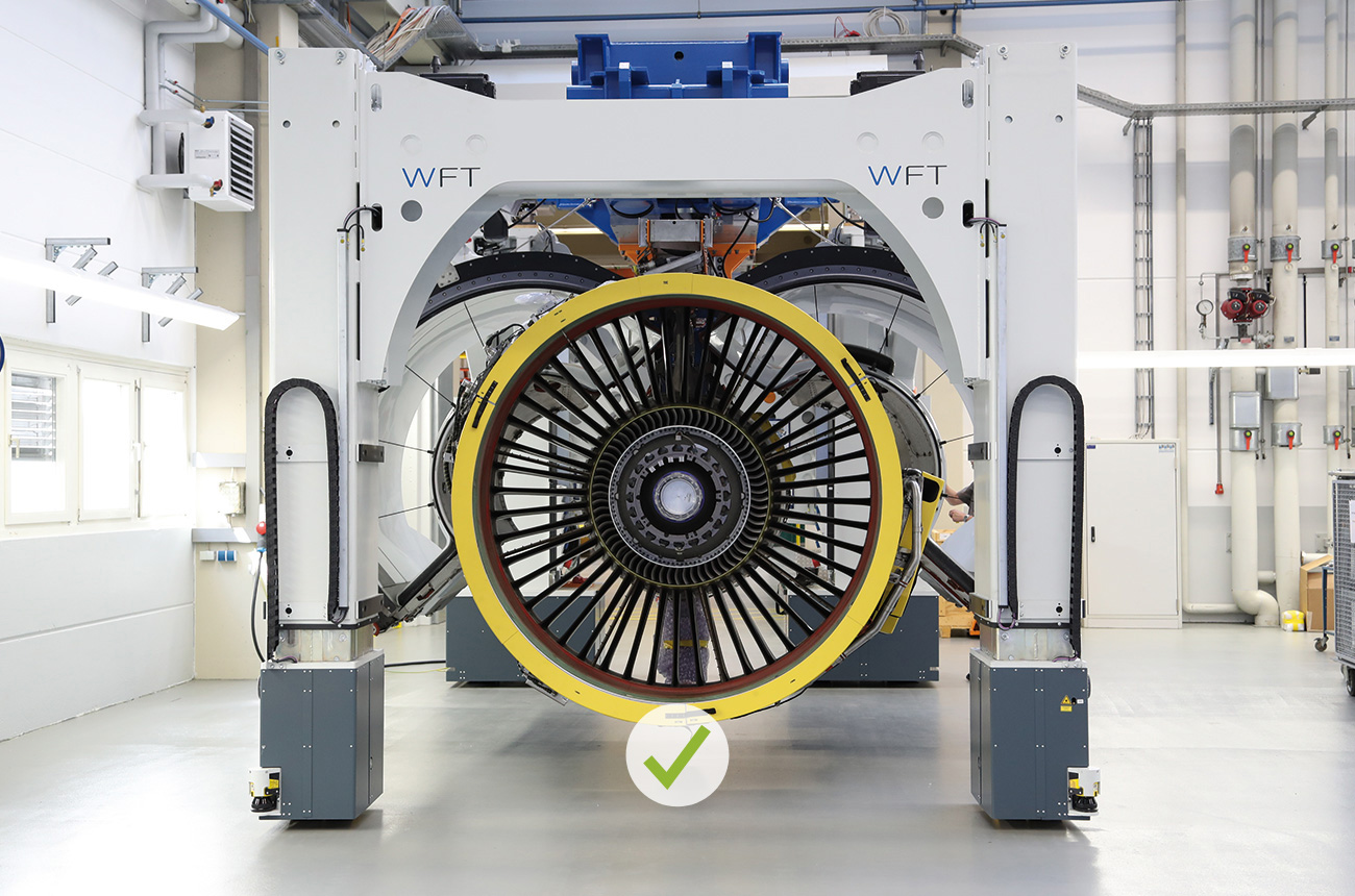
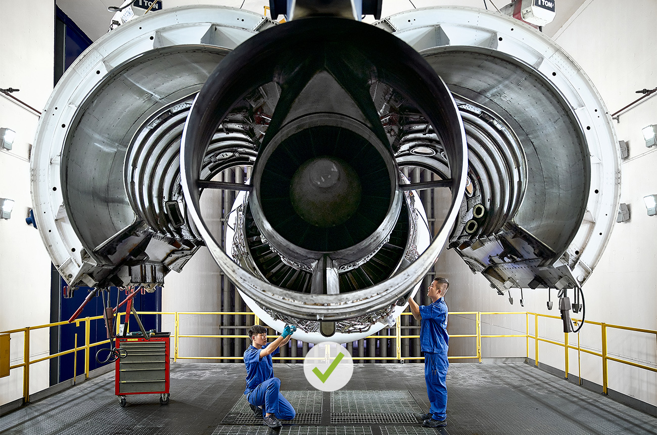
DO
Clear structure, eye clearly led, simple image interpretation, calm background. Rule of thirds.
DON’T
Crowded image, unclear, difficult to grasp and also crooked.
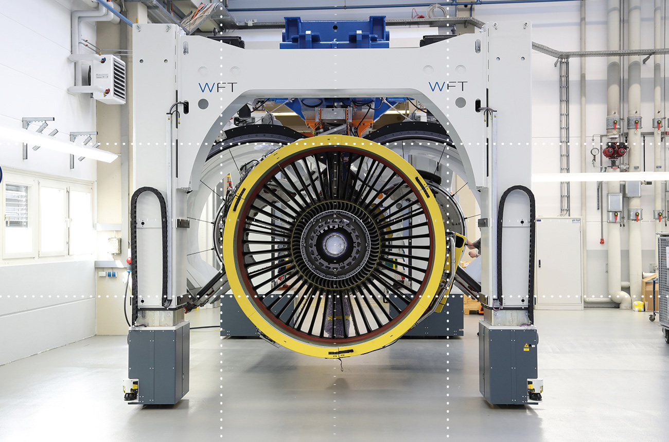
DO
Clear graphic composition, good lighting, clean perspective.
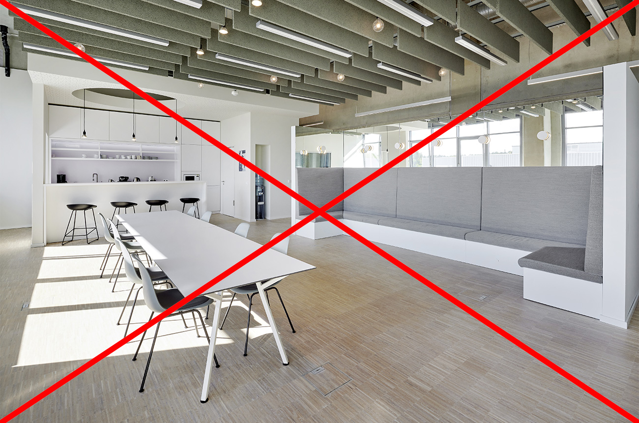
DON’T
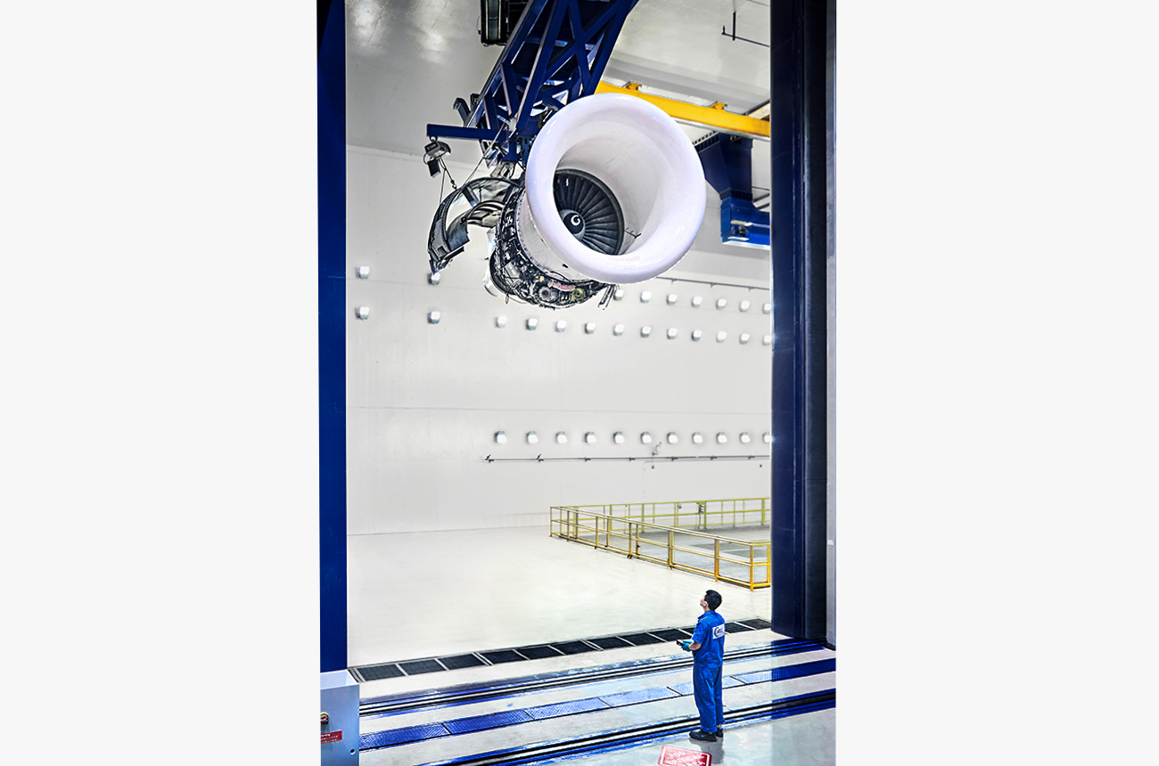
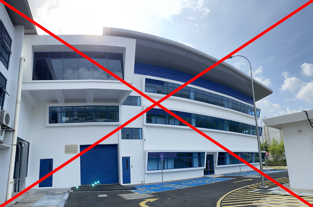
Architectural elements photographed only with wide angle; no context, not lively or inviting.
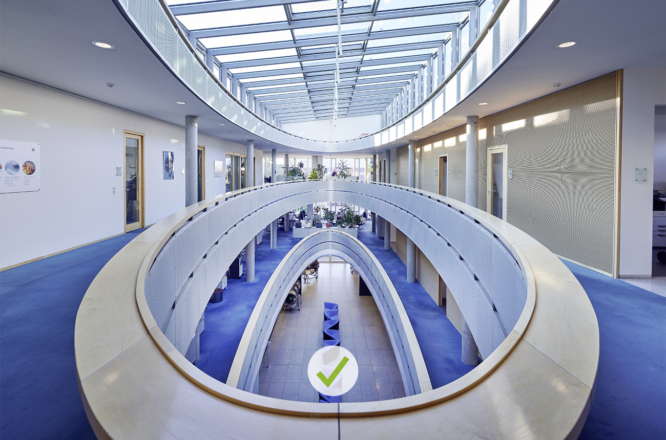
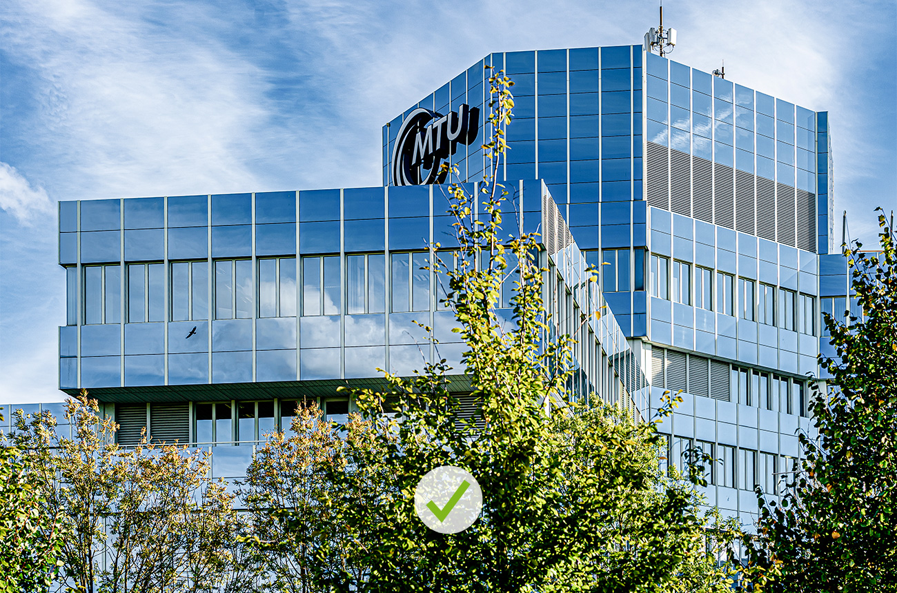
DO
Look for exciting sections of the room; if necessary, choose smaller segments instead of long shots.
DON’T
Disruptive lines, unflattering perspective, difficult lighting.
DO
Cleanly photographed and corrected.
DON’T
Avoid generic, impersonal images that have been seen hundreds of times. It’s best to avoid stock images completely.
DO
If certain topics need to be illustrated using stock material, please search and source from quality libraries.
Nevertheless, the general rules for the MTU Mediapool apply.
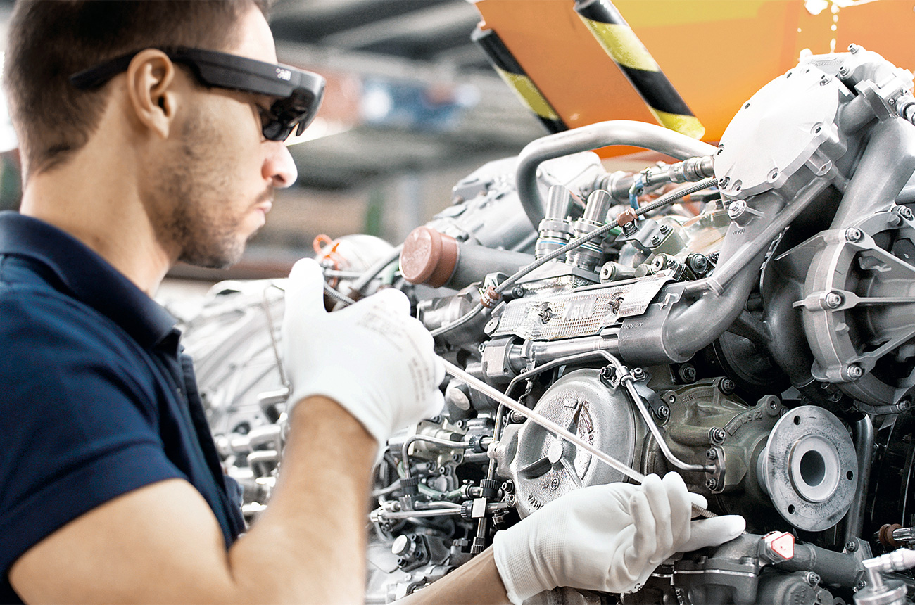
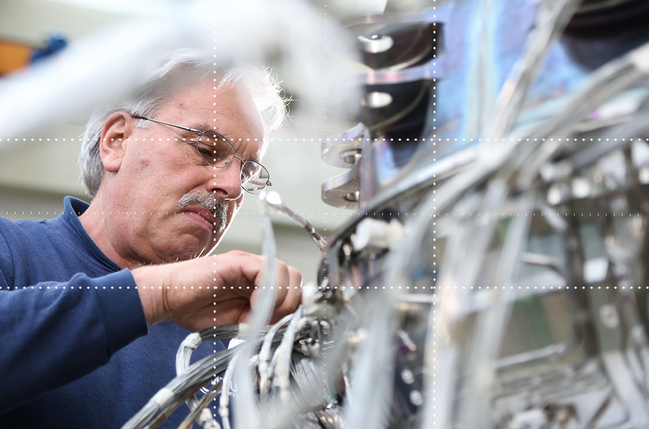
DON’T
Uncertain focus and image composition. Unflattering facial expression.
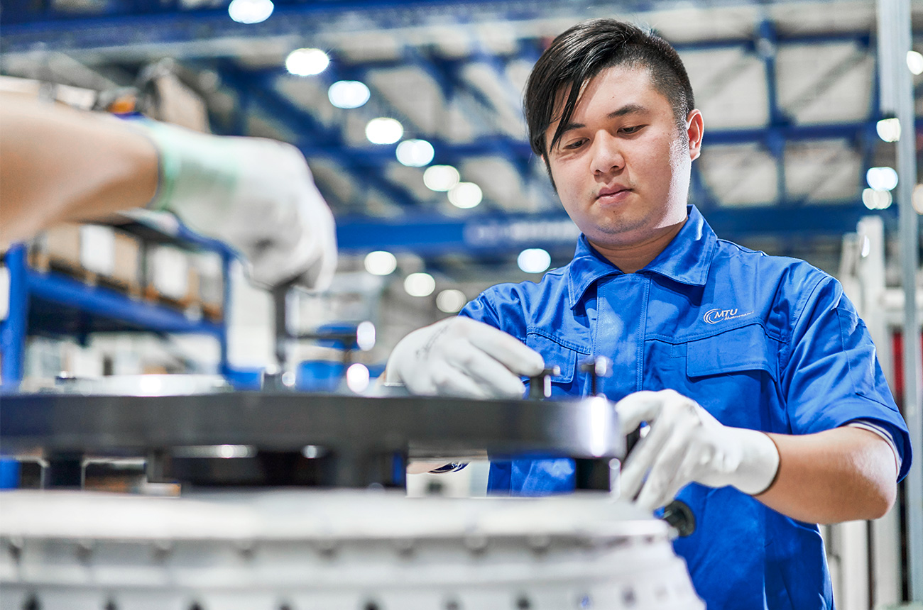
DO
Sharp focus, human presence clearly perceptible, image easy to interpret.
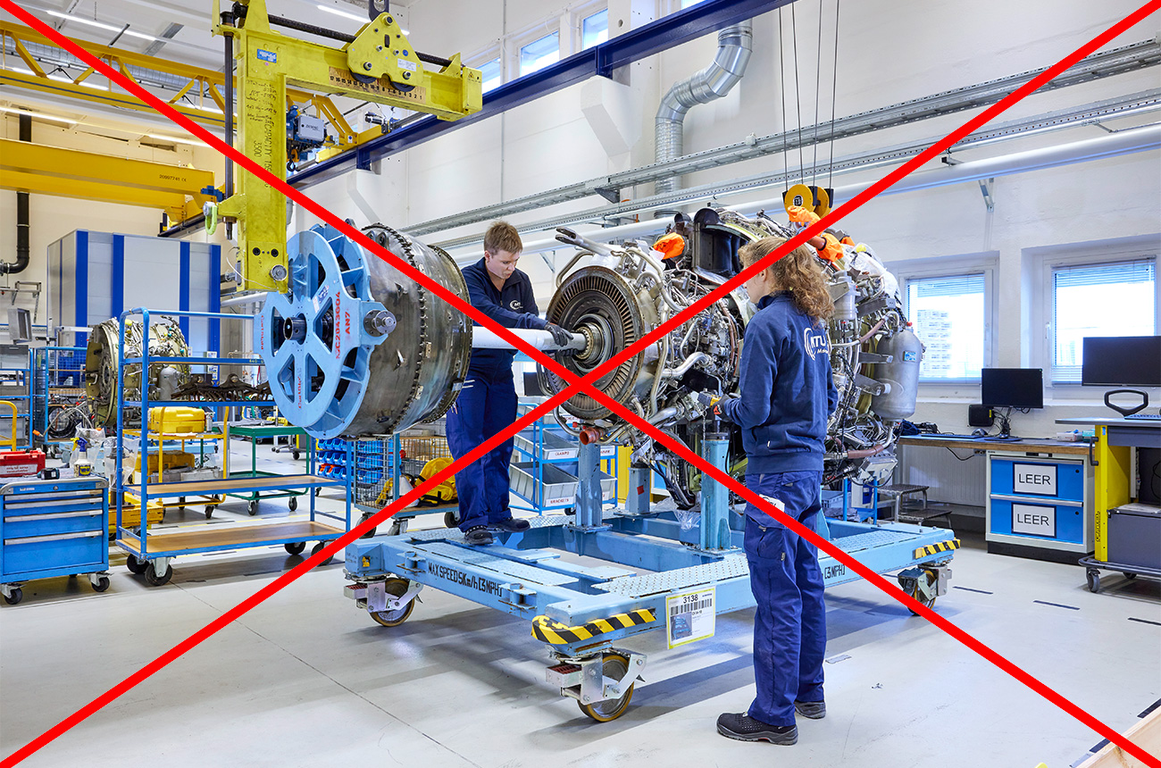
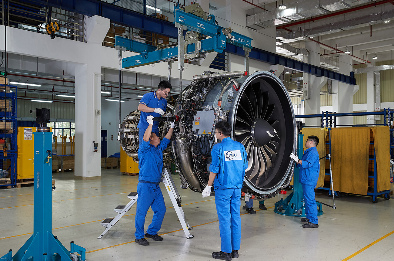
DON’T
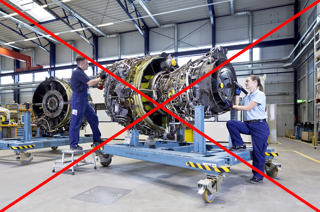
Arbitrary/unrealistic staging (here e.g. angle of the dolly) for “at work” motifs.
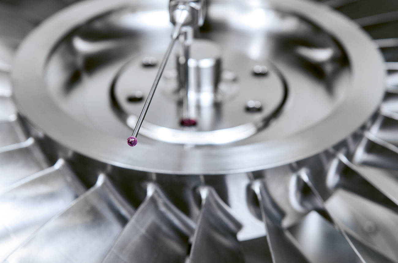
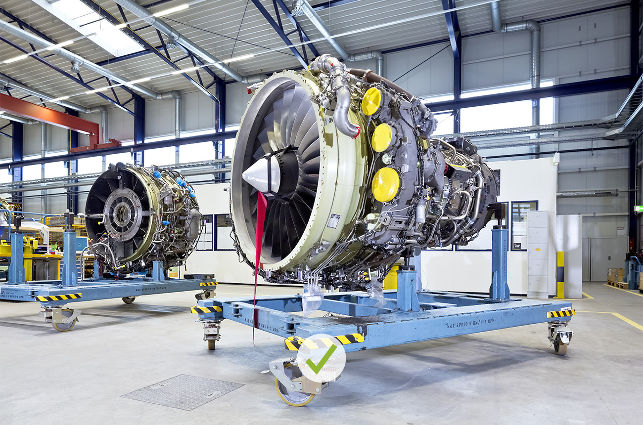
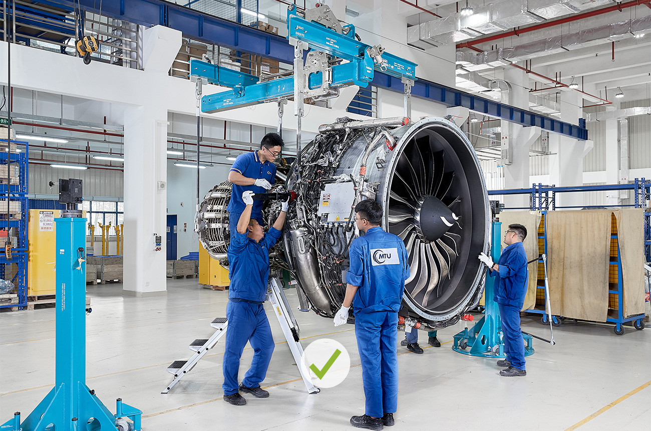
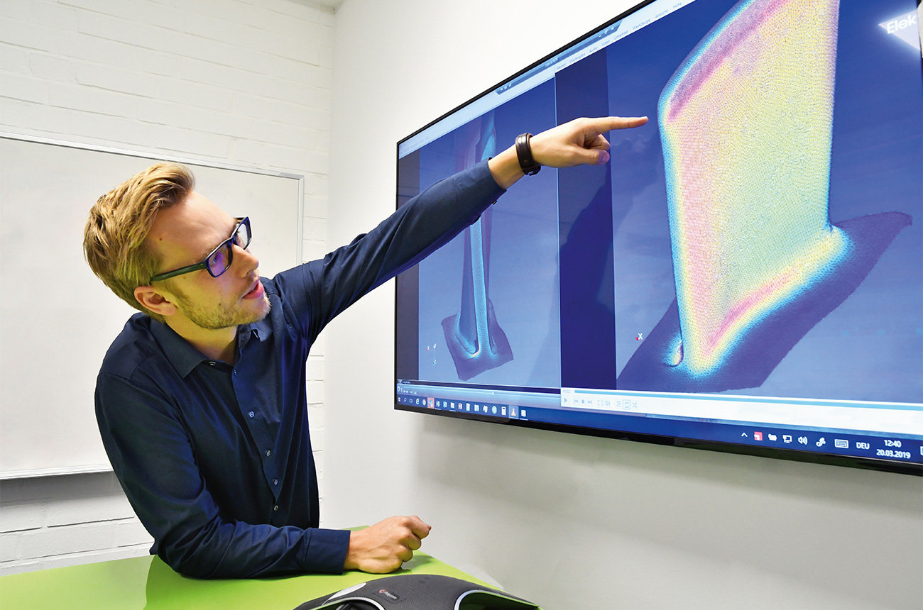
DO
Clear staging as a stylistic device for images without people.
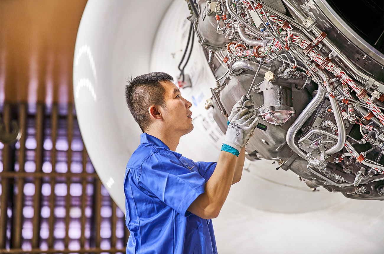
DON’T
Visual axis not cleanly centered.
DON’T
Unnaturally wide angle.
DO
Choose greater distance, longer focal length and a more natural perspective.
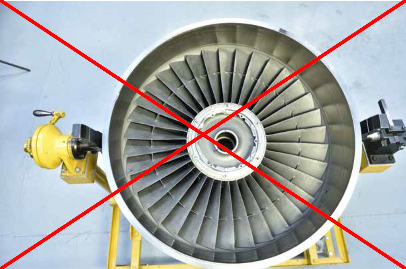
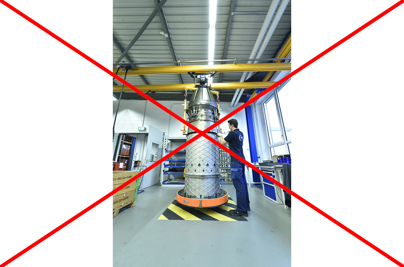
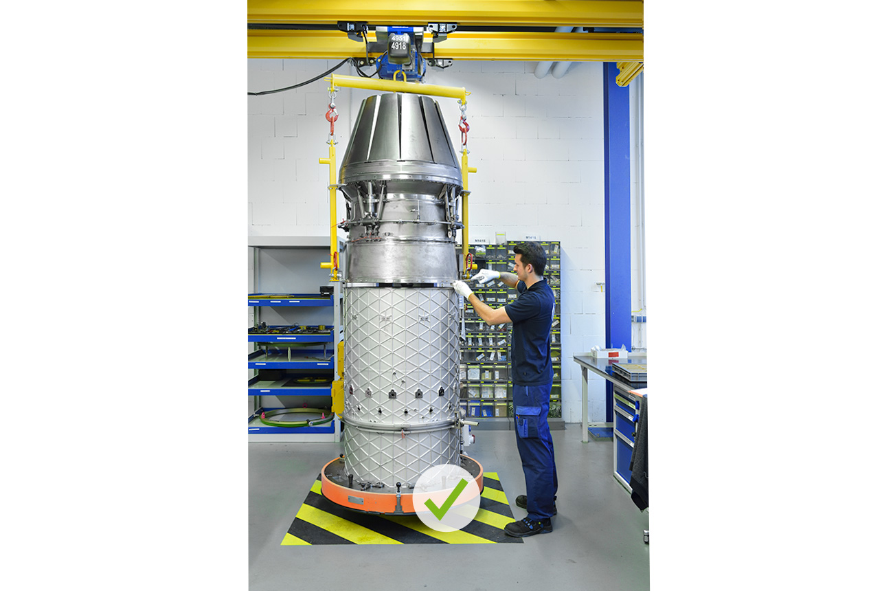
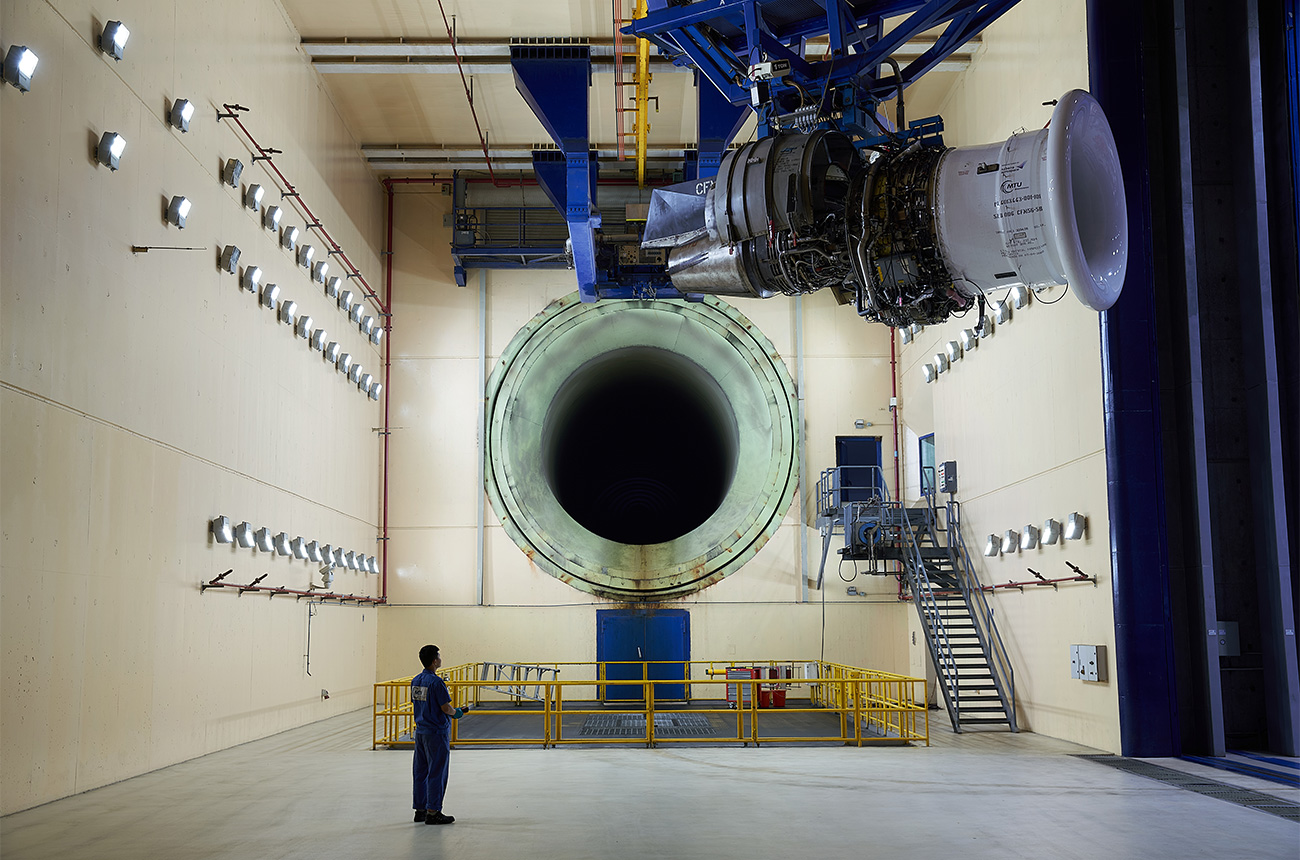
DON’T
Artificial perspective, extreme wide angle.
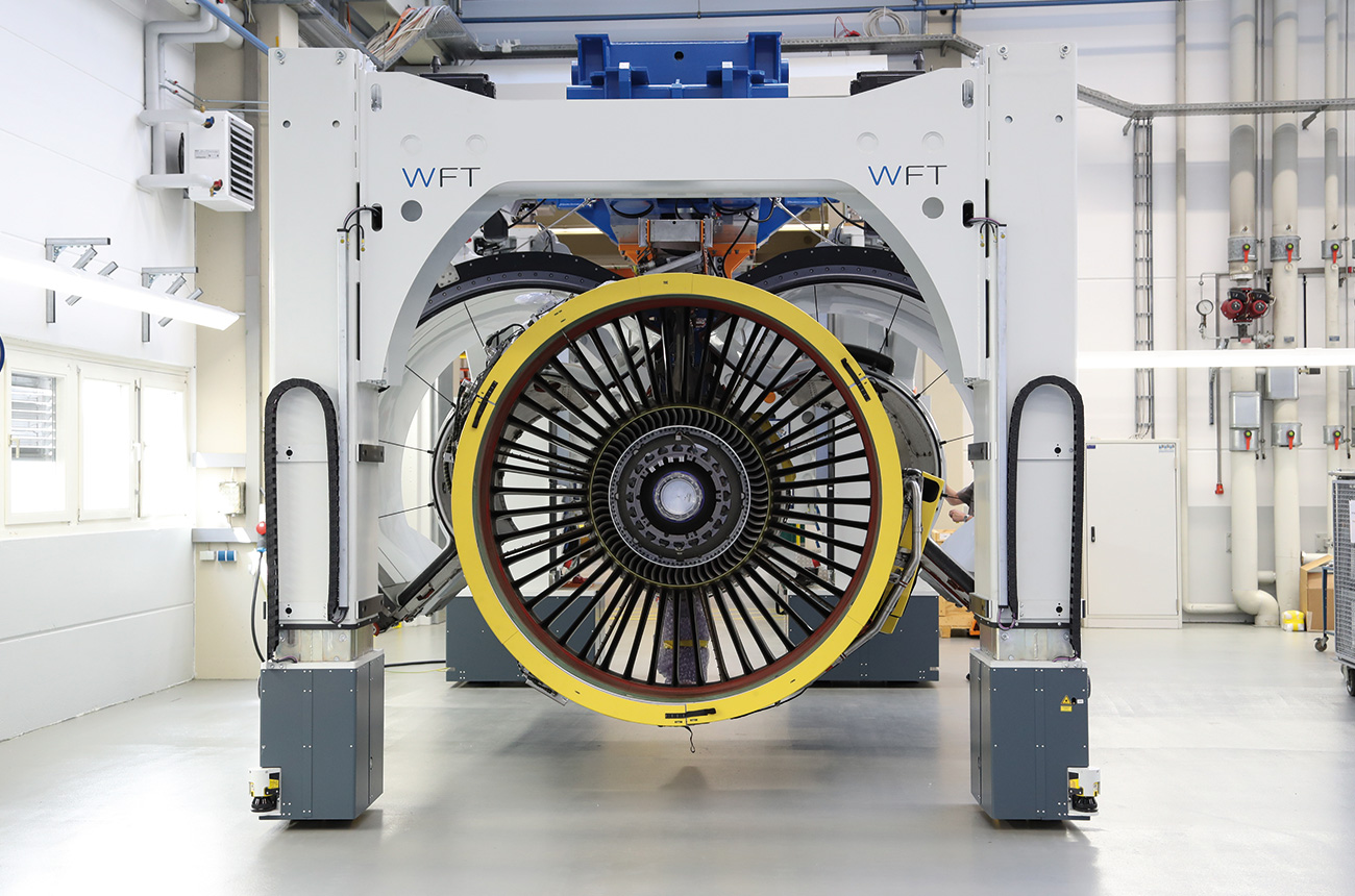
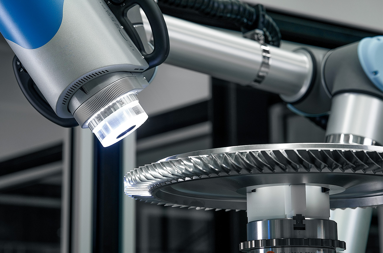
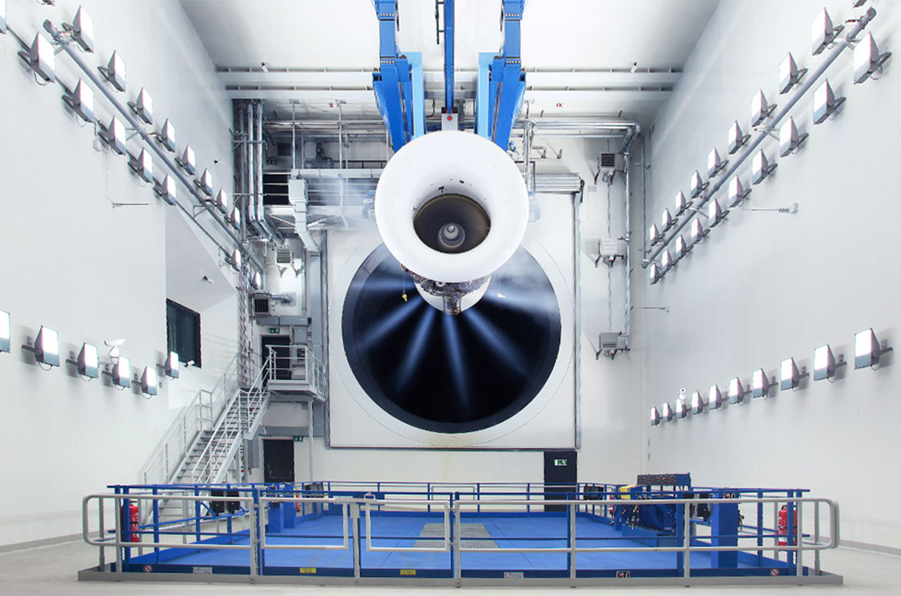
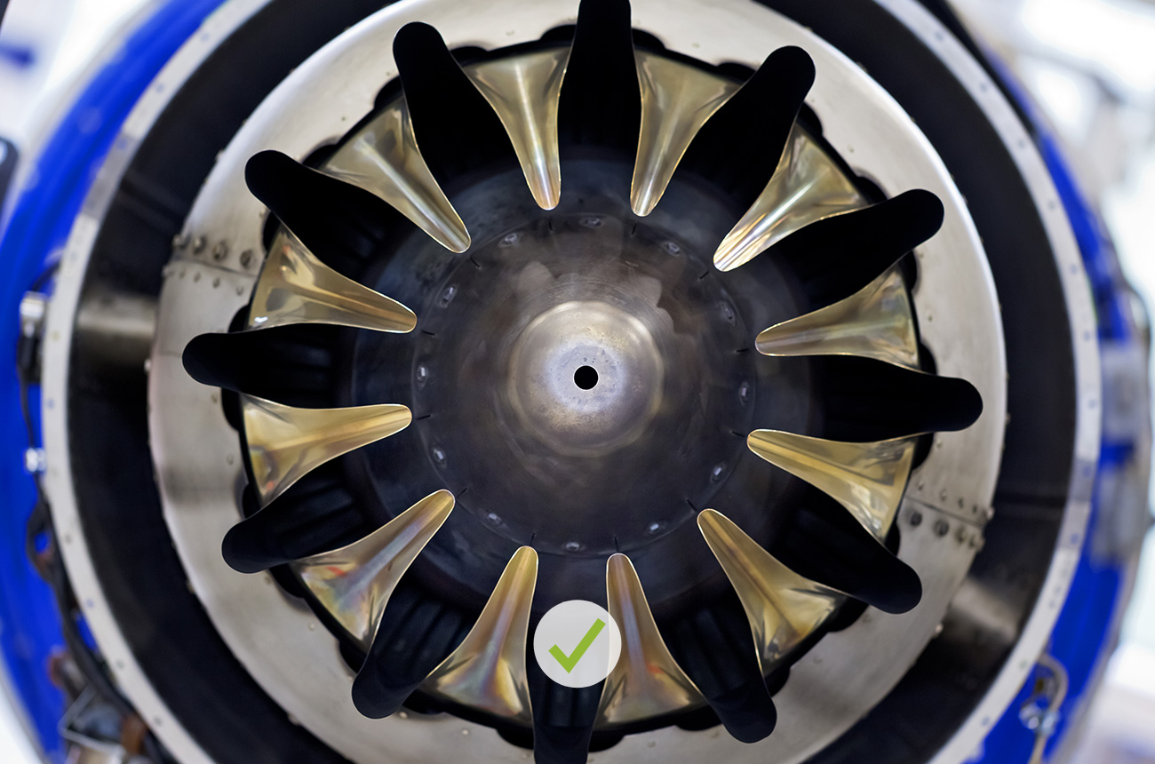
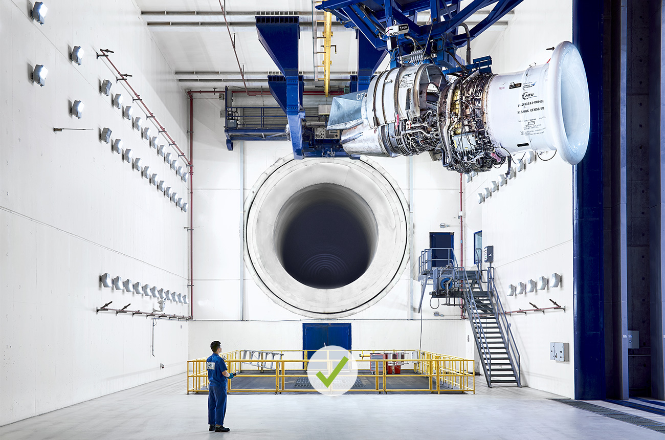
DO
Clear lines, dimensions recognizable, graphically simple and visually pleasing.
DON’T
Wide angle not justified by the subject.
DO
Klare Linienführung, Dimension erkennbar, grafisch schlicht und schön.